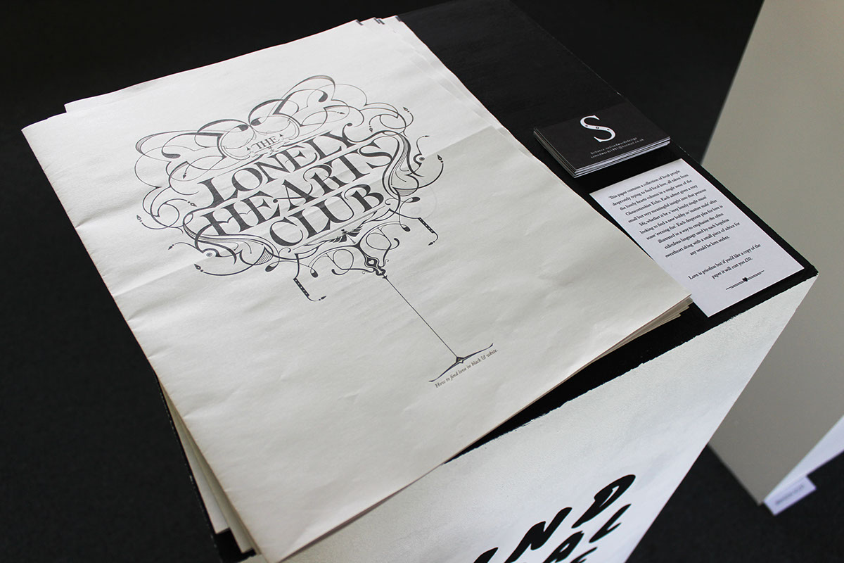
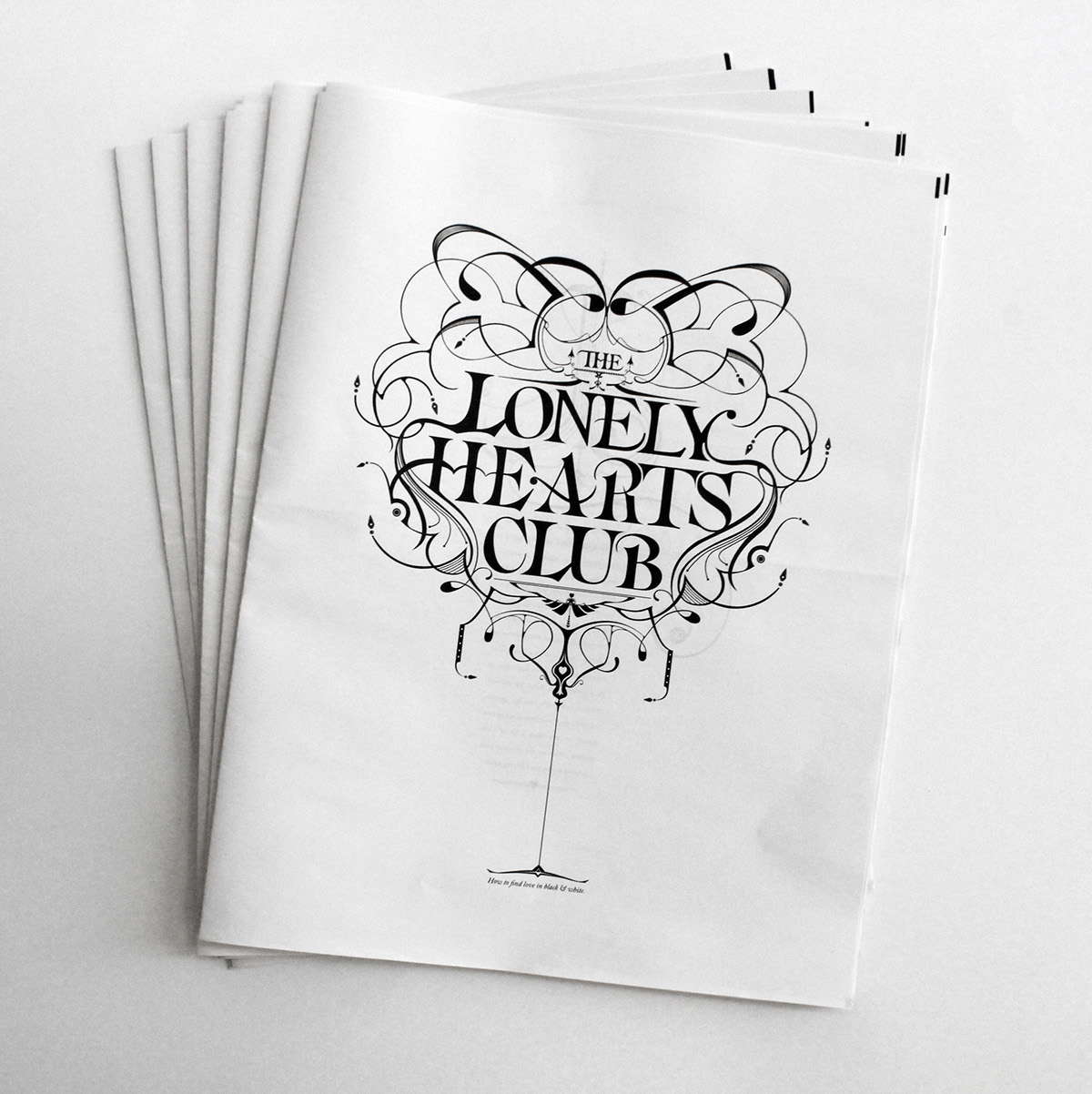
How to find love in black & white.
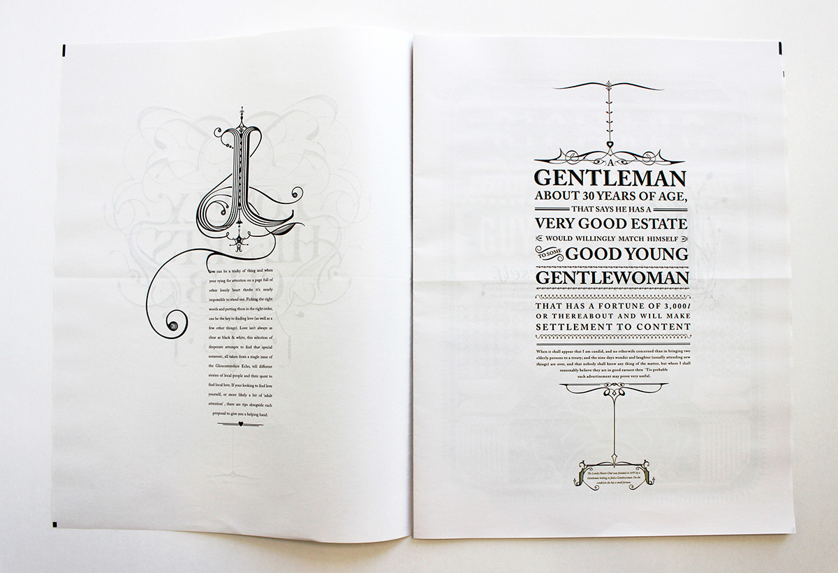
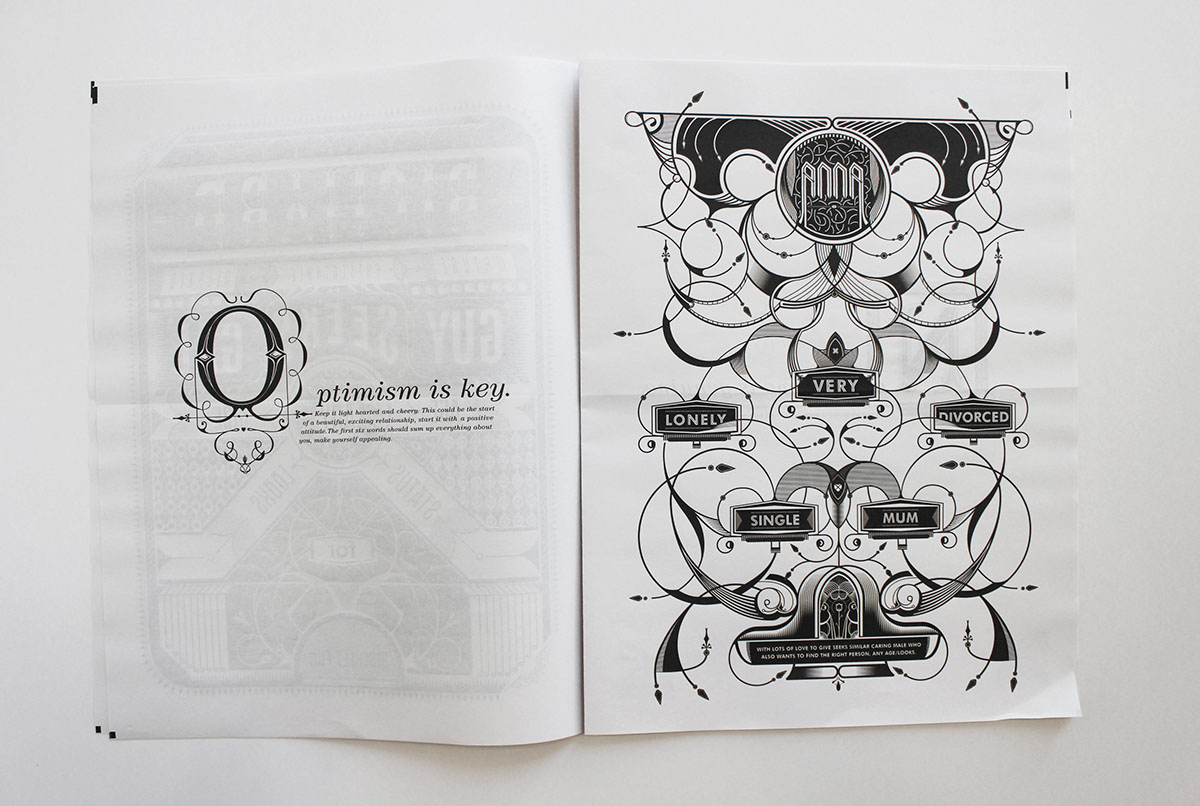
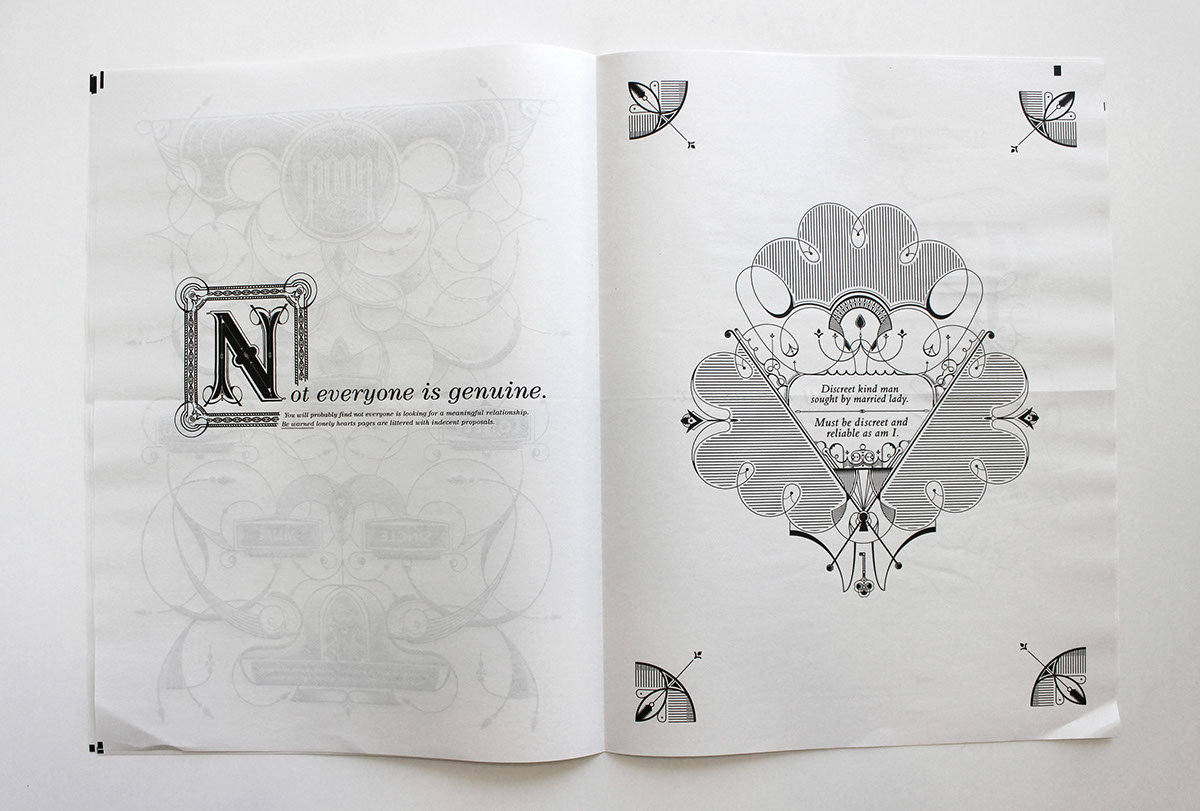
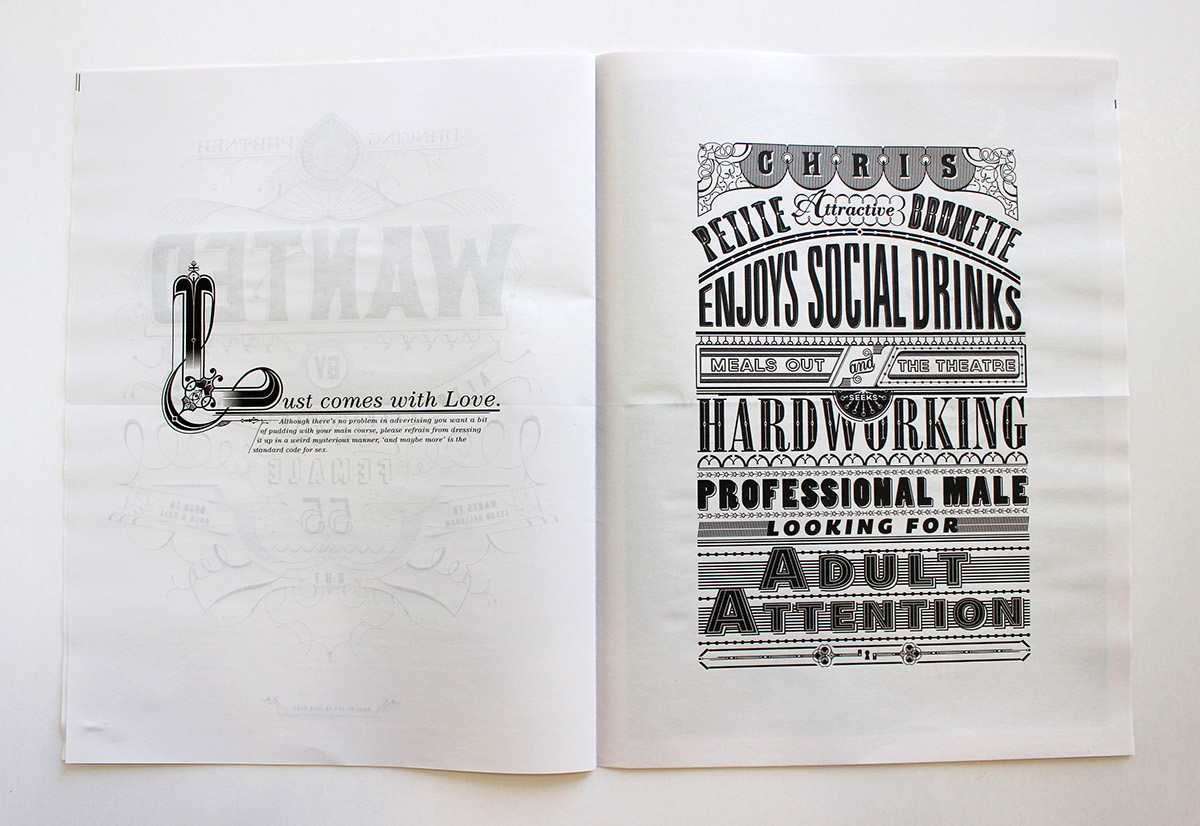
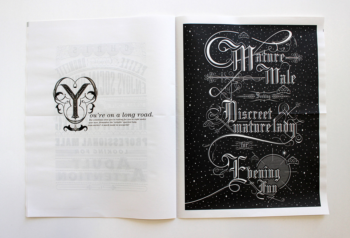
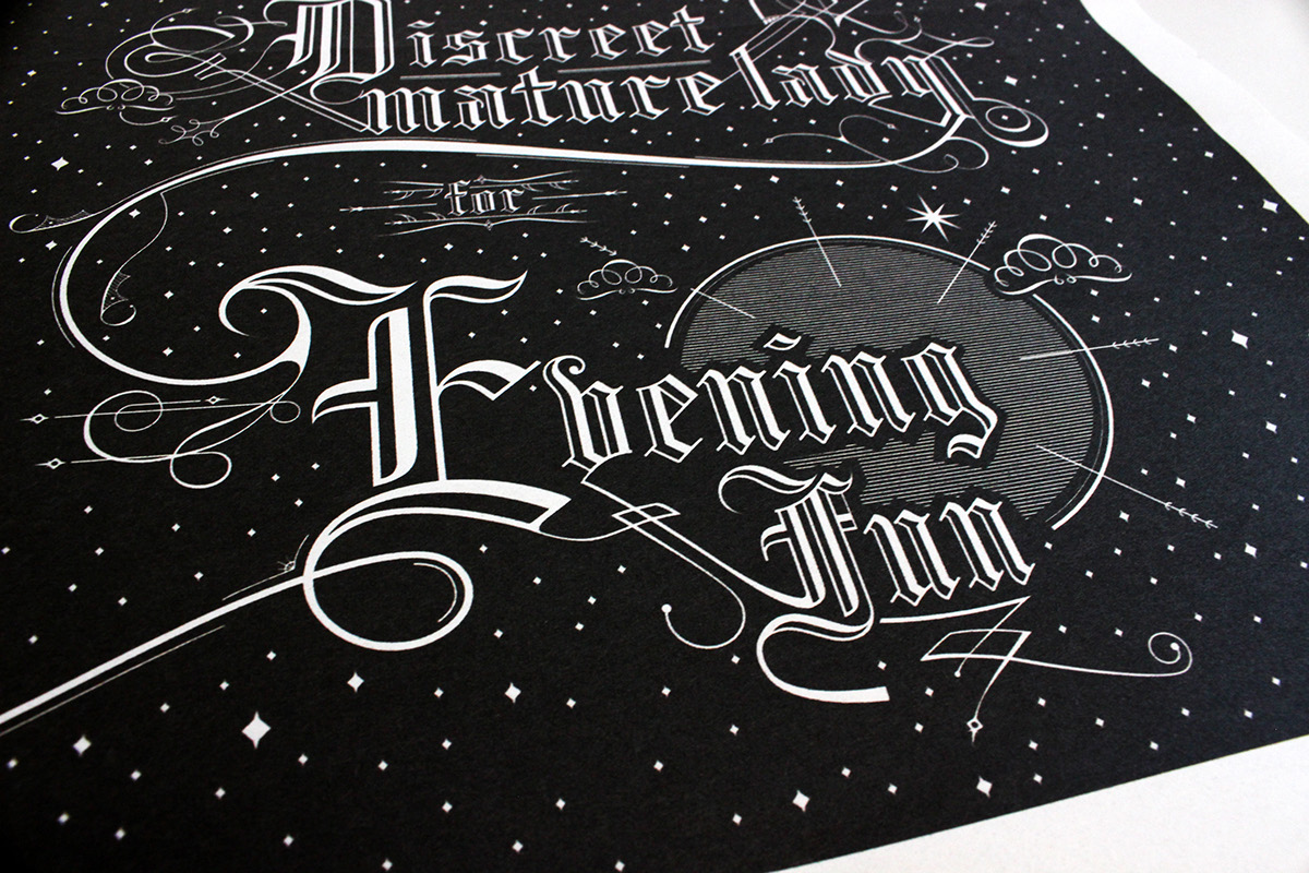
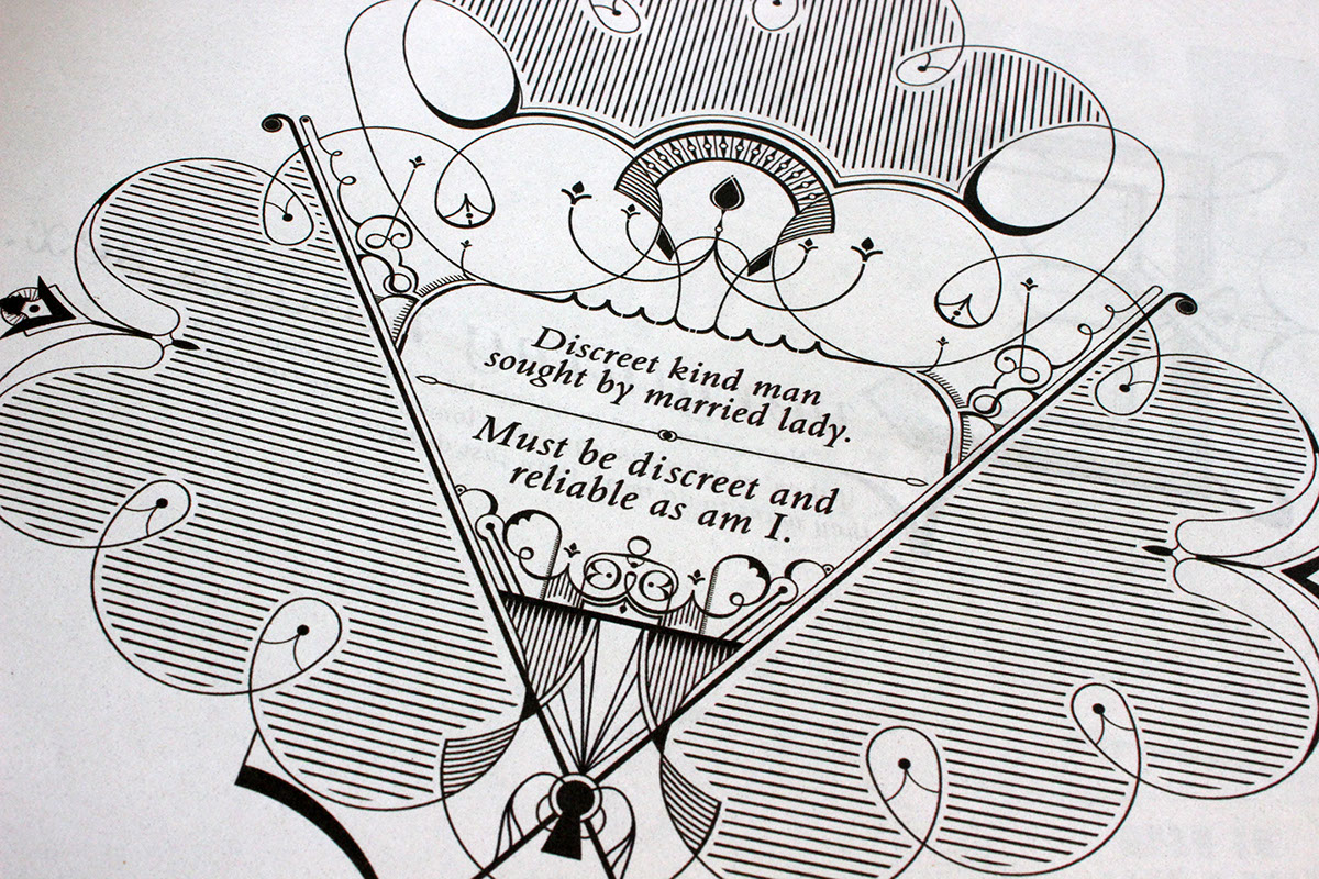
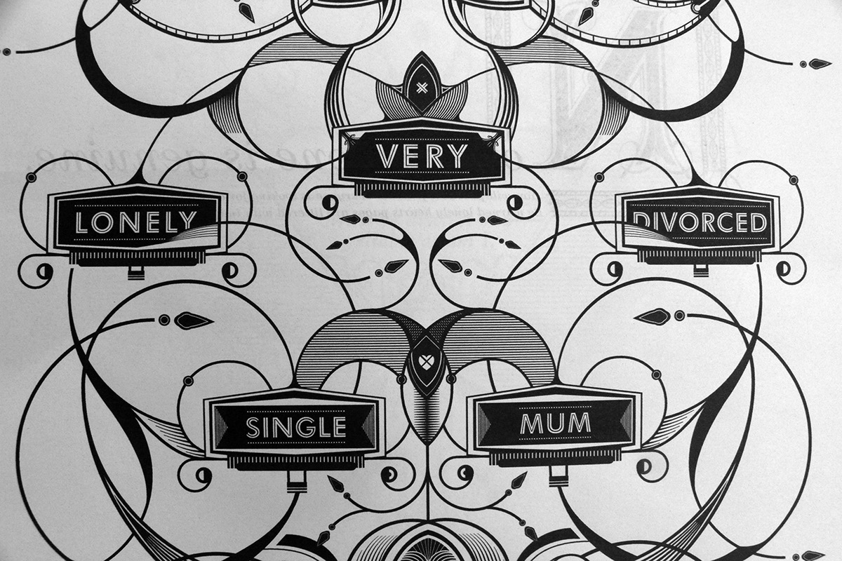
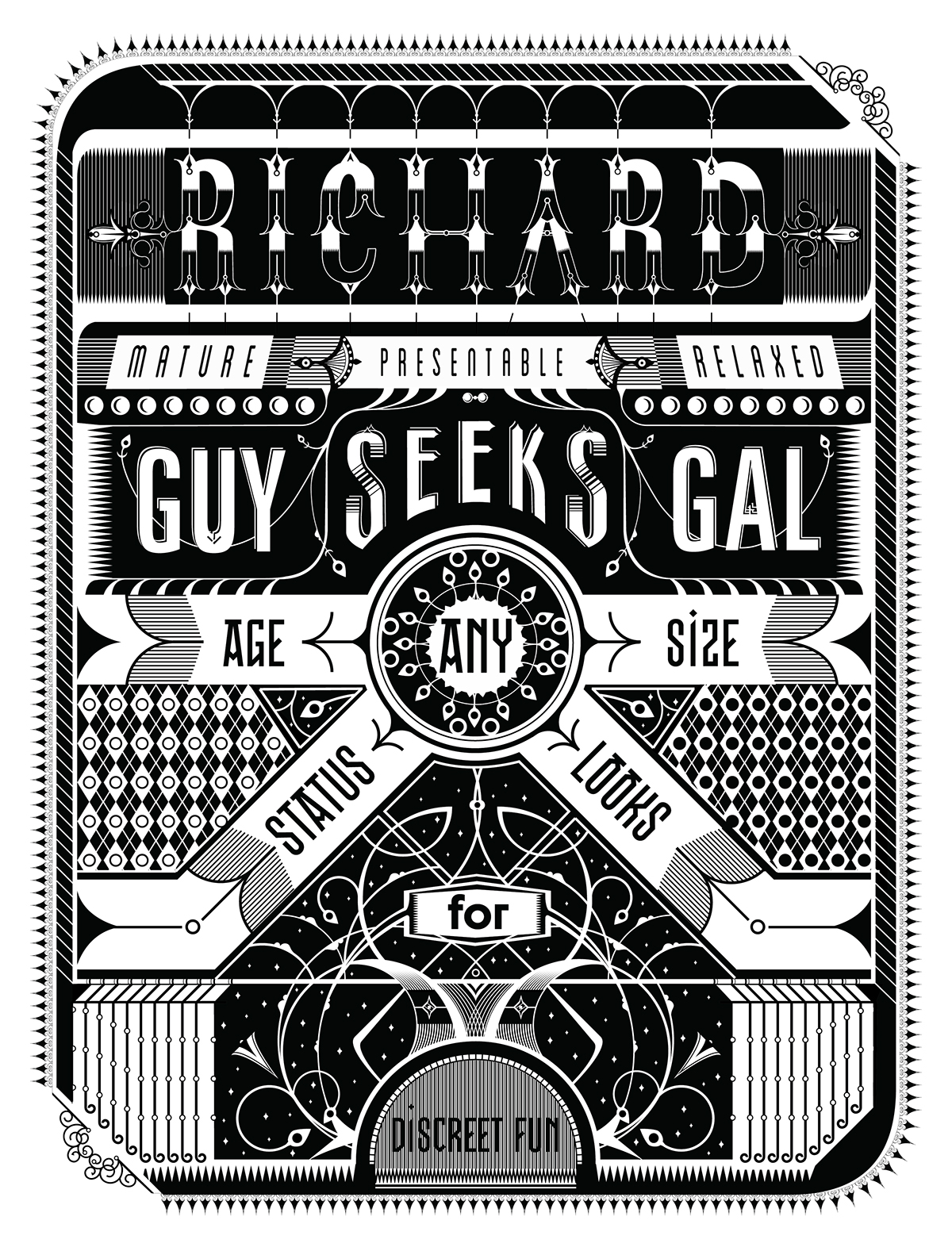
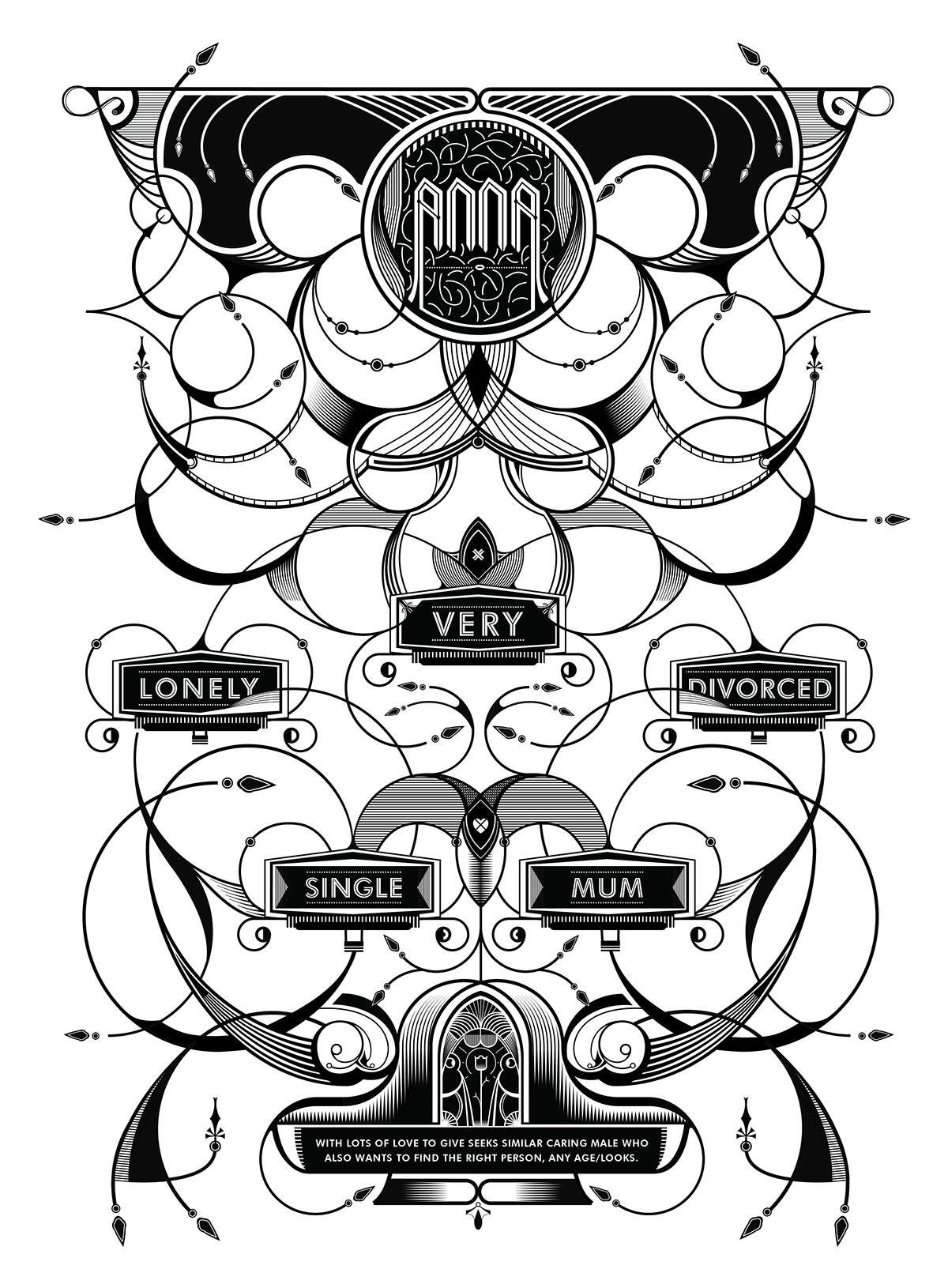
This newspaper contains a collection of local people desperately trying to find local love. They are all taken from the lonely hearts column in a single issue of the Gloucestershire Echo. Each advert gives a very small but very meaningful insight into that persons life, whether it be a ‘very lonely single mum’ looking to find a new hubby, or ‘mature male’ after some ‘evening fun’. Each desperate plea for love is illustrated in a way to emphasise the often ridiculous language used by each hopeless sweetheart along with a small piece of advice for any would be love seeker.
Layout and Format


Illustrative style and detailing
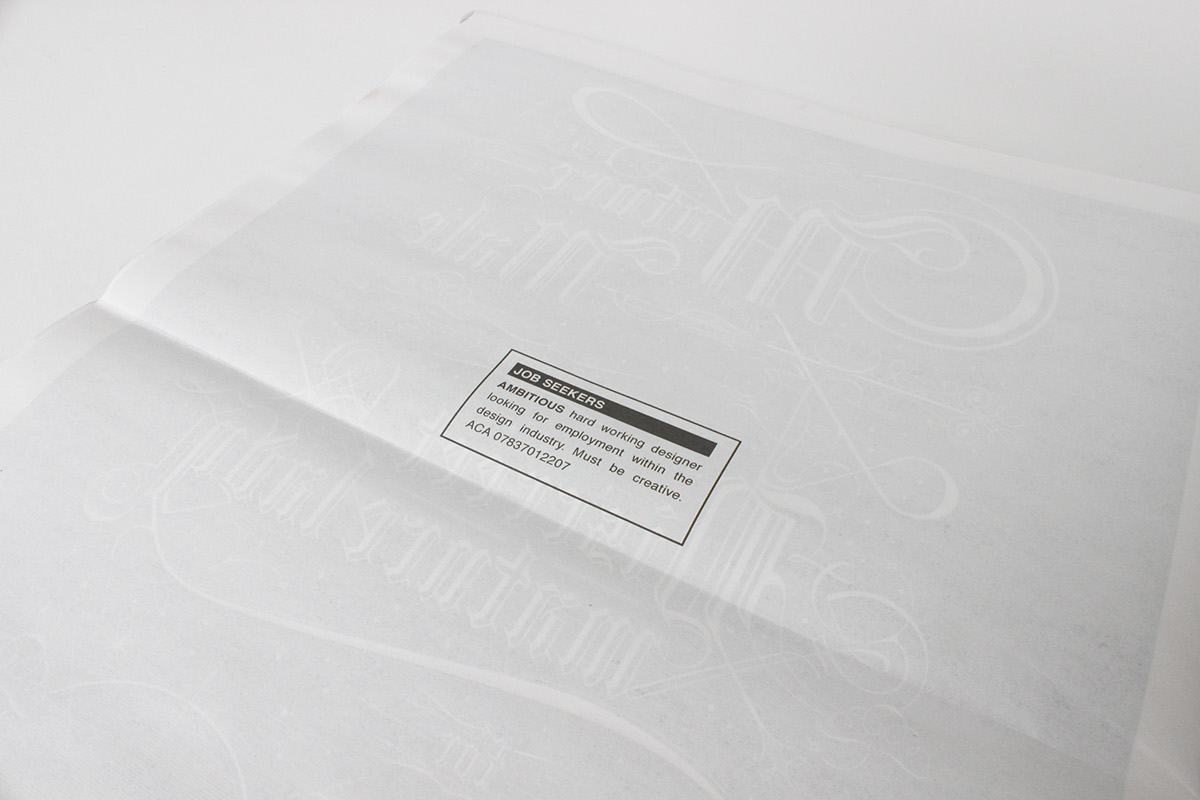
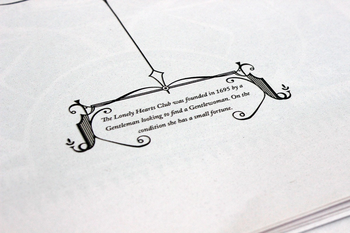
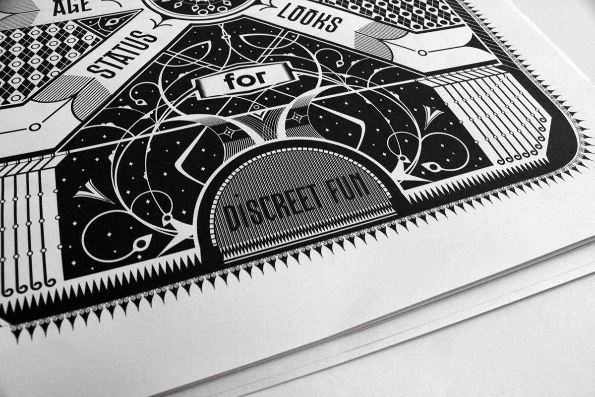
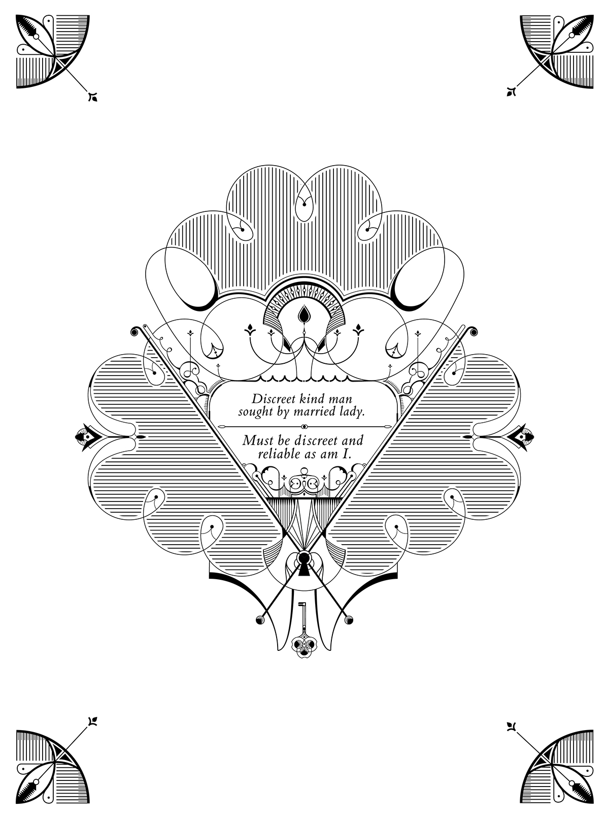
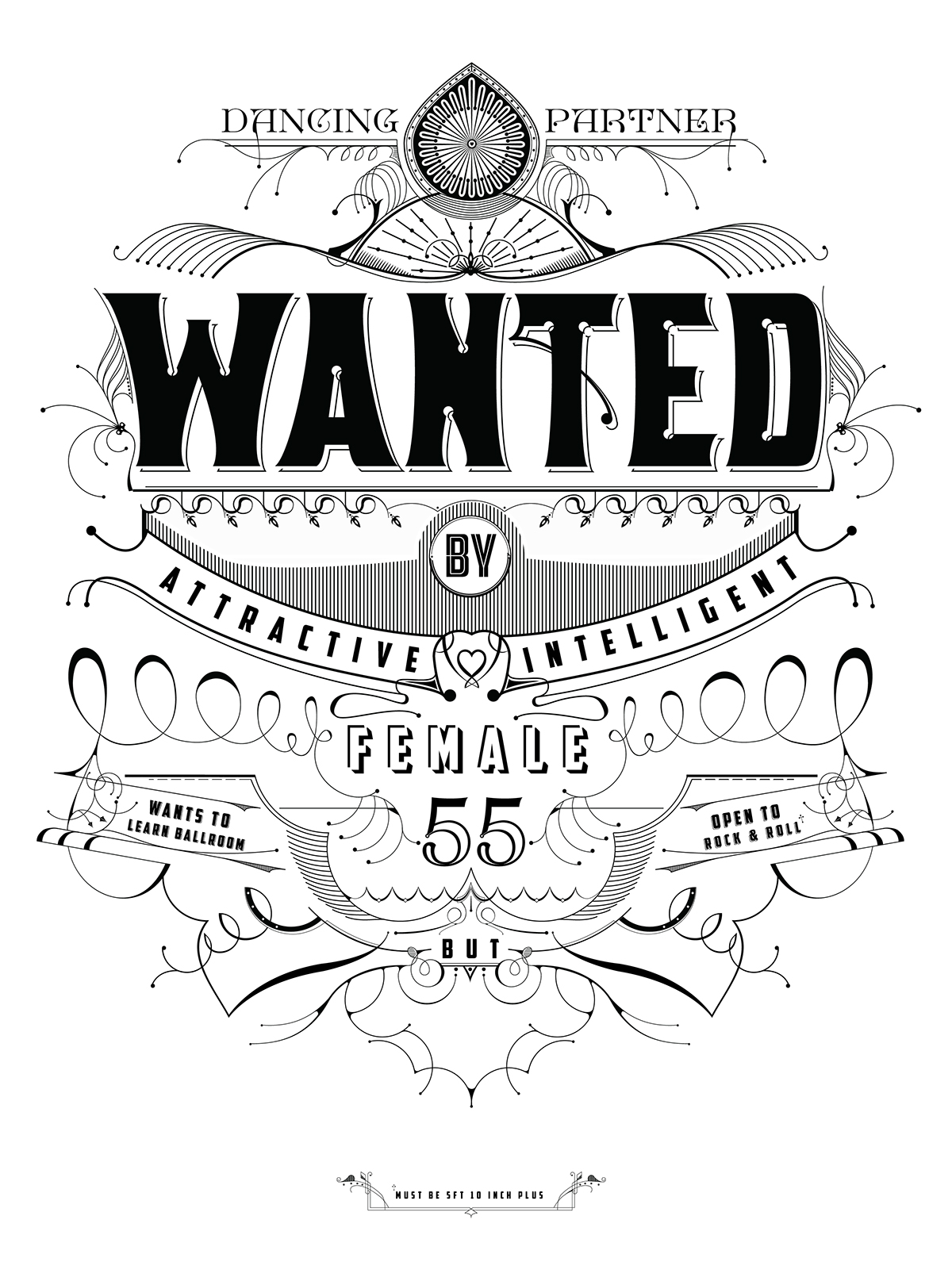
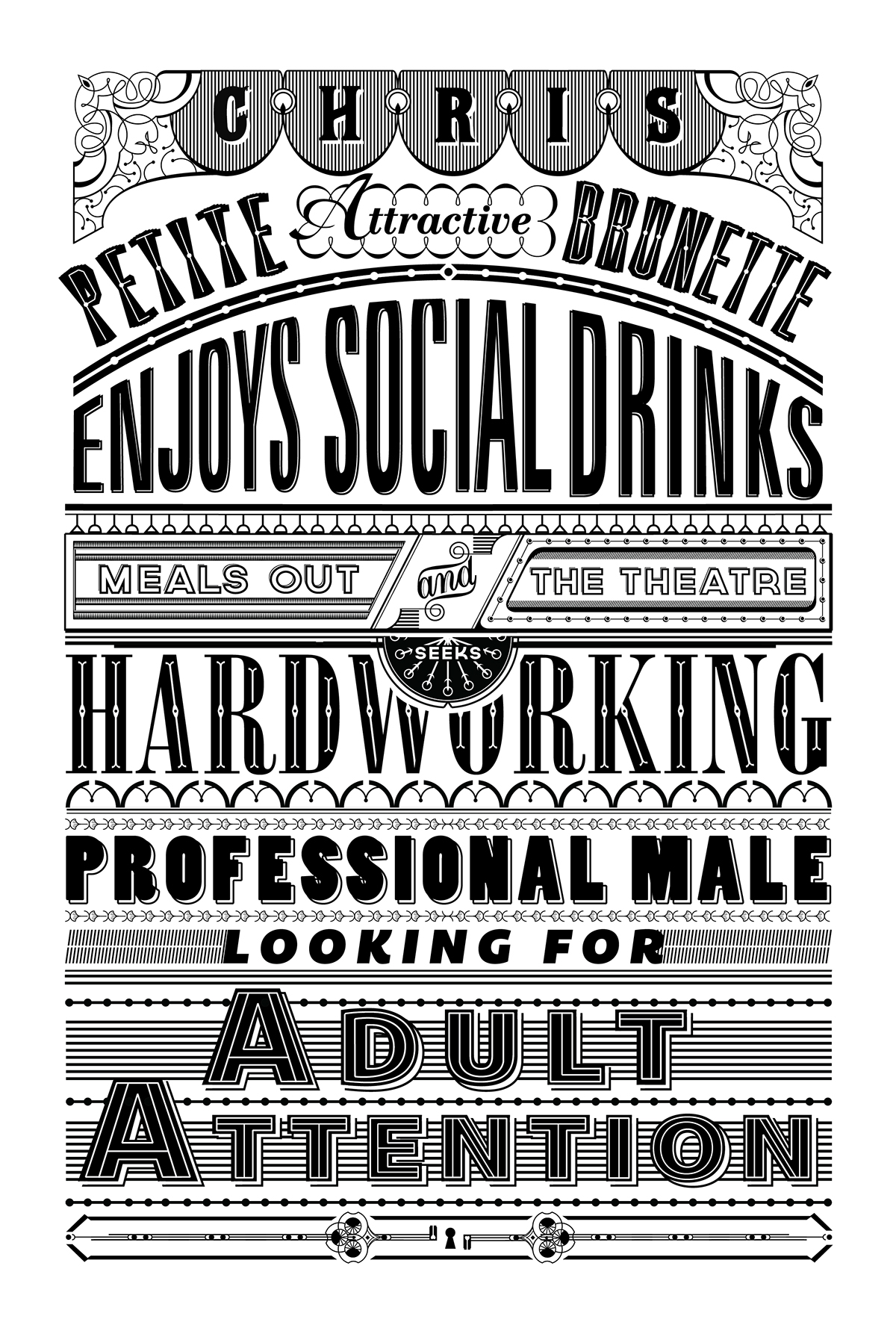
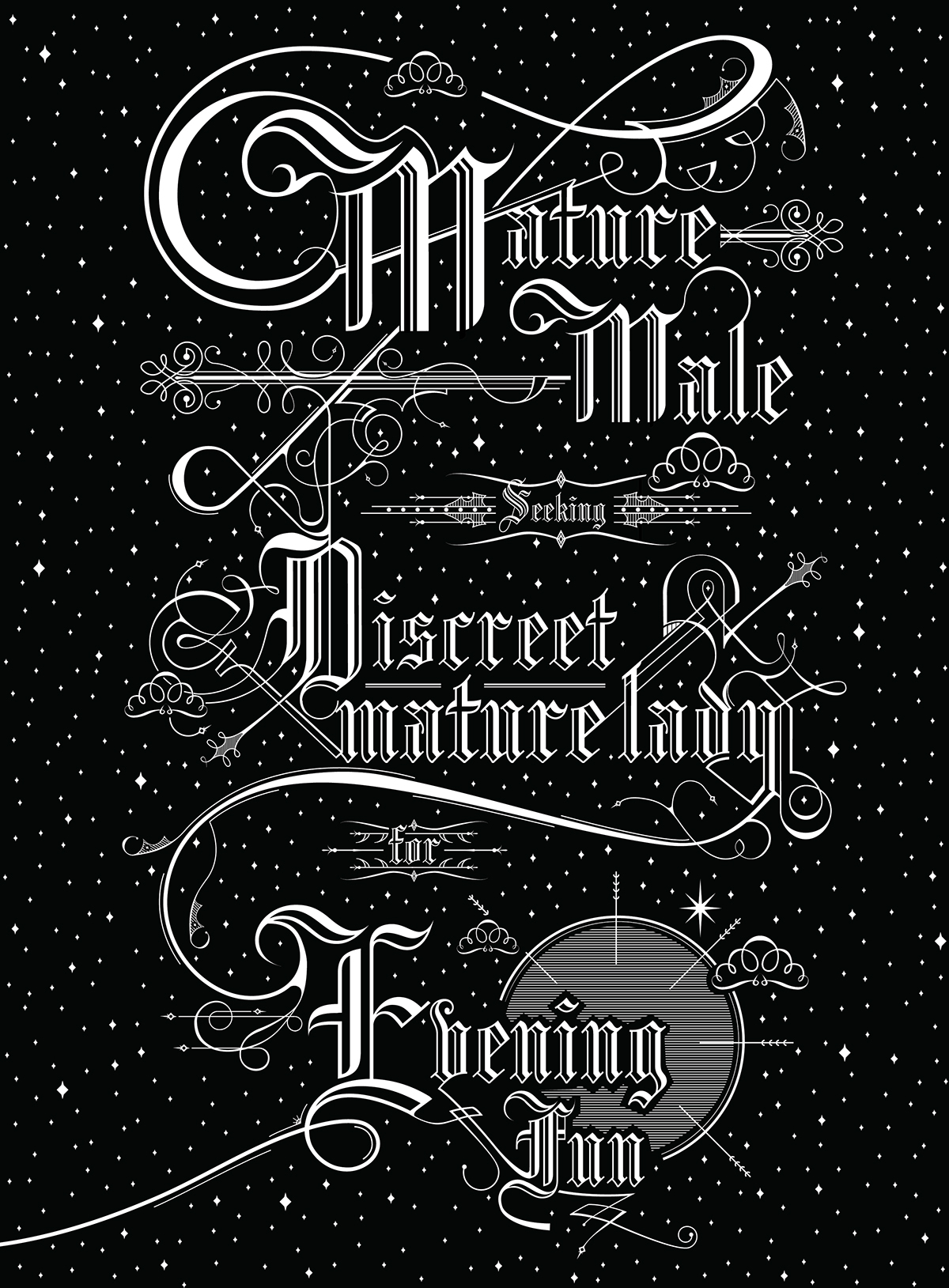
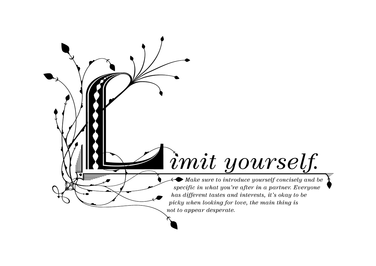
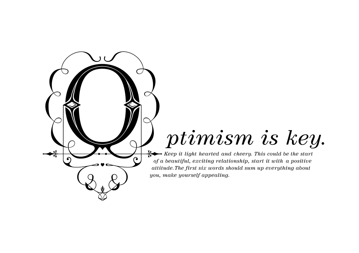
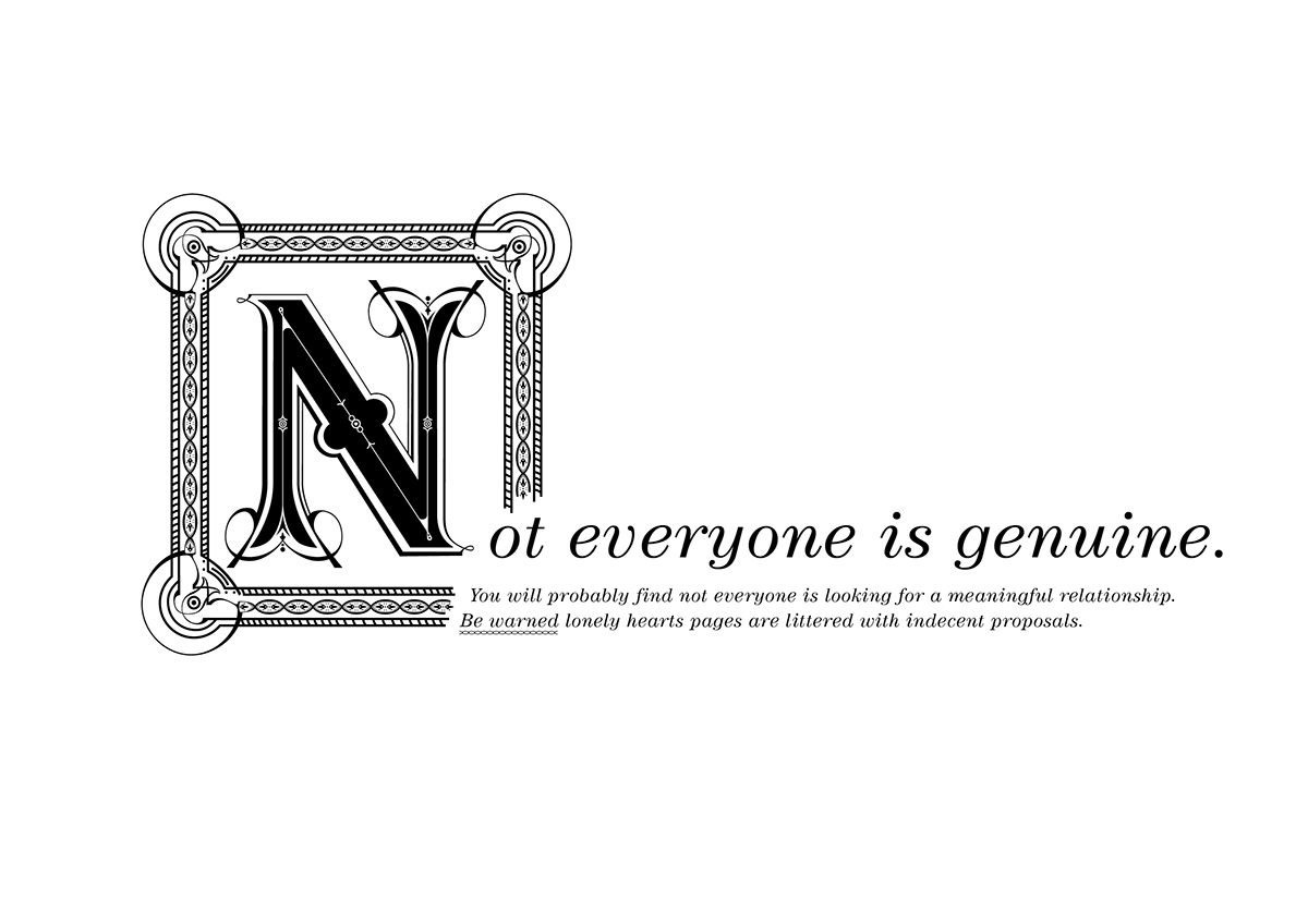
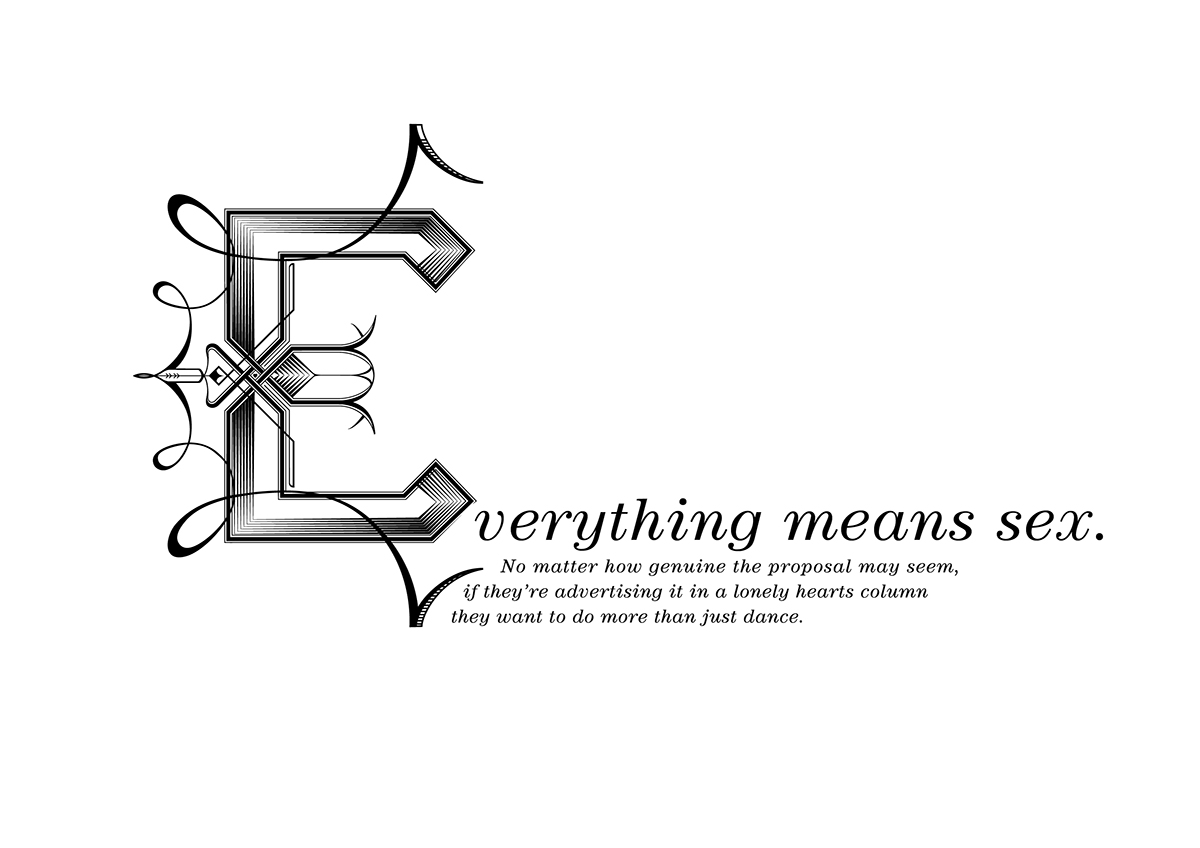
To emphasise the wonderful selection of language used I chose a very illustrative and very detailed style of typography. This allowed me to ornament and decorate different words, therefore emphasising certain parts I found amusing. You can't help but think of the story behind each advert and what each person could be like. Each typographical response reflects the person, how the advert is read and what language each person uses.
Single page layouts
Tips & Advice


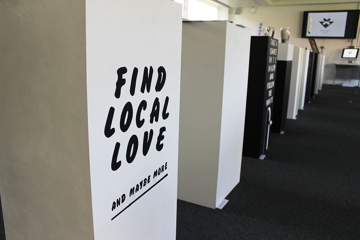
Exhibition Piece