


Chartered Accountants Australia and New Zealand
—
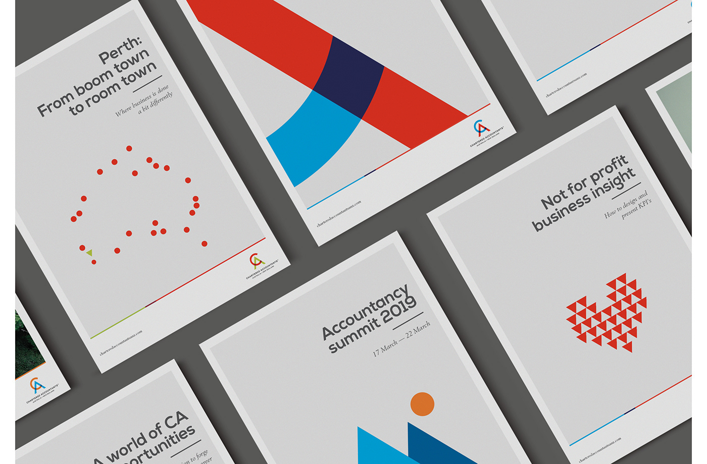
We were tasked with creating a consistent, ownable visual-style for Chartered Accountants that could work across the myriad of their internal organisations and divisions.
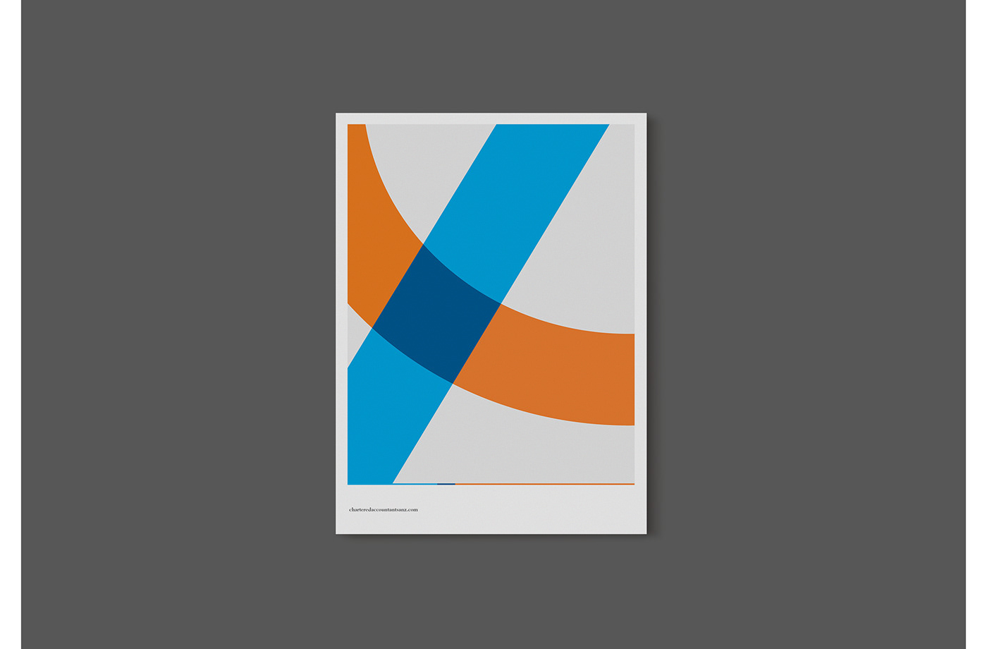
We started with two shapes derived from the logo – the circle and the triangle – and created a flexible visual system that could work with almost any message.

We then developed a visual framework based on a style that any accountant would be familiar with – a ledger. We subtly brought to life a Chartered Accountant’s obsession with numbers by featuring right-aligned headlines and ‘total’ underlines.

The style runs across both brand and tactical communications, right down to stationary and social media.

Lorem ipsum
Lorem ipsum

Lorem ipsum

Lorem ipsum


