Directed & produced By TCP TBWA
Photograph by HERET FRASTHIO of 2H+ PHOTOGRAPHY
Touched by me

A kinda challenge for me doing this kind of photograph, where depth are maintained well by the photographer, then i've asked to seperate it, to make an adjustable and movable elements, to be fit for layouting.

As a graphic designer, as a digital imaging artist, this kind of treatment make me feel happy. Once i've asked to show some elements to be highlighted more, then the agency allow me to interact the picture with the headline. Love it so much.
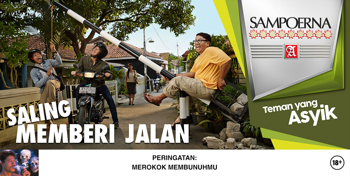
I just did a very few color grading for this series. The source photos and stock elements were taken well also by the photography team.

Suddenly a hard rain in the middle of photo session.Even the street turned into a river! And for this vertical version, i've ordered to make all wet things to be dry :)


This is actually the first session of all series. I love to see the very blurry foreground placed that deep on to the layout, anyway. What a brave directing by the agency.


