ROCKBUG is a hip pet grooming salon in Horseheads, NY. Upon finally acquiring a storefront location, the owner wanted to step up her game and be as polished and professional as possible (as her budget allowed). She hired me to help her realize her vision and build her brand. Renovating the space was a considerable hit to her funds, so there wasn't a lot of cash to work with. I think we came up with some pretty cool results within that space to help propel her business as far as it could go. As it grows, I'm sure we'll continue to develop the brand, which is very exciting! I fully believe in what she does and her work is outstanding. My dogs approve. ;)

First project goal was, naturally, a compelling logo. In our conversations the client established that she wanted pink and brown to be her main colors, and a worn, "shabby-chic" appearance. Other than that, she wasn't sure. Getting to know her more as an individual and having followup conversations led me to propose drafts pretty close to what we finally got. The final image has a bug mascot with a sassy smirk. The crossed scissors both invoke a jolly roger with the bug's head while simultaneously communicating the nature of the service being performed. The distressing is flexible and dynamic as long as the core image remains.
The logotype is a combination of characters from two typefaces, along with some tweaks to the letterforms and spacing. Primarily built from Superclarendon, the type has been supplemented with the "k" and the "u" characters from Denial2 Regular based on how the ascender ("k") and the tail ("u") suggest cutting tools that may be used in a salon. Denial2 Regular has a smaller x-height, so sizing adjustments needed to be made to those letterforms to make them integrate visually with the characters from Superclarendon.
Other edits: The right serif on the leg of the "k" was connected to the serif on the stem of the following "B;" the tail stroke of the "R" was dropped below the baseline to cradle the "o" a bit and balance the descender on the "g;" overall kerning was hand nudged to create a more unified appearance.
The ear of the "g" was a happy accident with its resemblance to a bug's antennae.
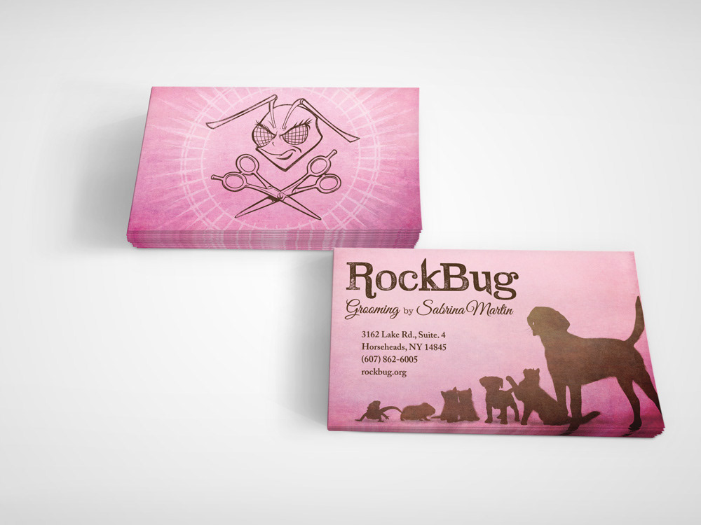
Business card mockup of the final design that went to print. Notice the assortment of animals on the front face. The client requested a display like this during our initial conversations in order to show that she offers services to all sorts of pets, not just dogs and cats. I knew she loved guinea pigs and bearded dragons so I made sure that those two at least made the cut.
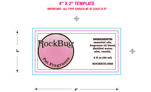
The client wanted a slick, professional blank label that she could affix to the pet fragrances she was making and selling in her salon. Doing blank ones kept the cost down while allowing her product line to be infinitely flexible. She could do holiday one-offs, and experimental lines without having to shell out for dedicated labels. This is the transparent, wraparound sticker template sent to the print shoppe. We ran 500 labels for her to start.
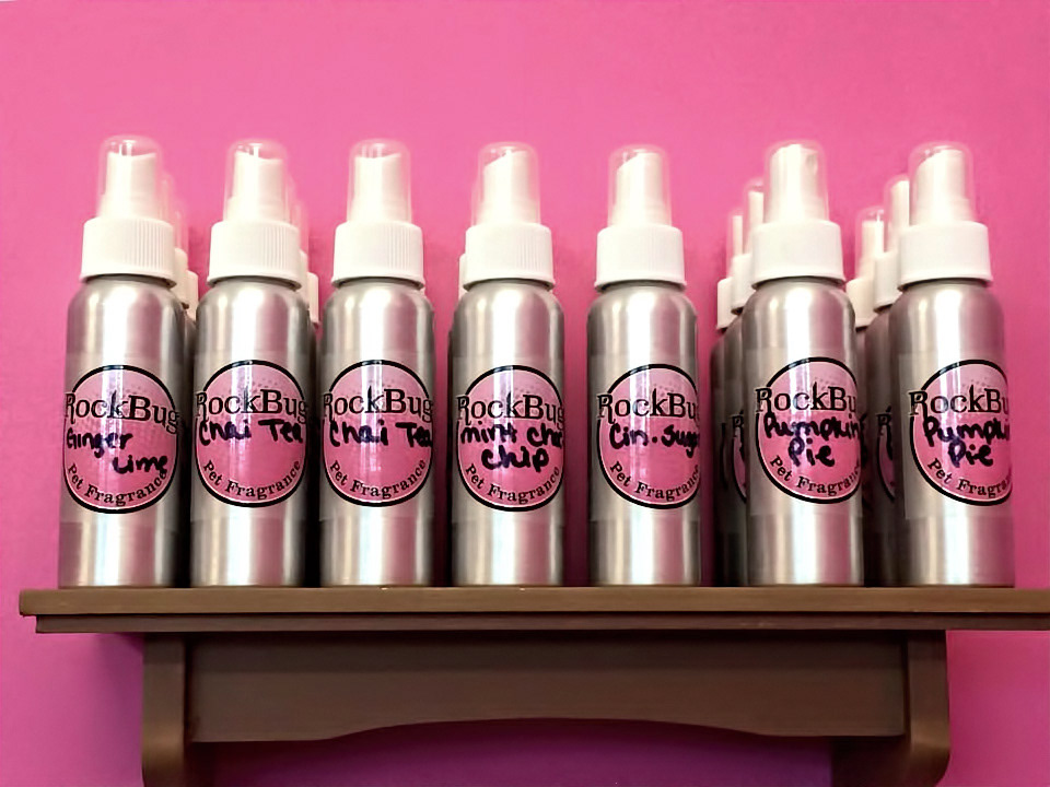
Fragrance bottles labeled and displayed in the salon.
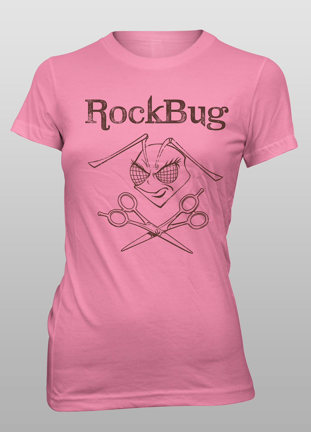
Staff/promotional t-shirt mockup to print as the business grows.
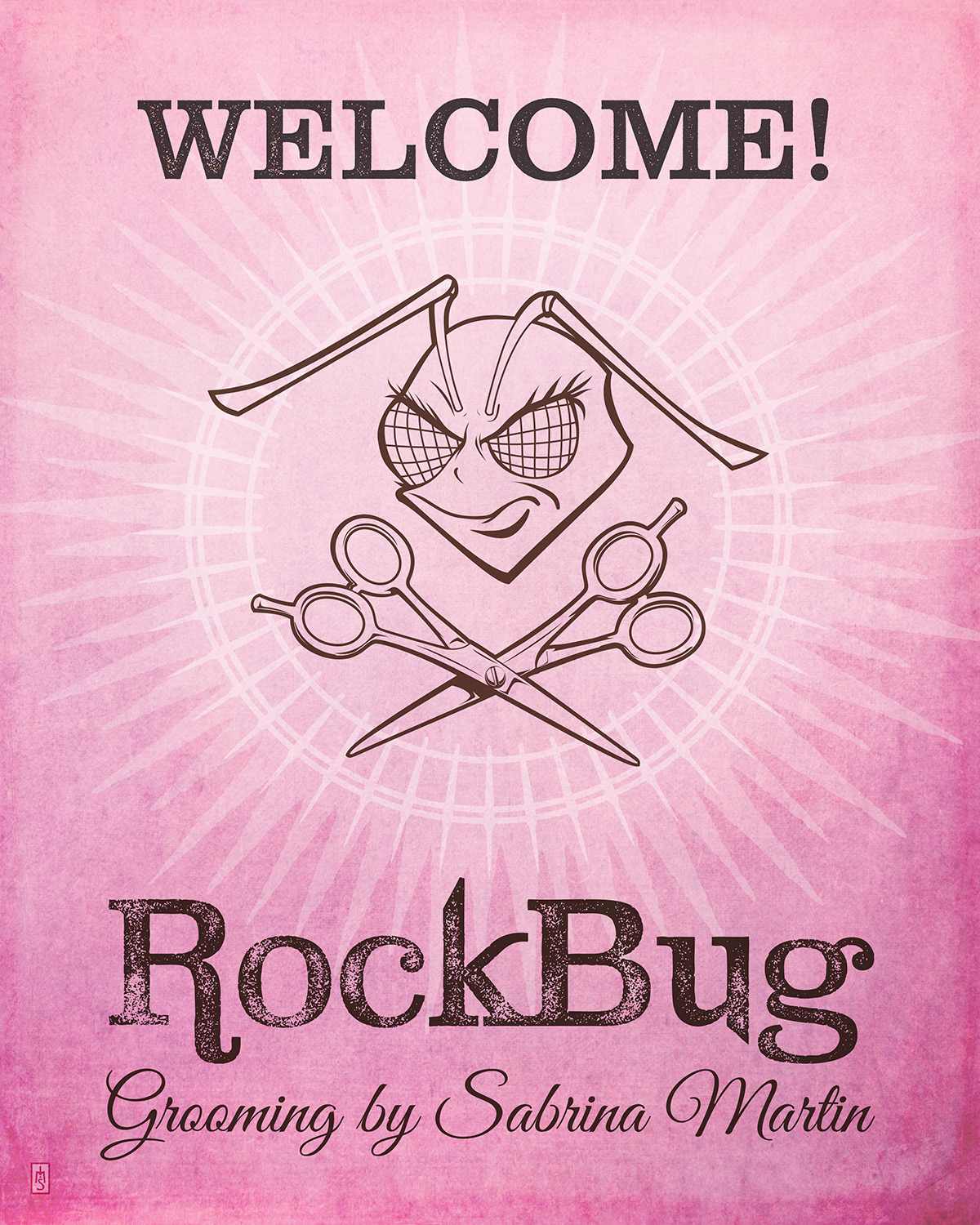
Welcome sign for the salon lobby, printed as a poster print and framed.
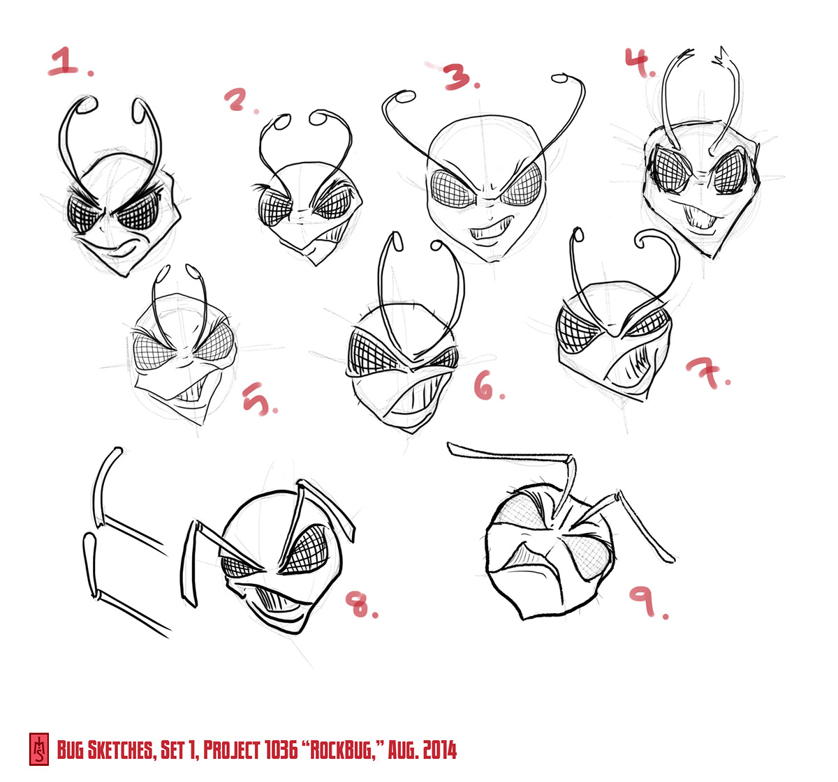
Draft sketches for the bug mascot.
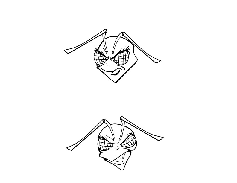
The final two vectored mascot versions that the client shose from.


