Experimental Jetset | Graphic Language Of Clarity Exhibition
Exhibition and Art Direction
This fictional exhibition was created to celebrate typographer Experimental Jetset, which is an Amsterdam graphic design unit founded in 1997 by Marieke Stolk, Erwin Brinkers and Danny van den Dungen. This was allocated to us for our typography assignment in school. The brief was to create an event in celebration of the chosen typographer's achievements and design philosophy. We were then asked to apply the unit's design style and philosophy into different design elements for the exhibition. The aim of the event is mainly to introduce the typographer.
Among all of Experimental Jetset's philosophy, I chose 3 that would best represent Experimental Jetset and the design direction of this exhibition. Helvetica (a typeface used in all of EJ's works), inner logic (their constant use of grid system) and white (A color they always stick to), believing that design is meant to communicate to people in a direct manner, these are Experimental Jetset's qualities.
CLEAR & PURE + SIMPLE + UNDERSTANDING = CLARITY
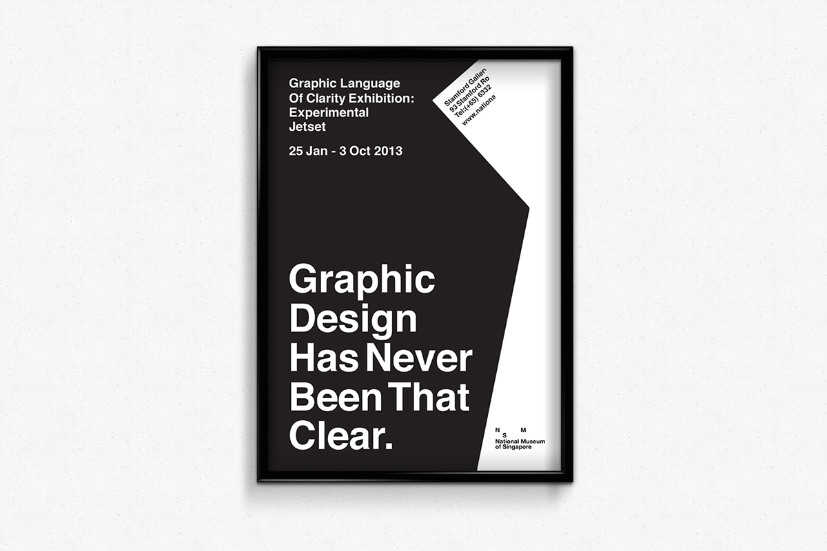
I created a slogan; Graphic Design Has Never Been That Clear as an element to support the identity of the exhibition which is the 'Graphic Language Of Clarity Exhibition'.

Imposed the poster on a newspaper.
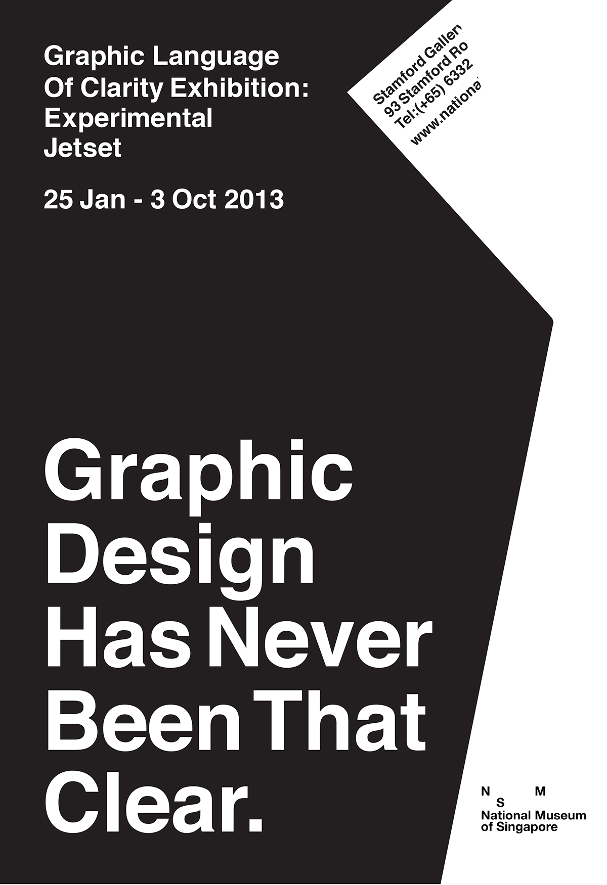
The poster
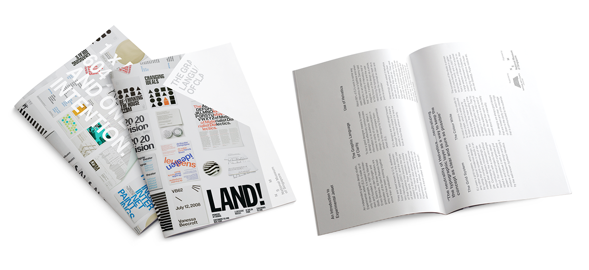
The brochure for the event. Simple direction that communicates the concept.
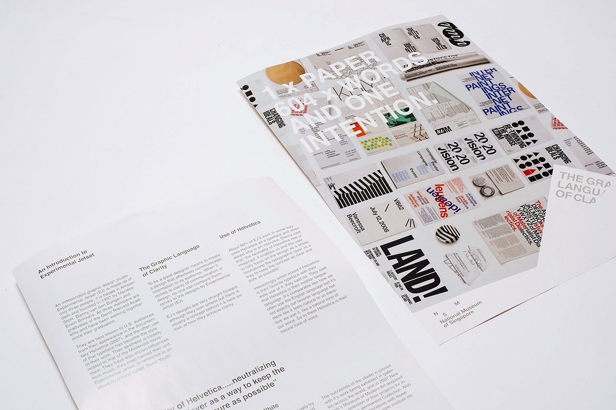
Photograph of the actual brochure.
1 x Paper, 604 x Words and One Intention represents the brochure. A brochure with one intention, explaining the approach of Experimental Jetset's works in search of clarity.
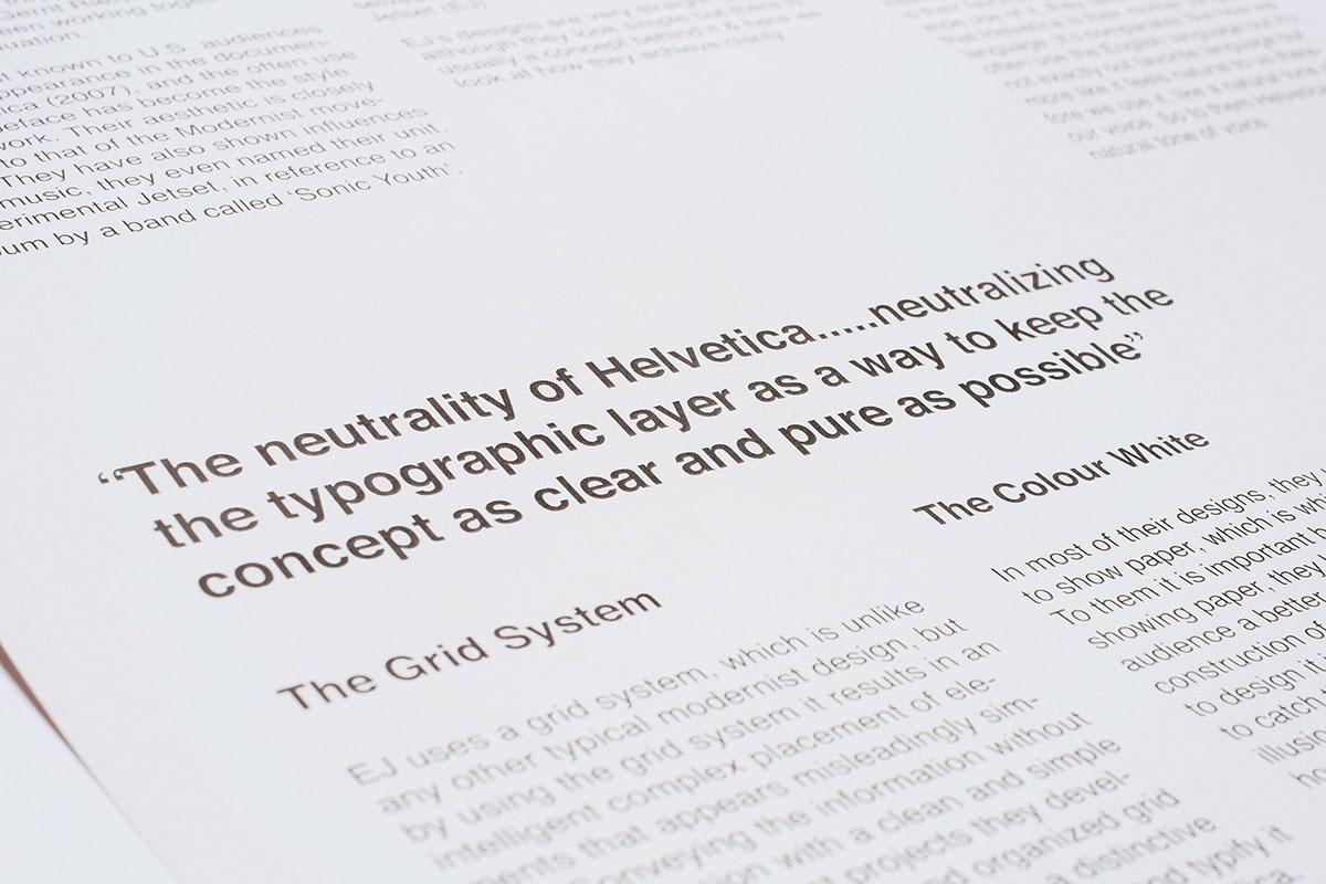
Quote by Experimental Jetset that relates back to clarity.
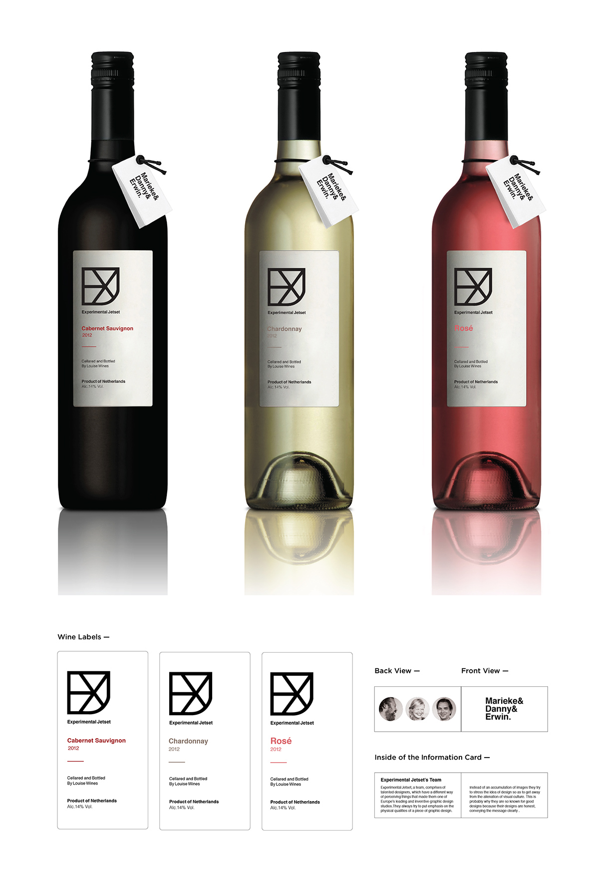
These are the wine bottles specially designed for the exhibition to complement the concept of it.
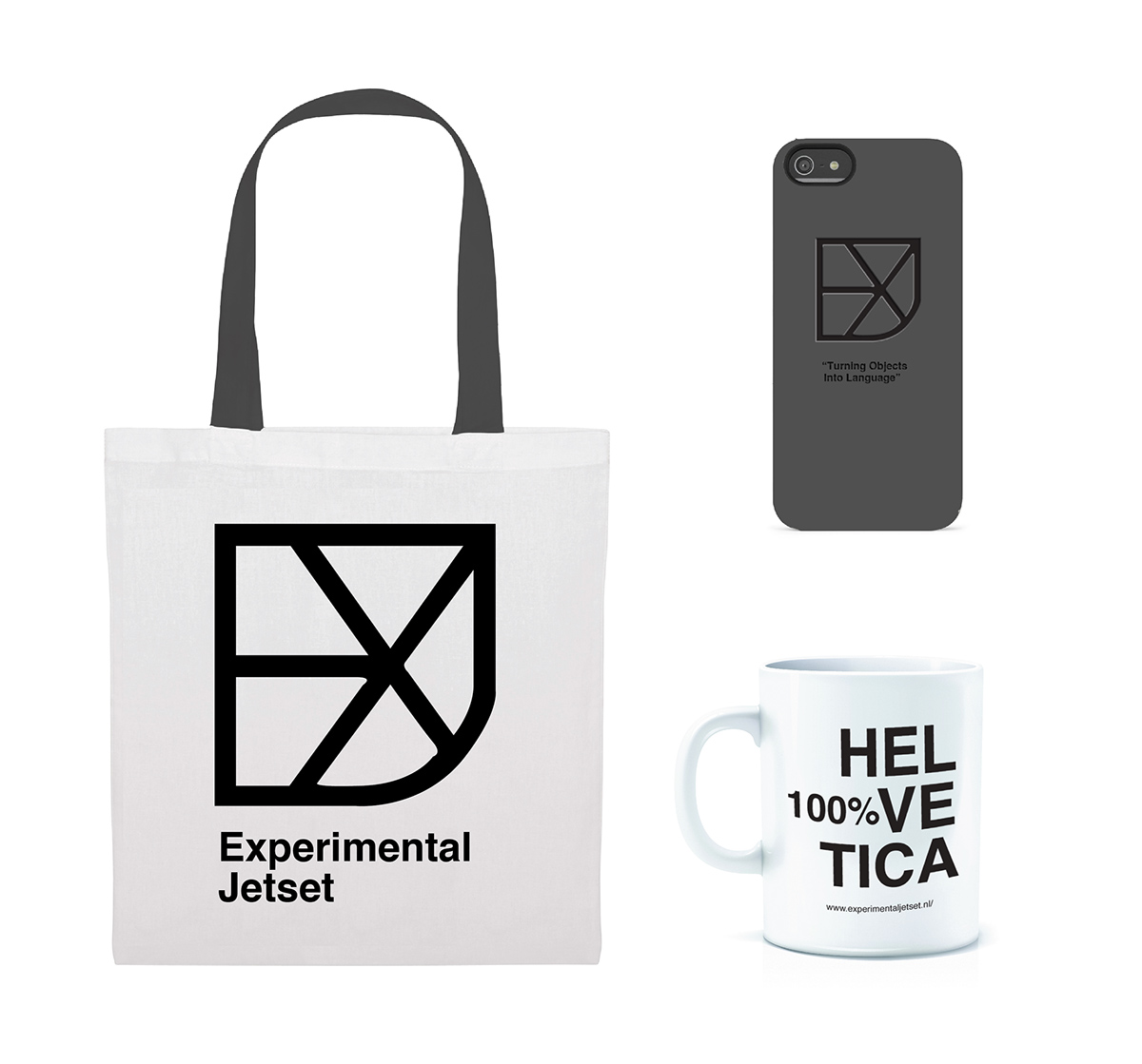
Additional mechandise for the exhibition.

