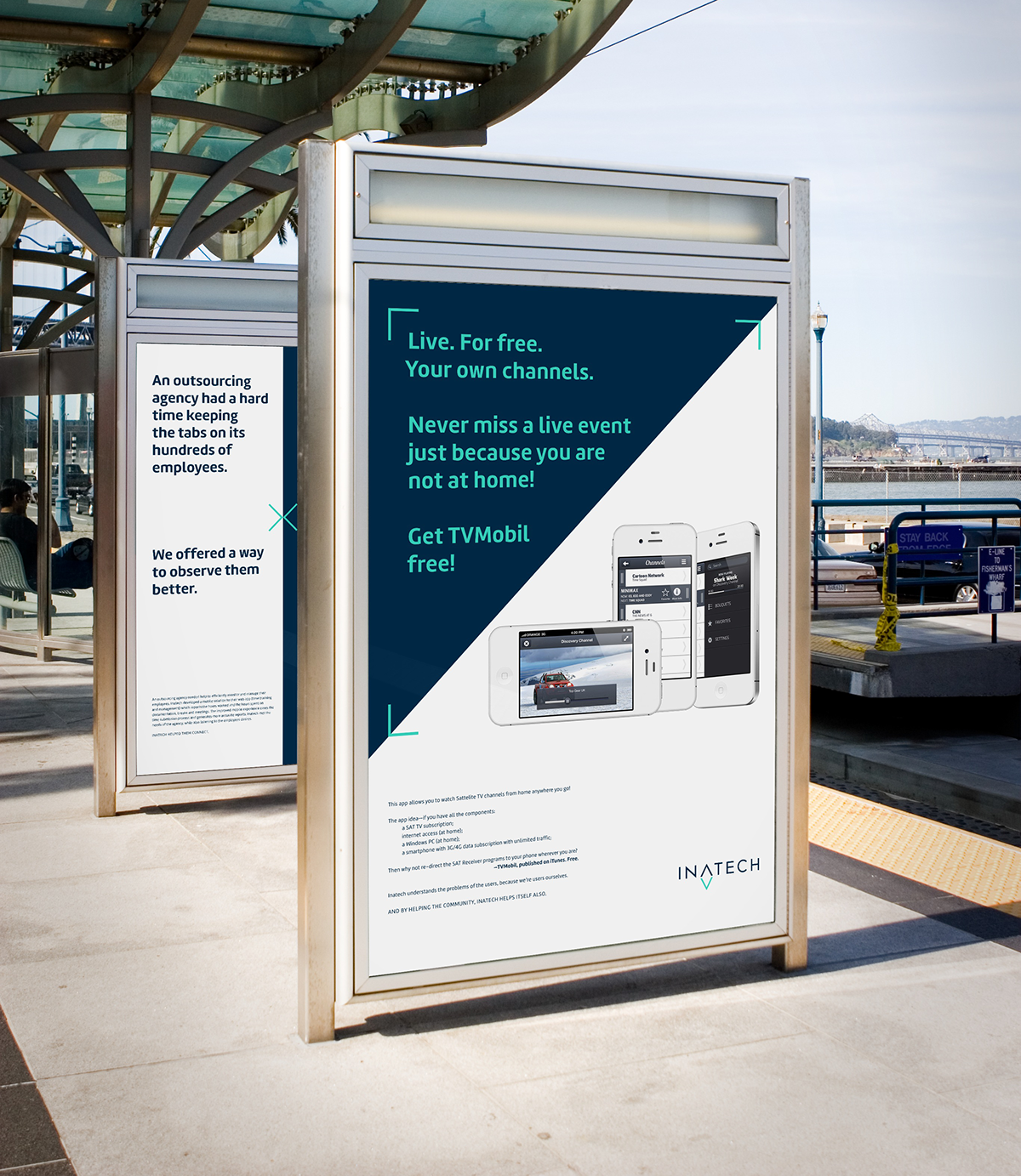
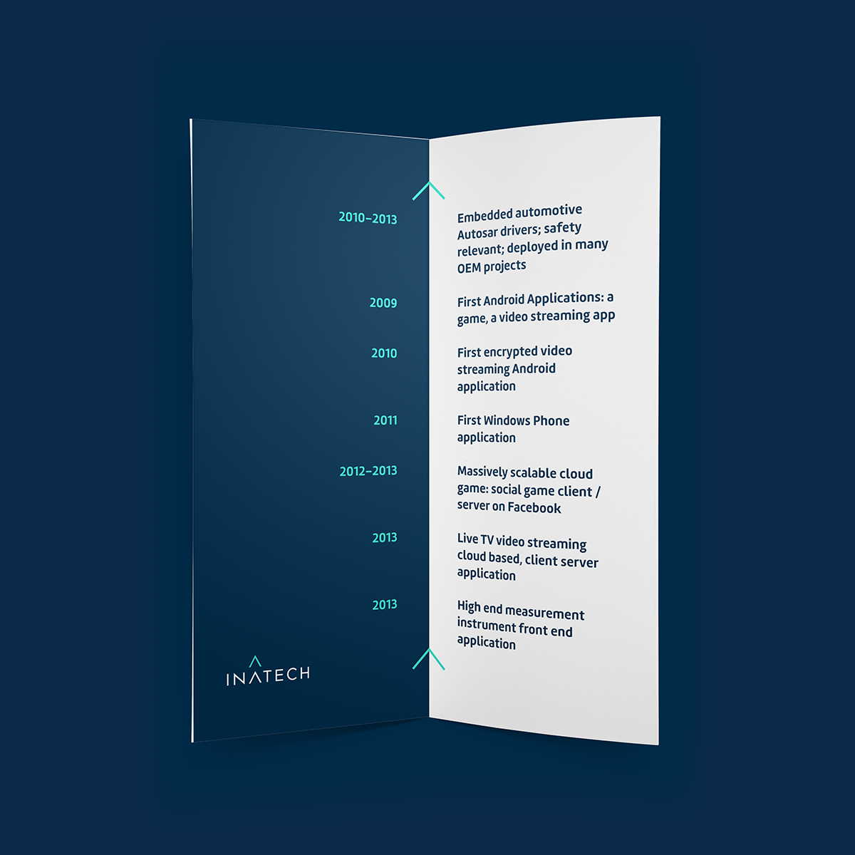
Inatech is a hi-tech software development and consulting company. They started working on mobile apps but now their main areas of expertise are embedded software development, cloud development & design and cool-oriented mobile apps—with a focus on the german/western european markets. In order to take up new and tougher challenges, they needed a revision to their old identity. A new visual language and a bold new strategy was created to show their dynamic and multi-directional approach to projects.
The Solution
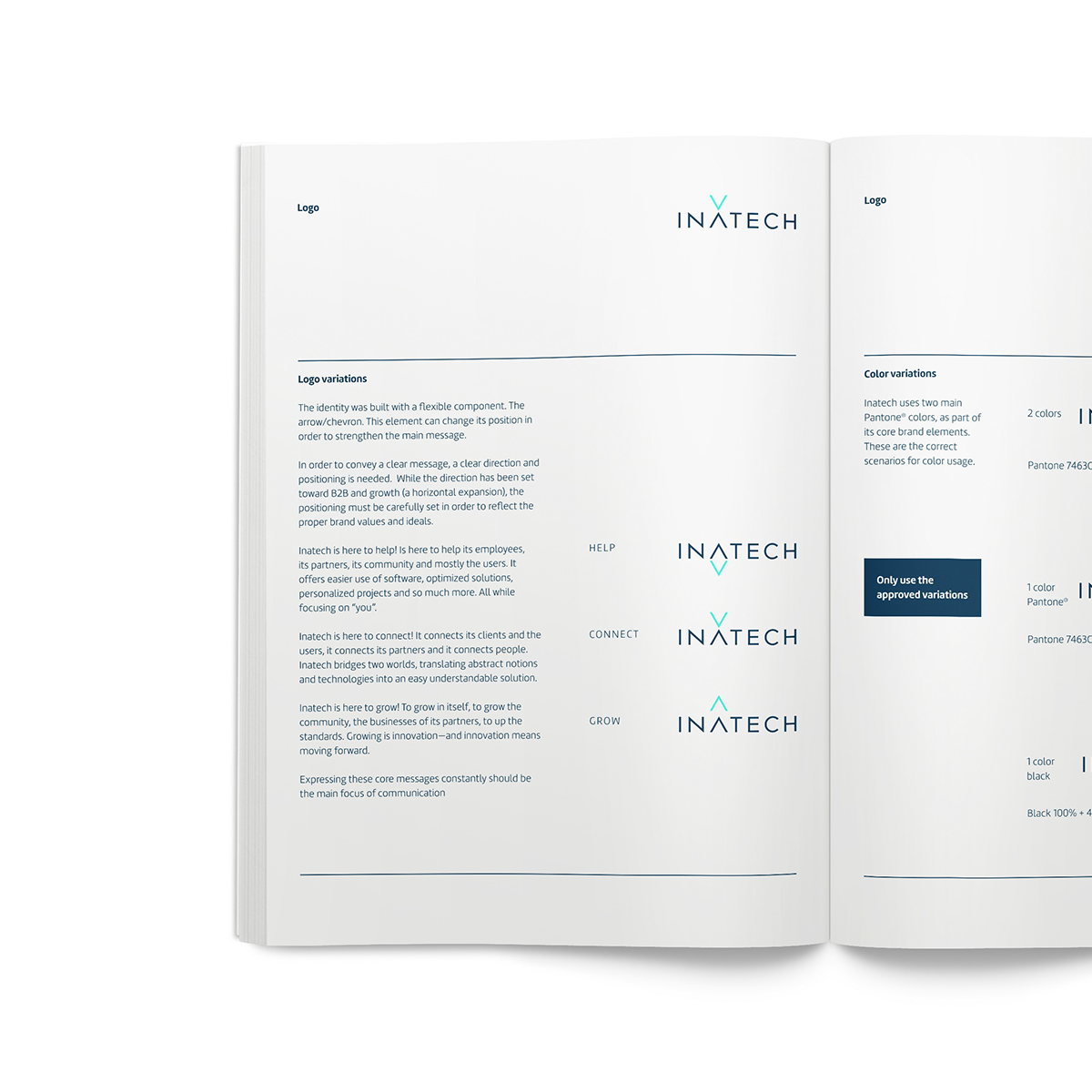
Inatech is here to help! Is here to help its employees, its partners, its community and mostly the users—It offers easier use of software, optimized solutions, personalized projects and so much more. All while focusing on "you". Inatech is here to connect! It connects its clients and the users, it connects its partners and it connects people—Inatech is a bridge between two worlds, translating abstract notions and technologies into an easy understandable solution. Inatech is here to grow! To grow in itself, to grow the community, the businesses of its partners, to up the standards. Growing is inovation and innovation means moving forward.
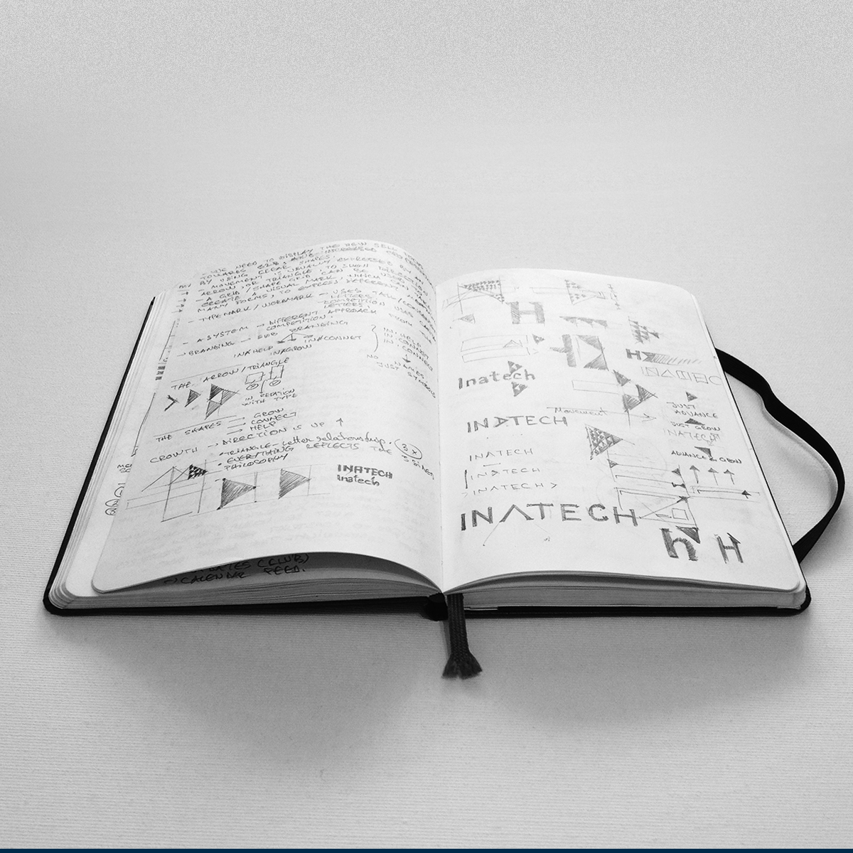
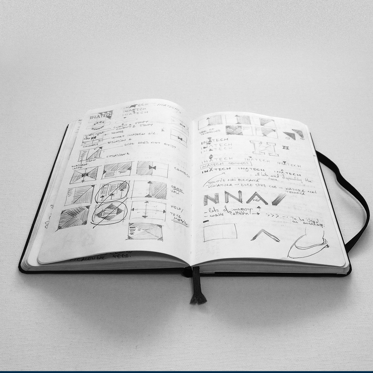
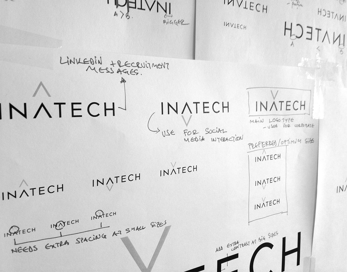
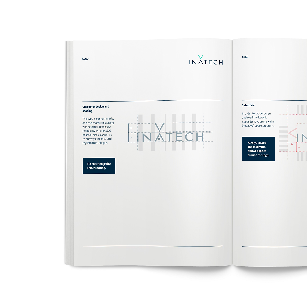
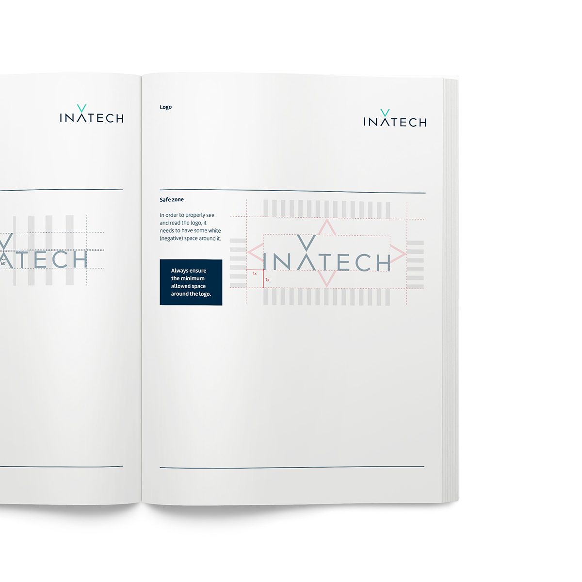
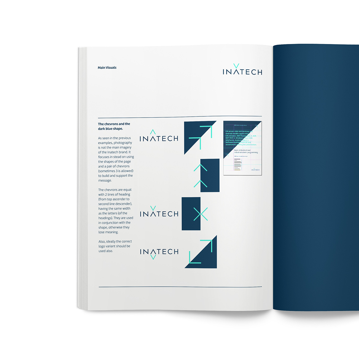
A system of chevrons paired with a bold contrasting color palette was used to convey Inatech dynamic character, creating a flexible solution that will suit any of the direction or message that the company will choose. These arrow are used to reflect the main brand vectors (growth, help and connection) both in the logo, as well as a auxiliary visual element in the background.
The result is a clear, minimal, durable and bold new identity, tailored for the western and northern Europe, that suits a board range of applications.


Thank you for watching!

