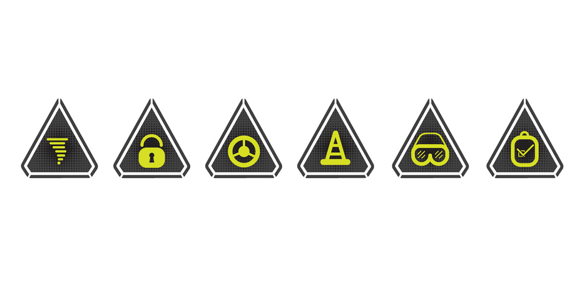
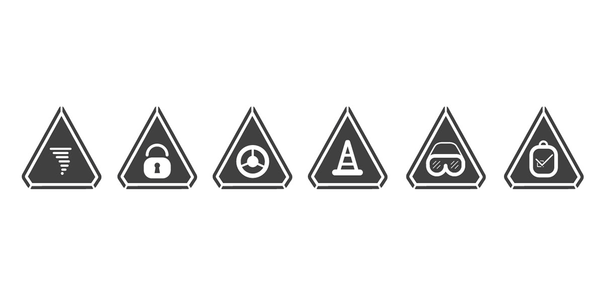
As the in-house graphic designer I have had the chance to do quite a bit of re-branding for internal departments. For this project, I created a 'Safety' identity to be utilized within the company to help employees' think before getting hurt. This brand will be used across 90 locations in 11 states, with multiple branding collateral including posters, banners, apparel, and other marketing collateral. The mark represents a 'safety' triangle that is also incorporated into the logotype. In addition to the logo, I created an icon set that will be utilized for establishing the brand as well as creating a visual identity that will be incorporated into a majority of the collateral. As one of the issues for the department was too much reading so I created a visual language of infographics and icons to help people understand what the material is at a quick glance.
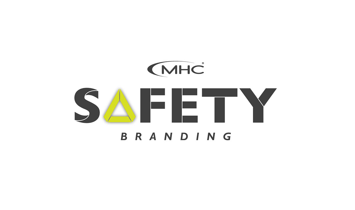
Logotype with MHC Kenworth logo

The triangular mark represents a safety hazard road sign
Icon set three-color

Icon set one-color
Icon set one-color option two

