«Konigsberg» after reconstruction.
A german word «Konigsberg» is the old name of Kaliningrad, as well as a beer brand belonging to «Heineken» group of companies. Thus, we present the story of this brand’s redesign (done by our agency) in the language of architecture.
Objective.
The brand had been existing since 2001 without a change. In these six years the beer market saw a lot of stuff, after which interest towards this brand was climbing downwards. The rivals got restyled, and some even got originally-shaped bottles.
The brand had been existing since 2001 without a change. In these six years the beer market saw a lot of stuff, after which interest towards this brand was climbing downwards. The rivals got restyled, and some even got originally-shaped bottles.
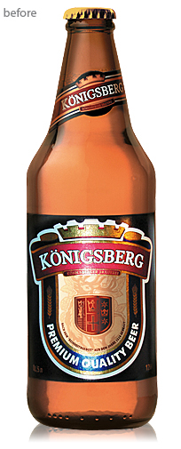
The esthetics of a once upon a time strong player in the mainstream zone was not as effective, and started reminding rather an economy-segment brand than a trademark with European roots.
Solution.
Before getting to work we tried to comprehend, how our customer imagines a german beer brand, what are his requirements to design, what does he feel contacting the product, and, ultimately, does the product meet his expectations.
Before getting to work we tried to comprehend, how our customer imagines a german beer brand, what are his requirements to design, what does he feel contacting the product, and, ultimately, does the product meet his expectations.
After this tiny test we understood the direction of our work. It was found out that then-current design was being accepted as a harsh, not European thing. The dark label color was giving a feeling of a dark or strong beer, leaving heavy impressions. But despite all the down sides, we knew that «Konigsberg» is a brand with a loyal audience. In a complex facelift we would have to bear in mind brand’s individuality, but make it a bit more modern, make the design a bit lighter and streamlined. This general plan was approved by the client.
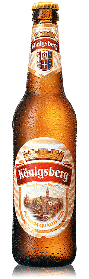
For the sake of succession the main label architecture was kept: a line with a crown and a «Konigsberg» sign, oval looping in the bottom. The crown got some more significance, the font graphics got some elegance. A white label with thin golden stripes and the new longneck bottle gave the design some neatness and lightness. The «Konigsberg» beer coat of arms was moved to the neck label, where it creates a complete architecture composition together with a brand logo. An illustration of the old Konigsberd recreated from old pre-war photos finalizes the brand’s European look.
«Konigsberg» is a Russian beer with German history, that’s bottled at the «Ostmark» brewery which was founded in 1910. Thanks to a complex reconstruction, the brand rapidly expanded its geography well beyond Kaliningrad region and became a federal trade mark.


