Kubō Japanese Izakaya
Creation of Branding for the Japanese Izakaya chain Kubō. Modern and traditional Japanese cuisine is mixed in this chain of restaurants located all over the world (Madrid, London, New York...).
Kubō was born as an appendix of the old Ryokan Shukubō from Hakone (Japan), Kanagawa Prefecture. Originally it was inside the Ryokan as a culinary complement to the traditional and rural Japanese lifestyle.
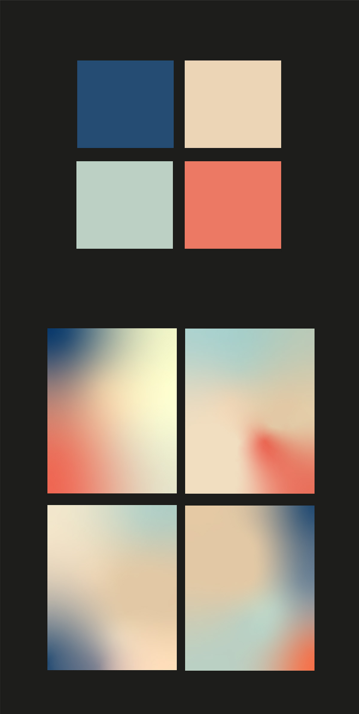
The colors used in the brand symbolize purity, calm, passion, and Japanese tradition mixed in a random but harmonic way. The main element is the sphere, which evokes the Rising Sun, creates a sensation of volume, and allows us to apply it as a container for images, illustrations, etc.
Art direction and graphic design: Martirio González
Naming, claims and storytelling: Paco Córcoles