
Health Poster Competition
Tema/Theme: Diabetes Mellitus
Pada bulan Maret 2020 kemarin, saya berpartisipasi dalam kompetisi poster kesehatan yang diadakan oleh sebuah perusahaan. Karena ini adalah kompetisi poster kesehatan, tema umumnya tentu saja adalah kesehatan; dengan sub tema yang diperbolehkan untuk dipilih para peserta yaitu obesitas, diabetes mellitus, penyakit jantung, dan ada beberapa penyakit menahun lain yang saya lupa tepatnya.
Translate: In March 2020, I participated in a health poster competition held by a company. Due to this competition is health poster competition, the general theme is absolutely health; with sub-themes allowed for the participants to choose are obesity, diabetes mellitus, heart disease, and there are several other chronic diseases that I forget precisely.
Saat itu Coronavirus (COVID-19) belum ditetapkan sebagai pandemi di seluruh dunia, termasuk di Indonesia. Padahal jika tema Coronavirus ini ditetapkan juga sebagai sub tema, sepertinya kompetisi akan lebih menarik dan konteksnya akan lebih relevan dengan kondisi aktual saat ini.
Translate: At that time Coronavirus (COVID-19) had not been established as a pandemic worldwide, including in Indonesia. However, if the Coronavirus theme is also set as a sub-theme, it looks like the competition will be more interesting and the context will be more relevant to the current actual conditions.
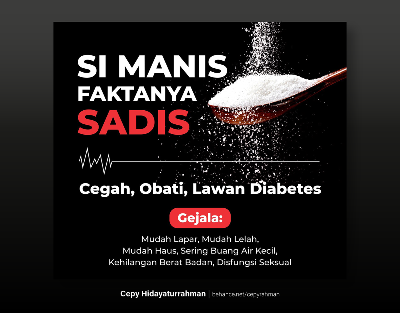
Mari kita lihat wujud poster kesehatan yang saya buat berikut ini:
Translate: Let's look the health poster that I made below:

Saya mengambil konsep typography-based poster, dengan meminimalisir penggunaan ilustrasi-ilustrasi cute yang begitu masif digunakan dalam lima tahun belakangan dalam berbagai tujuan komunikasi visual, yang sebetulnya sering kali tidak relevan. Misal, poster tentang aturan-aturan hukum, tidak relevan konteksnya ketika dihiasi ilustrasi-ilustrasi kucing-kucing lucu, pemandangan gunung-gunung membulat bergaya flat design, dan sebagainya.
Translate: I took the concept of typography-based poster, by minimizing the use of cute illustrations that were so massive to used in the past five years in various purposes of visual communication, which actually are often irrelevant. For example, posters about the rule of law or legal, the context is irrelevant when decorated with illustrations of cute cats, round mountain views in flat design style, and so on.
Saya memberanikan diri untuk mengambil keputusan tersebut karena ini adalah poster kesehatan, dengan tujuan agar target audiens sadar untuk menghindari penyakit yang serius dan menahun. Dengan demikian, saya rasa kesan visual yang harus saya tonjolkan adalah "kelam", "mendobrak", "sedikit menakut-nakuti", dan "menyadarkan". Sehingga, warna dominan yang saya pilih adalah hitam.
Translate: I ventured to take this decision because this is a health poster, with the aim that the target audience must be aware to avoid serious and chronic diseases. Thus, I think the visual impression that I must highlight is "dark", "breaking", "a little scare", and "resuscitate". So, the dominant color I chose was black.
Uniknya adalah, warna hitam tergolong dalam daftar warna-warna yang sangat dihindari oleh perusahaan tersebut. Latar belakangnya saya tidak berani mengatakan ini adalah fakta, namun saya pernah berbincang dengan seorang Manager di perusahaan tersebut, ia mengungkap bahwa warna hitam sangat dihindari oleh Top Management karena warna hitam membangkitkan nuansa kelam, masa lalu yang suram, masa depan yang buram, hingga pupusnya harapan.
Translate: The unique thing is, the black is classified in the list of colors that are very avoided by the company. The background I do not dare say this is as a fact, but I have talked with a Manager at the company, he revealed that black is trully avoided by Top Management because black color evokes shades of dark, gloomy past, a blurry future, until the disappearance hope.
Akan tetapi, saya berusaha untuk mendobrak pakem atau tradisi tersebut. Alasannya sangat kuat: karena warna hitam di dalam poster kesehatan yang saya buat ditujukan untuk menyadarkan orang untuk segera menghindari buruknya gaya hidup asal-asalan untuk kemudian memulai pola hidup yang jauh lebih sehat, agar perlahan meninggalkan masa lalu yang suram, dan moga-moga dapat terhindar dari masa depan yang buram.
Translate: However, I tried to break their standard or tradition. The reason is very strong: because the black color in the health poster that I made is intended to make people aware to immediately avoid the bad lifestyle and then start a much healthier lifestyle, so that they conscious to leave the gloomy past, and hopefully we can avoid the blurry future to live better.
Best Regards,
Cepy Hidayaturrahman
Graphic Designer


