

Background
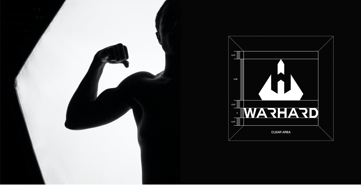
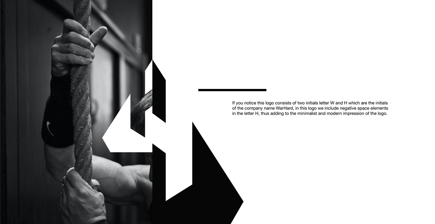
This identity system is based on the initial WarHard, the letters W and H. I took the concept of negative space at that time and decided to make something deeper and more interesting. and when researching names, I want them to be abstract and phonetically sharp.
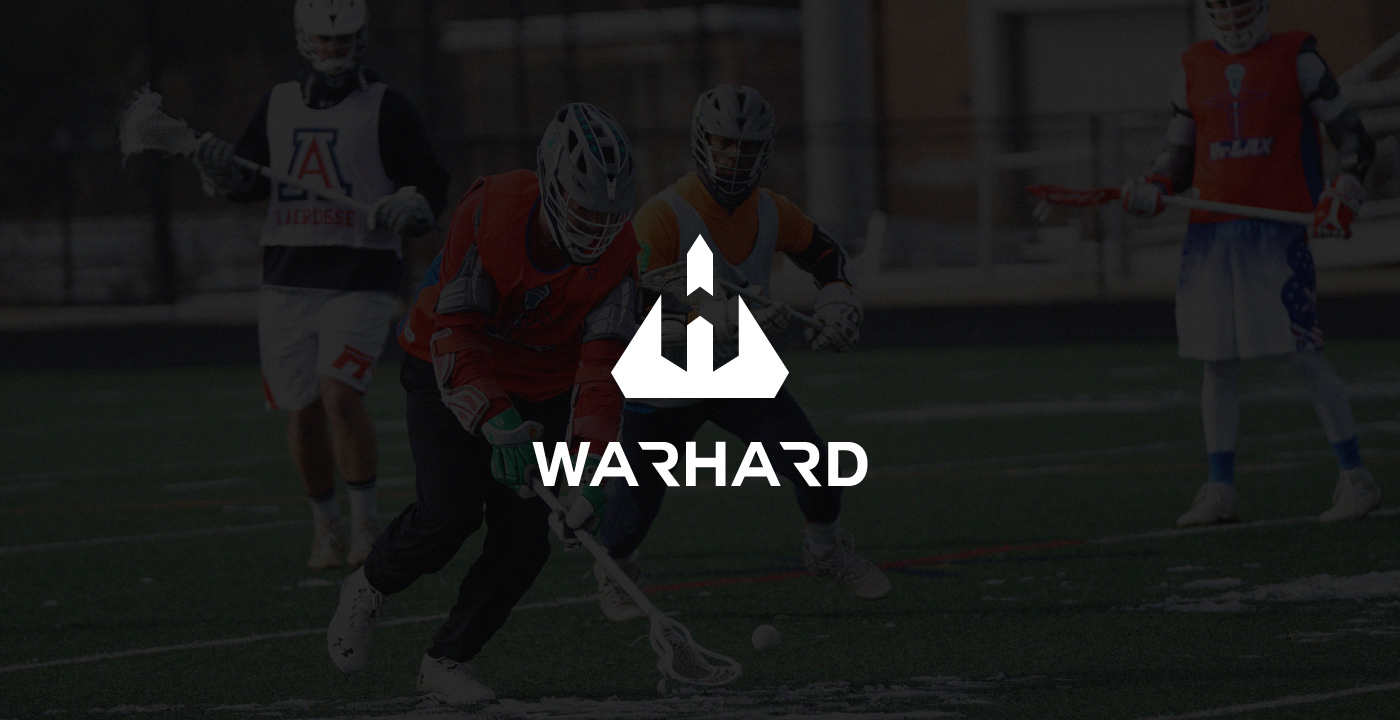
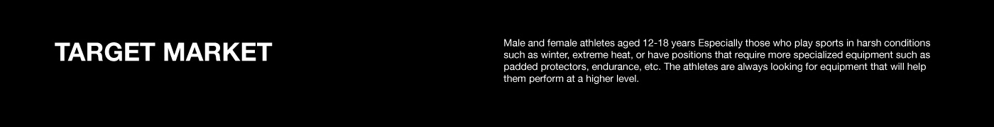
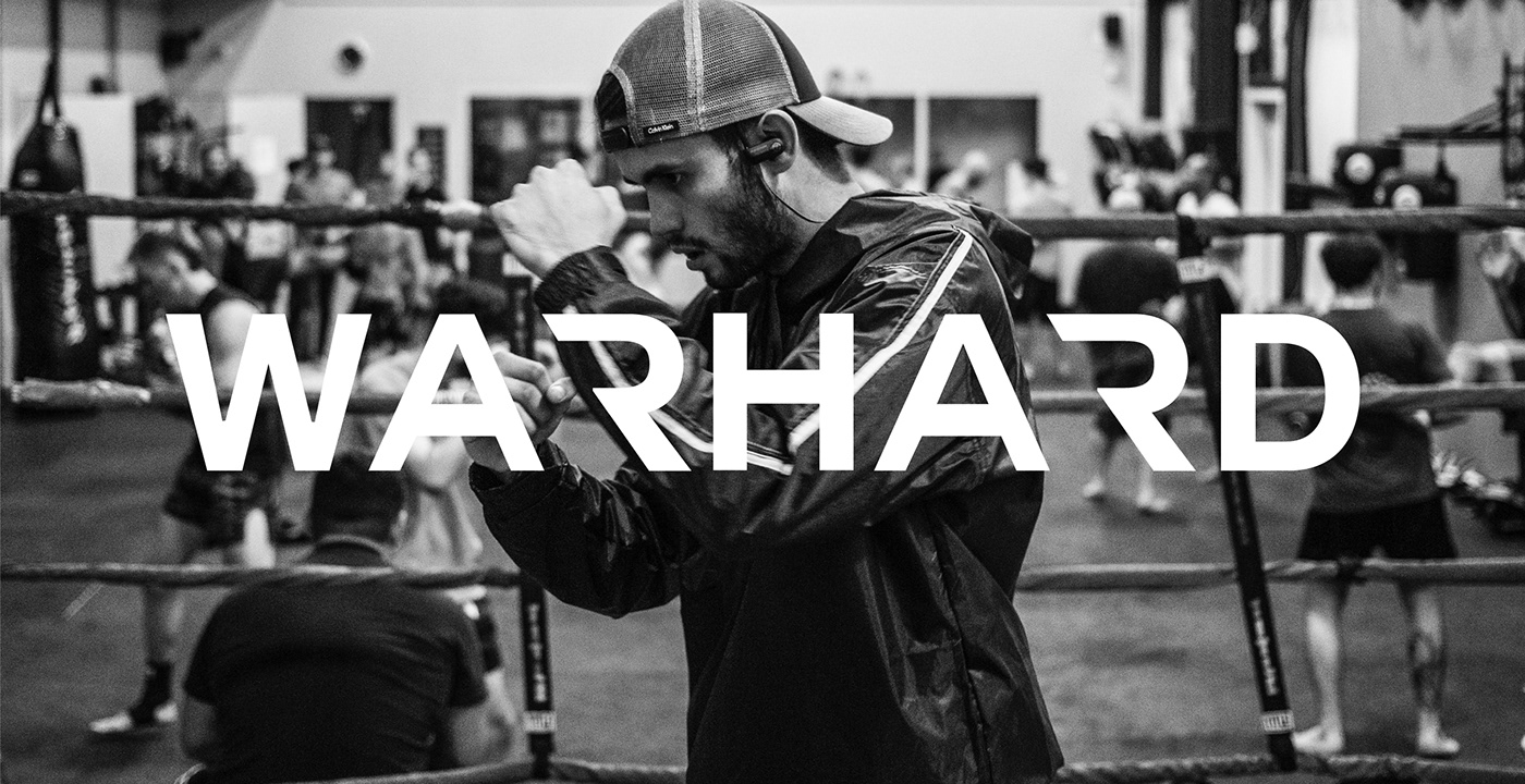
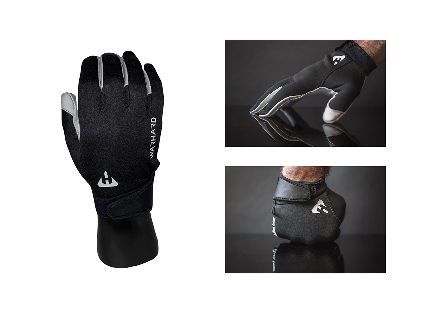
Because the product issued by Warhard is actually to provide comfort and protection for athletes in extreme sports and is used for young customers, therefore this logo must look strong and modern.


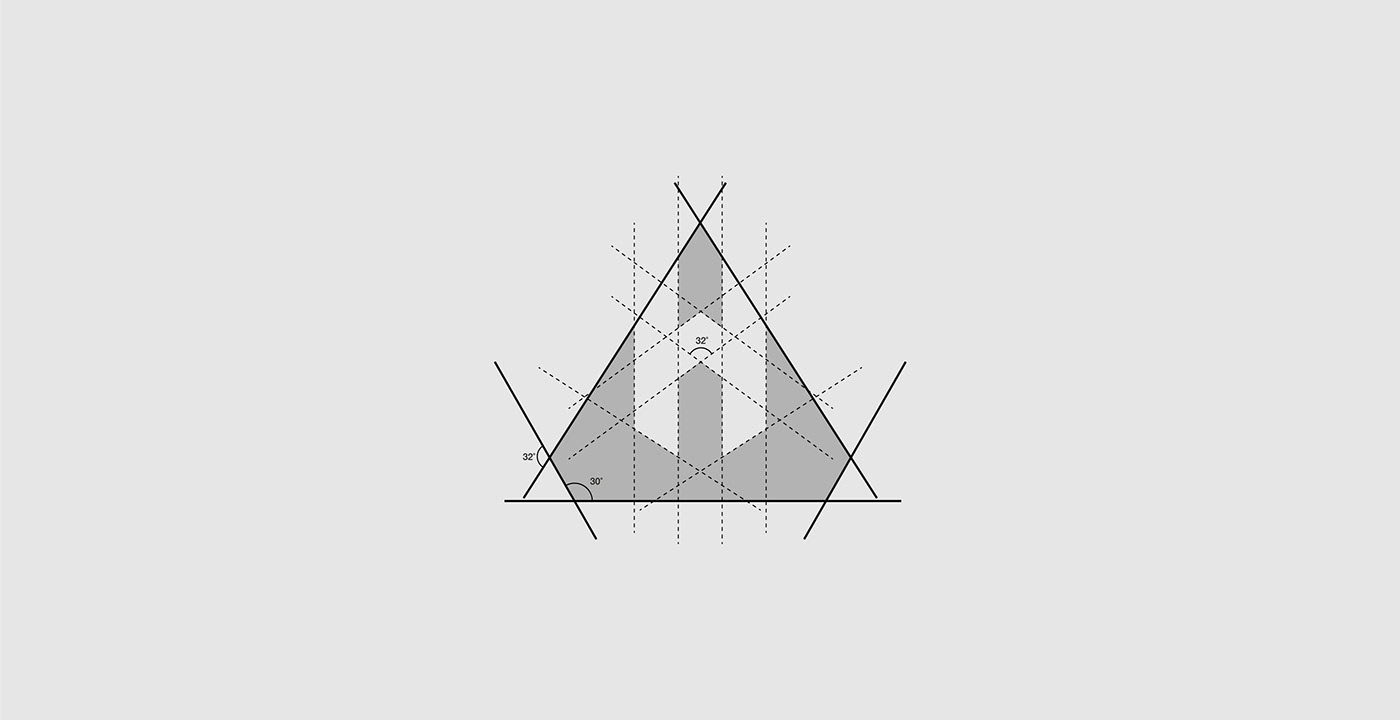
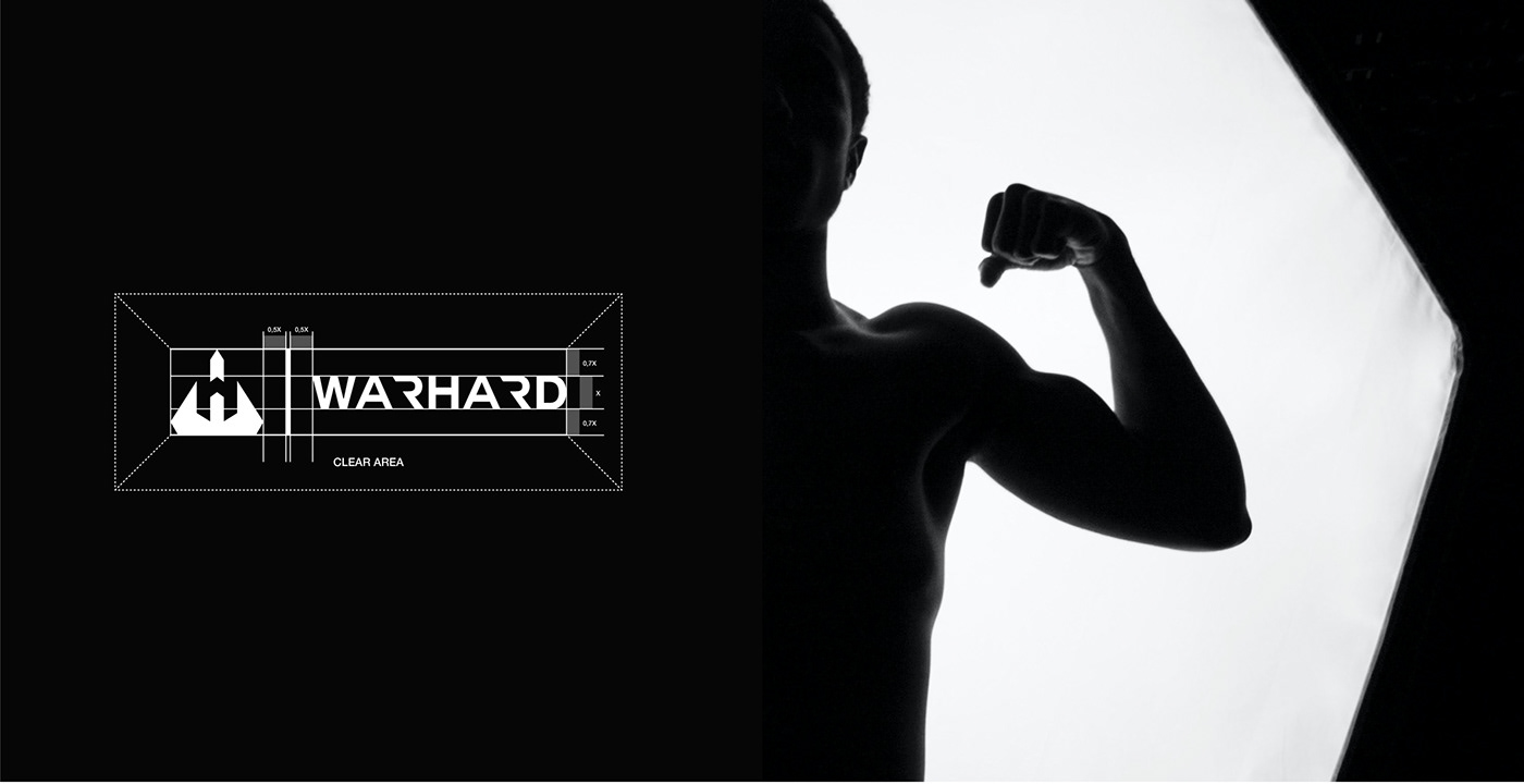
Grid system
I took my time to craft this. I want to explain the structure as clearly as possible. For the main symbol I use angles of 30º and 32º. It's less aggressive than 45º but still dynamic.
I took my time to craft this. I want to explain the structure as clearly as possible. For the main symbol I use angles of 30º and 32º. It's less aggressive than 45º but still dynamic.
Wordmark is created using a triangle as a base. This allows me to start and change from there. The end result is a type that is very modular and structured with sharp edges.
Lockups
A brand needs to be versatile, that's why it's always good to have at least two different lockups. In this case, I decided to craft three: Horizontal and Vertical.
A brand needs to be versatile, that's why it's always good to have at least two different lockups. In this case, I decided to craft three: Horizontal and Vertical.
Thank YOU for stopping by! I would highly appretiate
if you can hit that button down there! Any tips are welcome too.
Have a great day ahead!
Contact me if you want to hire me :
Another portfolio check here :


