


RUE - Nordic Beauty
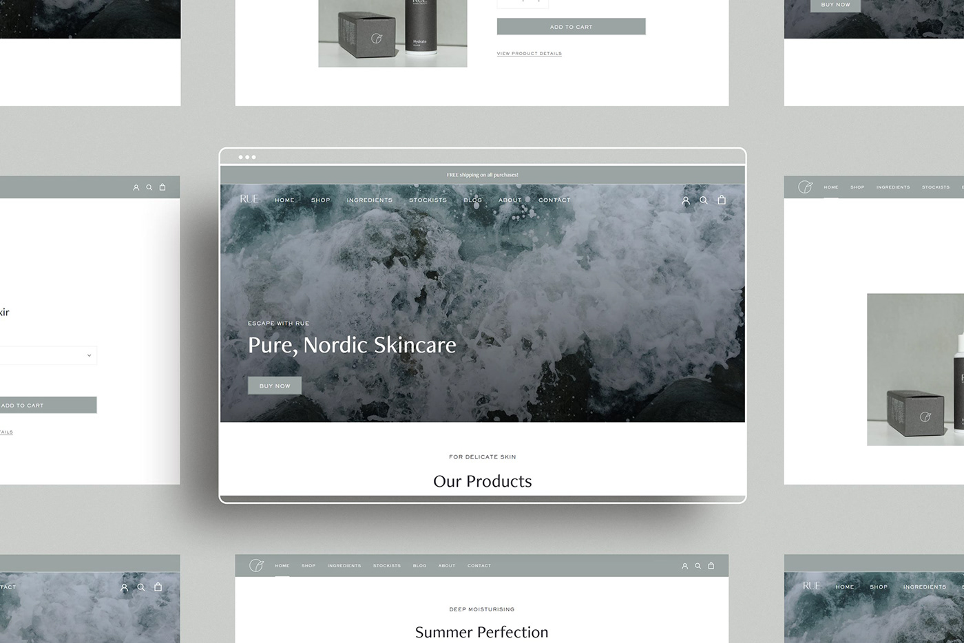
With the seeds of a brand planted firmly in her mind, Kristina, the formulator and founder behind the stunningly sustainable Rue Nordic Beauty, approached me with a logo, an illustration of a rue plant, and an idea. Looking to elevate her brand from concept validation to an international brand known and loved for bringing ease to daily beauty rituals, we paired our talents to create a holistic visual identity inspired by Scandinavia’s deep seas and stormy skies.
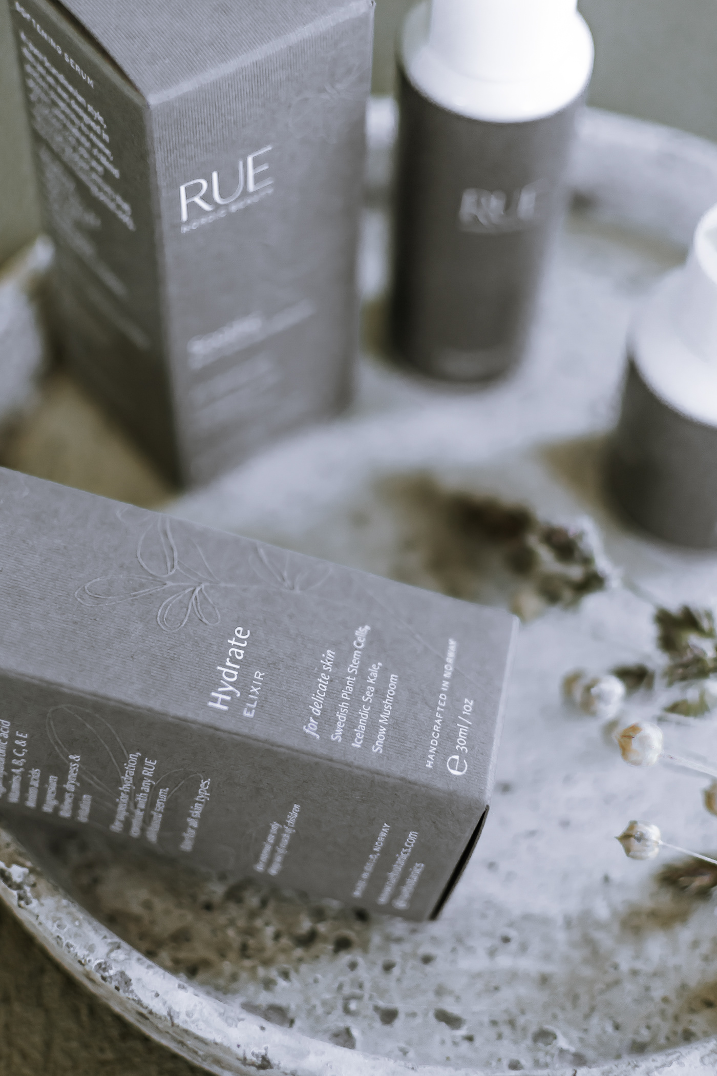
Taking inspiration from a moodboard that highlighted nature as a vibrant yet sustainable force, I selected colours and typography to create a modern feel that contrasted Rue’s hand-drawn illustration and grounded the brand. Then we applied that visual identity to the more tangible brand elements — packaging. To enhance the customer experience and differentiate the brand, I sourced textured fibers that would stimulate the senses while establishing the premium feeling that Rue embodies.
With the visual identity and luxurious embossed packaging complete, Kristina’s brand has gone from strength to strength since its launch, including a sold out product run and print features in Elle Norway, Costume Norway, Finansavisen Norway, and Bo Bedre Norway.


Photography by: SORGENFRI, Oslo
Hand drawn illustration by: Esra Røise
Case Study words by: Crisp Copy


