

The team at anynines decided to create a meetup for people interested in working with cloud infrastructure technology and I got to take a stab at the official branding for the event.
The idea was to create something new and fresh in somewhat stale design world of tech events. The event also encompasses multitude of technologies that people could work with, so one of the unique challenges was to display that multitude inside the brand. I decided to go with tiled design, in which some tiles mean technologies or methods, while others exist purely for decoration. That way we ended up with a versatile brand system that could be reused in many different ways.

The logo is a simple cloud, based on the current cloud that anynines uses in their logo. The colors also hark back to the original brand, with the punchy orange being a hallmark of anynines brand — coming across very contrasty in a world of dark blue and toned down visual identities.

The brand consists of three primary colors that is a reflection of the original anynines brand, making it seem more like a part of a working system with the original brand, rather than a 100% stand-alone identity.
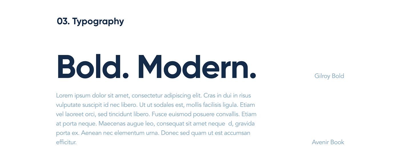
Typography is another design that borrows from the original brand, using Avenir — the typeface that anynines logo was based on and that is still used in parts of anynines brand as headlines and display text — as a backbone of the design.

The biggest part of the identity is the library of reusable tiles and components, as well as a whole bunch of templates to be used in marketing across all sorts of media — from print to Instagram Stories. The thread of tiles is still woven through all of the designs. As you can see, some tiles have meaning to them — e.g. technology that the meetup will be focusing on, in this case Kubernetes — and some are just pure decoration.


