
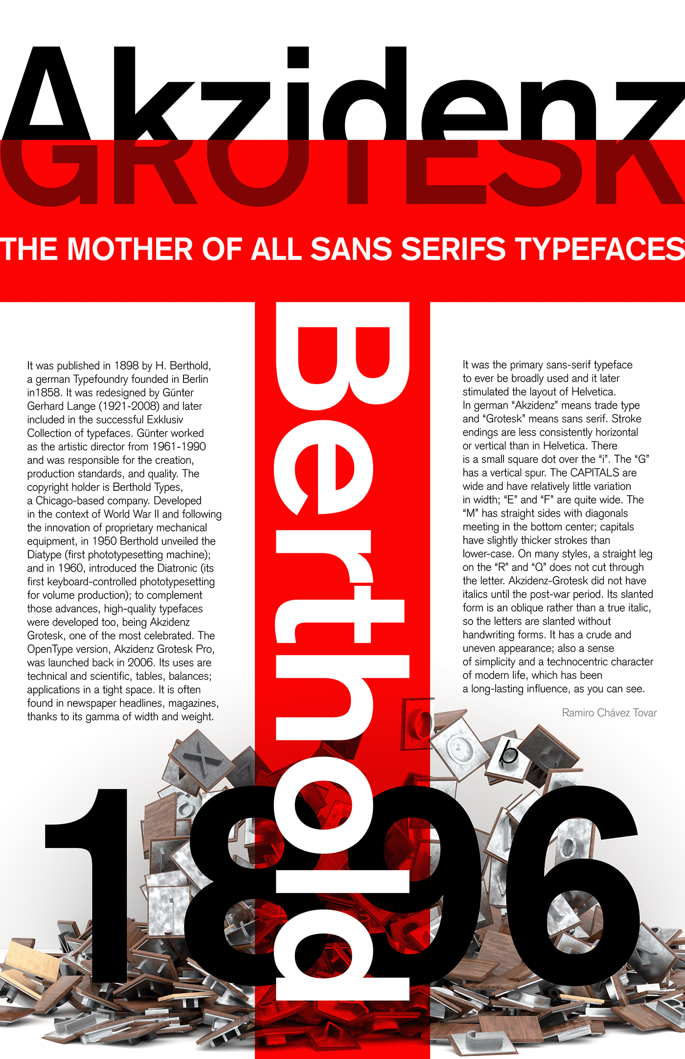
Akzidenz Grotesk typography poster. The meaning I'm trying to convey is that the typeset is very old (1896) when there were wood and metal press letters wherein extensive use in the XIXs; on the other hand, it was re-launched in 2006 so it is also modern and actual and had had a long-lasting influence because of its straight, wide capitals, weight, and san serif shape, very advanced for its time.
It also evokes a feeling of rigidity and strict rules; it lacked italics most of its history and when it got them they weren't italics. It connotates a technocentric ambiance, trade, machinery, and volume production... but it’s broken. It was done in the middle of a horrible war and post-war context by Günter Gerhard Lange, an ex-combatant who lost a leg (firearm wound); and interestingly, the "R" and "Q" have a "problem" with the "leg"; it surely should have hurt him so badly after all the suffering he endured.
The red accent is both about the blood of the designer and the brand colors of the typefoundry, Berthold, which, in a greedy movement, never gave enough credit to the designer. The whole Berthold brand is red, white, and black; it inspires an exclusive atmosphere; the digital font is quite expensive USD 450 for a .ttf digital asset!? Come on, it looks OK but the resulting type is not that spectacular: it has inconsistencies; the typographic result is uneven, difficult to read in small sizes... So, give me a break.
For the composition I've tried to use as many types of contrast as I could: positive and negative space, color, position, scale, weight, and direction; but also tried to experiment with the background dynamically to contrast the rigid and static lines of the top; so I made the bottom trying to depict the metal and wood letterpress types with a modern twist.

