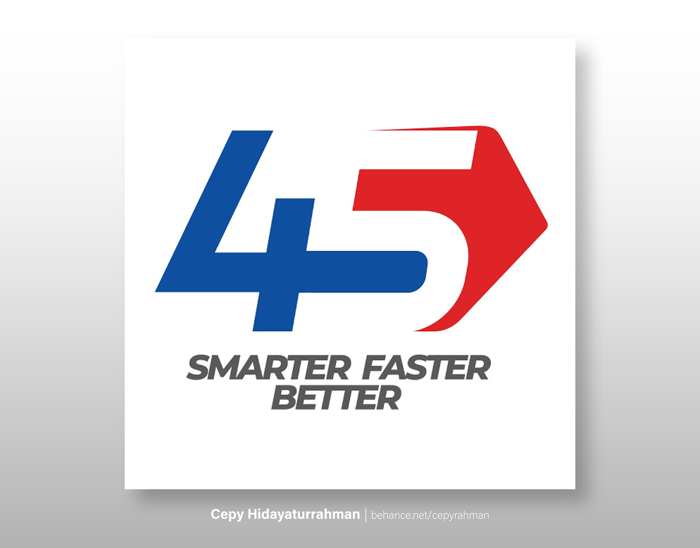
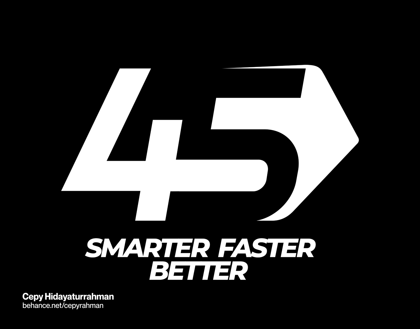
Company Anniversary Logo
Indocement 45 th Anniversary Logo (Official)
Tagline: Smarter Faster Better
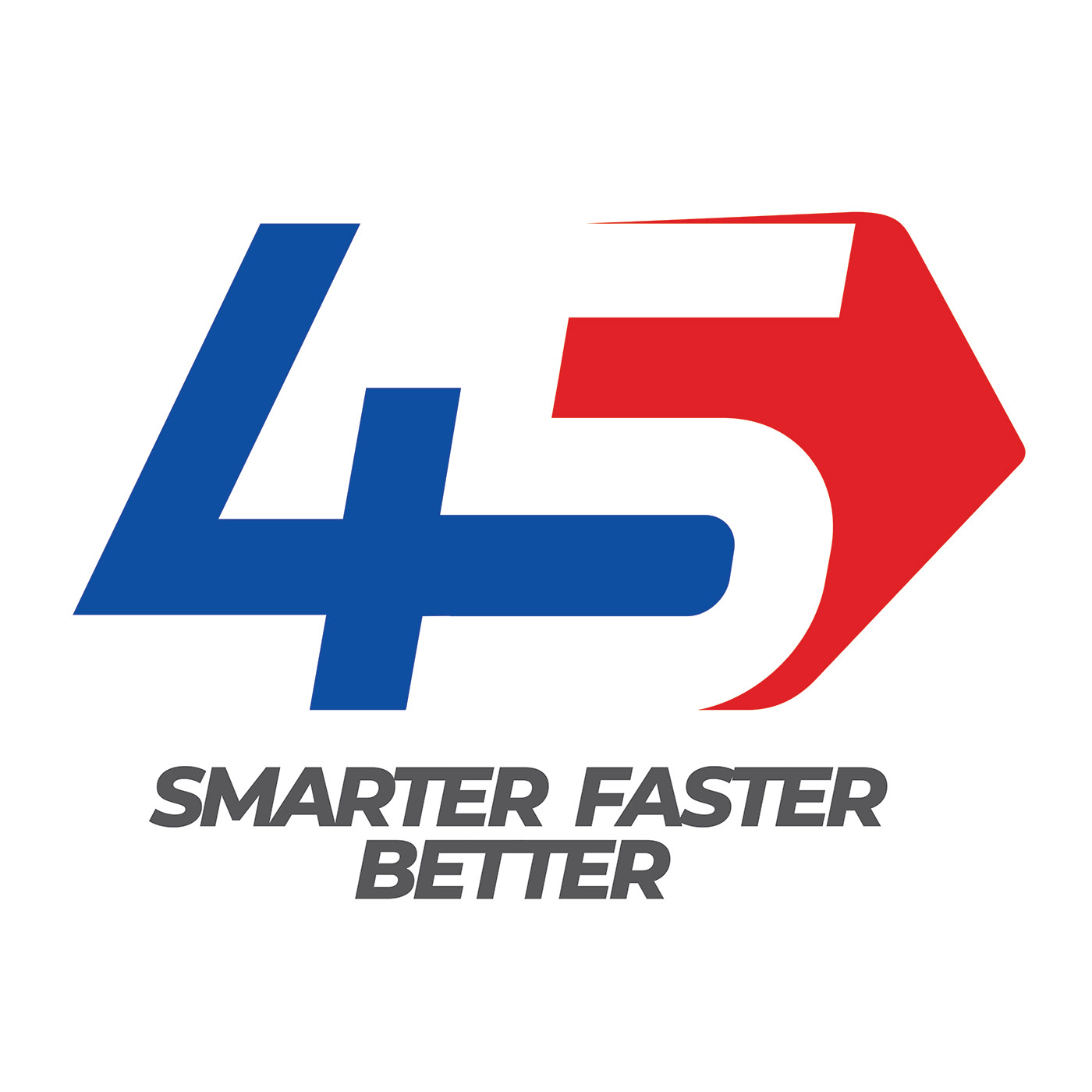
Move Smarter, Faster, and Better in a dynamic era. The asymmetrical and curved red arrows mean that flexibility is needed to deal with the dynamic times. The number 5 is colored white in order to portray the availability of "free space; opportunity" for the emergence of new innovations within the company.
Intersections between numbers 4 and 5 form the letter D which represents the word "Dynamic". Consists of 3 primary colors: red, blue, gray. Red & blue represent corporate identity; gray represents "sophisticated".
Best Regards,
Cepy Hidayaturrahman
Graphic Designer

