Launching a fashion brand in America.
With kisses.

Initially, Mexx planned to just use their European ads to launch their first stores in America, but at the last minute they had second thoughts. The ads seemed to be missing something.
Original Campaign

For Fall 2003, Mexx dramatically changed their advertising direction in Europe. Up until then, their ads had always been vibrant, colorful and accessible, in keeping with the brand’s core values. However, after 17 years they felt a new angle was needed, and they switched to a moody, black-and-white campaign.
For established markets, this approach might work, but the U.S. market had never heard of Mexx, let alone been exposed to the brand’s rich history. It would be premature to launch with this campaign before familiarizing the audience with the Mexx name and its basic brand values. Initial research confirmed this. People didn’t understand the tagline and didn’t know what the ad was selling.
Restart
We were awarded the assignment to fix the campaign just before the stores were due to open. There wasn’t time or budget for a new photo shoot, so instead we reviewed what Mexx had done in the past and, by drawing on their corporate philosophy, were able to repackage existing elements for more street impact.
Background
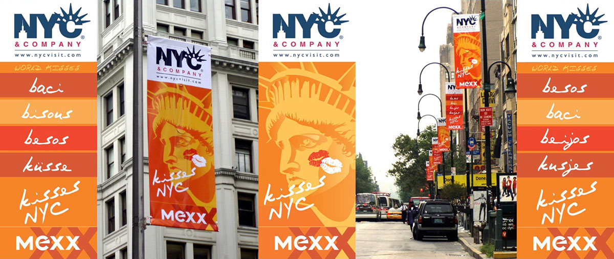
In 1986, two fashion labels, Moustache (M) and Emanuelle (E), were brought together with two kisses (XX) to form a new Dutch company: MEXX.
From the beginning, the kiss has been the core inspiration for the brand. The attitude is “optimistic, inspiring, fun, and non-conformist.”

New Campaign Concept
Even with the post-9/11 strain on U.S. international relations (remember “freedom fries?”), New York and Europe have a great deal of affection for each other. Who here doesn’t have a friend or two over there? Since the campaign was scheduled to launch around September 11, we thought it was a perfect opportunity to express this mutual good will. How better than with an exchange of kisses?
Elements
We needed some graphic elements and were, of course, drawn to the X. As far as letters go, you can’t find one more powerful. It has a strength and movement that commands your attention. Plus it’s the symbol for a kiss.

Next, we reevaluated the photography to see if it could support our developing story. We found that by focusing in on the couple, these somber, distant photos became pretty hot and sexy.

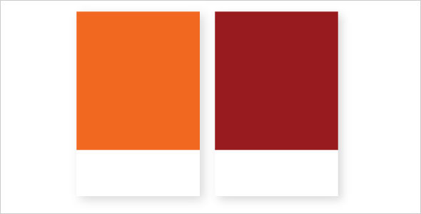
Finally, we needed some color to make it all pop. We felt warm tones would look great on the streets this time of year, cheering people up as summer was ending and winter approached. Orange was perfect for this, especially since it is traditionally associated with Holland (it’s the color of the Dutch royal family, the House of Oranje-Nassau). Adding a bit of lipstick red gave us a color scheme.
The Launch Campaign