

Week 3 – Lava Lamp Lab Logo
This project required first year university students to create a logo for a fictional event lighting company named Lava Lamp Lab. The client provided three sample logos from the internet and wanted their logo to incorporate the graphic styles common to them. Their target audience were 'hipster start-up companies' and 'urban-based corporations' that have events to promote launches and promotional parties, respectively.

Reference Icons
Common graphic elements between the provided images include strong capitalised sans-serif fonts, bold colours, a flat graphic style, geometrically-focused path shapes, an absence of skeuomorphism and text seperate from the respective logo.
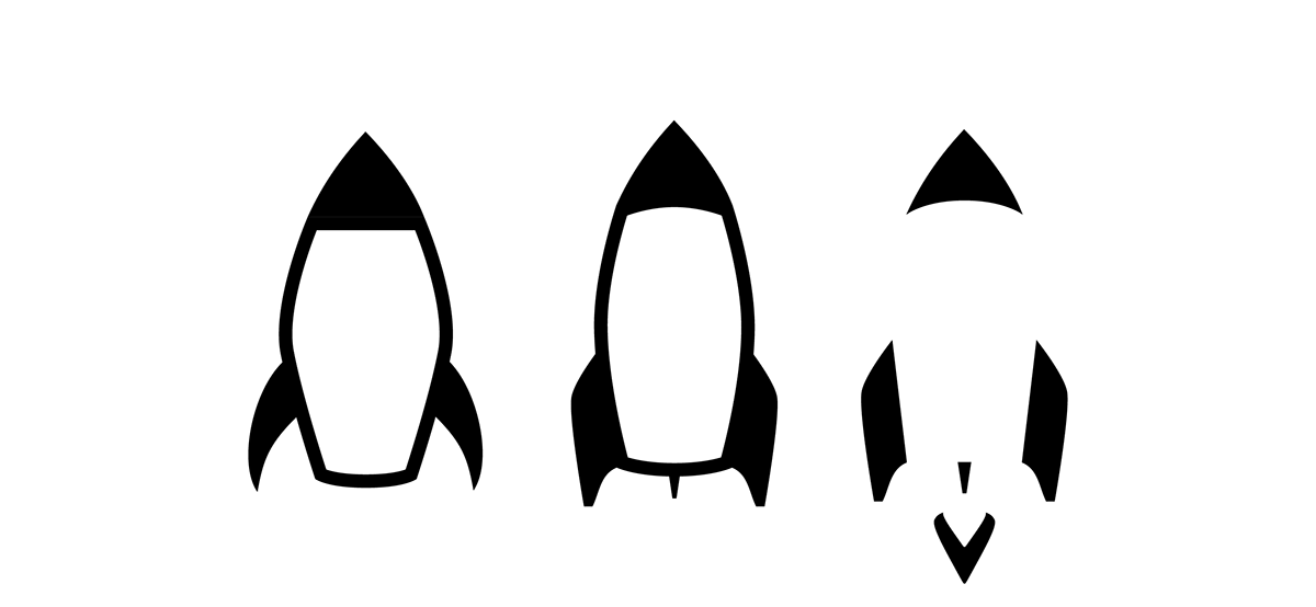
I knew I wanted to use the motif of a lava lamp in some way and that this was to be the main focus of the logo. I started by creating a simple rocket shape and tweaking it until I arrived at the first one above (from left). I wanted to use the shape of this similar-looking object for visual interest.
I didn't like the sharp points near the wings of my first rocket design and so I created the second by refining the shape to make it more sophisticated and streamlined. I thought about how a lava lamp needed to be able to stand and whether I wanted mine to have 3 or 4 feet –ultimately deciding on 3.
Upon experimenting, I found that I quite liked the look of the rocket with the main body of it deleted, instead being revealed by the negative space, arriving at the final revision with added exhaust flames (above, right).

I also knew I wanted to incorporate some sort of lava lamp liquid into the logo and began experimenting with simple shapes. Above, the progression can be seen. In the second stage I duplicated the black set of ellipses I made, merged those which were overlapping, and began to delete anchor points where the ellipses joined. I found converting the anchor points in question from smooth to corner and back to smooth again (thereby resetting them) to be a good starting basis for a natural curve from which one can modify. Further refinement and tweaking led me to the final image on the right.

I then wanted to experiment with a stage light graphic to use in the design. The image on the left (traced in Illustrator) was found online and provided a good basis for the final look. The image above in the centre shows the breakdown of the recreated rough shape. For illustrative purposes and clarity, I coloured the sections different shades of the same hue, and added some feet to the light.
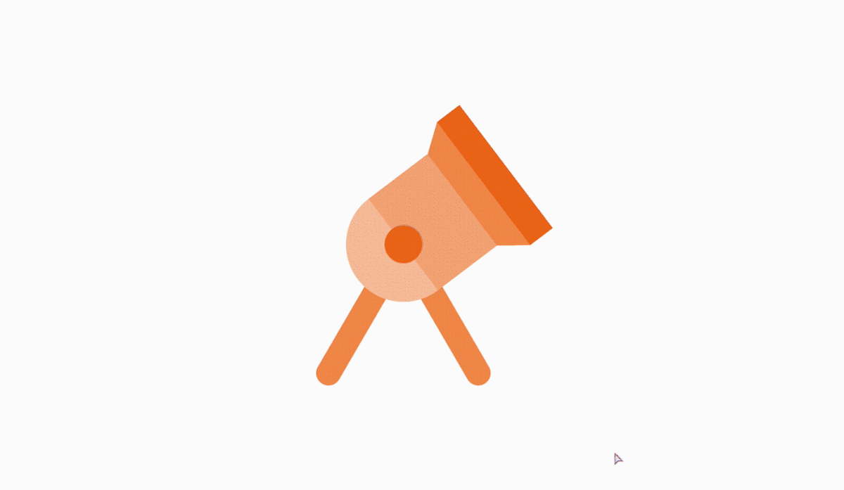
The video above shows the way in which I was able to position the lights in the draft image below. By using the Rotate tool I was able to change the angle of the light and move it as it would in the real world by setting the anchor to the centre-point of both the top of the feet and circle shape making up the light.

A draft of the logo is pictured above. I didn't really start off with a sketch for this logo, rather, as mentioned, I focused on what I wanted the logo to incorporate. I ended up with this design using the elements I had developed, however, I returned to the first revision of the rocket, with its closed shape. The logo would have been too ambiguous otherwise. I blacked out all the elements apart from the light shining from the two stage lights and the fluid inside the rocket. This was to draw attention to the light itself, considering the company is a lighting company, not a lava lamp manufacturer. I used a bold, striking font against a black frame to provide further contrast.
To improve this draft either more realistic looking fluid (to contrast with the completely flat look elsewhere) or/and refinement of the lights and how they shine and interact with objects would be needed.

I wanted to ensure however that my design was scalable and remain easy-to-read at smaller sizes. Unfortunately, the draft proved to be too intricate at some sizes, and whilst I liked the idea of actually incorporating lighting into the logo itself, I began to toy with the negative-space version rocket and the fluid. This logo doesn't have the lights on the sides and instead also has text in the middle, which playfully overlaps with the fluid, creating a sense of depth. I came up with this alternative version of the logo on the left and then asked myself the same questions about how the design would scale. I created a negative, monochromatic version of the logo (pictured above, right) which would be also more adaptable to different materials, however with the body of the rocket filled back in. A consistent thickness separates the three elements, which can be adjusted to make it even more scaleable.


