

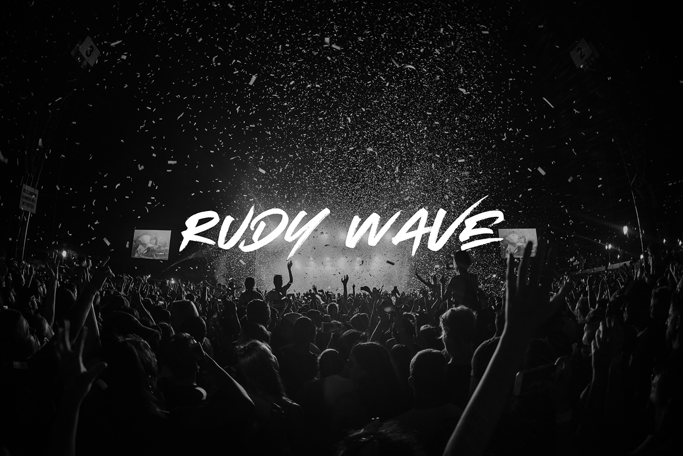
Rudy Wave is one of the most prominent icons on the Moldavian scene, winning honours and awards.

The Problem
Being an influential public figure, having an identity that resonates the brand’s values and goals, is imperative. This was also the basis as to why the team considered a redesign.
Being an influential public figure, having an identity that resonates the brand’s values and goals, is imperative. This was also the basis as to why the team considered a redesign.
The old logo posed elements of visual disproportionality, along with some legibility issues, which made for an uneasy transition across different media. It wasn't at par with what the team had envisioned.

The Process
As with any project, the process started off with sketching. Rough concepts that came to mind were documented, both on paper and digitally.
The goal - A logo that conveyed the teams idea of a “BOLD, SHARP, FRIENDLY and TIMELESS” brand. After lots of exploration and messy art boards, a few selected variants were presented to the team. Upon their feedback and a couple more revisions, a strong and refined concept was proposed. This made the cut, and is now the current logo.

The Solution
The goal behind redesigning the logo was to overcome the flaws that were, and make it 'PRACTICAL' for the brand. The primary focus was on the pragmatic implementations of the logo, and the result was one which could easily be incorporated on a variety of media, ranging from business cards, flyers, to billboards - all with ease.
The fans were also a prominent factor in the design strategy. Emulating the perspective of a true RUDY WAVE supporter was key to understand what their expectations of the brand might be…. What were they expecting when they see a flyer? Or when they go to a concert?


For work enquiries: Send me a message
or email at grigore.cojusneanu@gmail.com


