


Established in 1997, The Hong Kong Mortgage Corporation Limited (HKMC) is wholly owned by the Hong Kong Special Administrative Region Government through the Exchange Fund. Missions of the HKMC are to promote stability of the banking sector, wider home ownership and development of the local debt market in Hong Kong.
The Policy Reverse Mortgage Programme (PRMP) is a new loan program in 2019 of HKMC. The PRMP enables the borrowers to use life insurance policy as collateral to draw down loans. The monthly payout calculation of this product is based on its death benefits instead of its cash value. After the borrowers have passed away, the lenders will use the amount recovered from the death benefits of the life insurance policy to repay the loans.


Base on the product features, we came out the concept of "The supporting circle", representing the circle which created by HKMC, the Bank and the Insurance Organization, the simplify looping icon to become this logo.
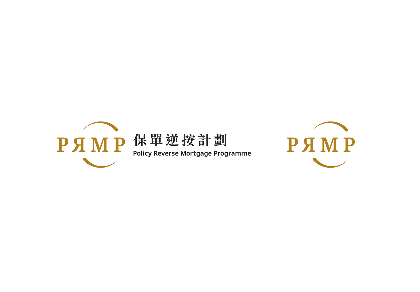
The circle we created dynamically points to the "R" and "P", represent different organization work together becoming an endless circle, the different thickness of the circle is expressing the flowing movement. Also with the reverse "R", the response to the program name and the concept of the program. We choose the golden color to build up a senior, professional and steady image of PRMP.


Continuation of the product launched, the product aims to be promoted in an attractive way to catch the audience's attention.


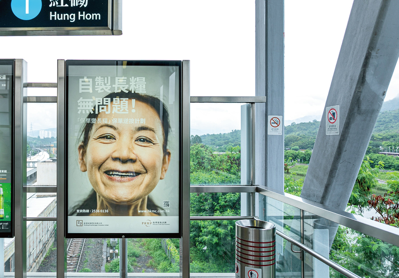
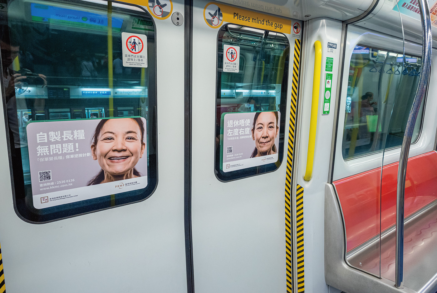
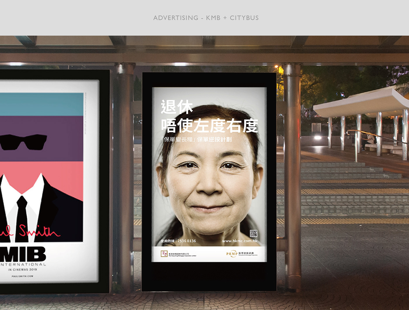
The key to successful and powerful advertising is whether it can arouse the audiences’ sympathy. Most advertising got less than few seconds to catch their attention. However, the general public has almost no resistance to large-sized texts. In order to reach the targeting group attention, we try to turn the voice of the retired person into words and enlarge it, to enhance the appeal of advertising and arouse the curiosity of the audience, the goal is to get the audience to receive the message in the shortest time. Conceptually we divide the theme into three parts: Enjoying Life, Empathy, and the Needs.
Get rid of the law that "silver hair ads must be old-fashioned", capture the various subtle expressions of models to express the feelings of different retired people, enlarge their expressions and related texts, and different content attracts audiences with different thinking. In order to achieve the maximum spread of advertising, all design arrangement is unified, and consistency is enhanced. When the audience sees the advertisement in different places, it will also create a contact impression, deepen the memory of the advertisement and the driving force for finding the relevant content of the policy against the plan.


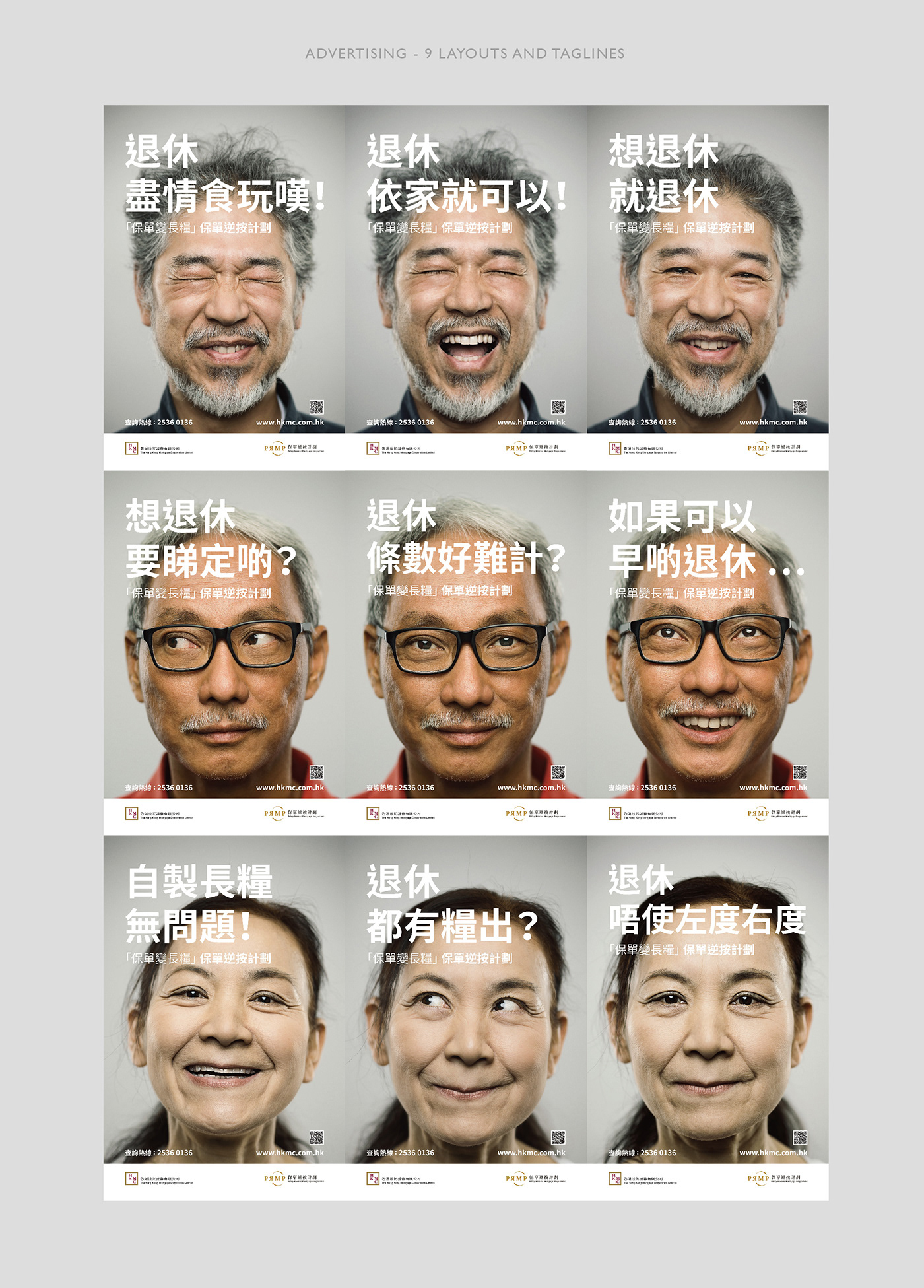
The first part of the theme: Enjoying Life
In the aspect of enjoying life, create different ideas and texts, as shown in the picture, projecting the idea of a retired person's dreams.
Theme Part II: Empathy
Cooperate with the various expressions of the model to amplify the problems that the retirees are worried about or are facing, such as: "Is it difficult to calculate retirement? If you can retire early..." etc., it will create a stronger sense of mutual sympathy and impression of advertising. Which leads to curiosity about the policy against the plan.
Theme Part III: The Needs
Showcase the actual function of the plan, so that the audience can better understand the scope of the plan to help the retirees, small amount of texts to guide the audience, and connect the concept of "policy becomes salary", clear and simple.


