

Reflecting the brand values in the new identity of Sun King by Greenlight Planet
Sun King | Visual Identity / Concept | 2020
I joined Greenlight Planet as a designer in 2018. While I was working there, my job was to streamline the brand language and work on making the brand more recognisable. This is a concept I had developed back then which did not get executed. So I thought I would share a snapshot of it here for you guys to enjoy!


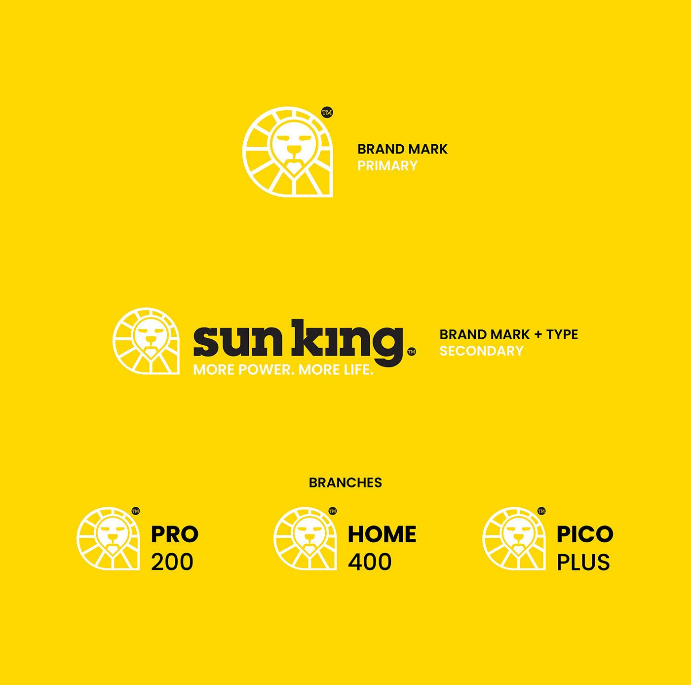


The Blue Green combination existed in their previous branding and we decided to keep that as a brand callback. There was a new darker blue introduced in addition to the two colors and the new motif signified the pharma cross in the center. The border crest around the logo was designed to look like a capsule and it also helped make the logo prominent in advertising.
Most of the elements and illustrations we designed for the pharmacy was on a lighter background. The darker background was reserved for achieving higher contrasts like signboards and digital usage.
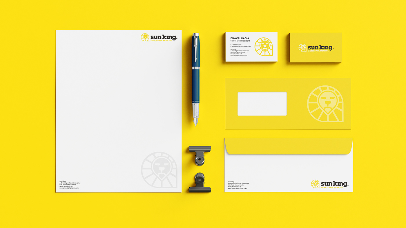


This is a concept project I had developed during and after my tenure at Greenlight Planet as a designer.


