Sex on the Table is all about “foods that get you in the mood.” Working with over 100 aphrodisiacs, Chef Fed creates a culinary experience that arouses all the senses.
The Michelin-star-rated chef already had a hit with his Sex on the Table cooking class and was ready to expand his business by launching a line of prepared foods. Motherhaus was brought in to redesign his logo and refine his brand.
The Michelin-star-rated chef already had a hit with his Sex on the Table cooking class and was ready to expand his business by launching a line of prepared foods. Motherhaus was brought in to redesign his logo and refine his brand.
The original logo (below) lacked cohesiveness and was not scalable. Chef Fed needed a mark that could work in any situation and convey a solid, professional pedigree.

original logo
The biggest challenge was figuring out how to work the word “sex” into the identity without it feeling sleazy or lowbrow. This was a gourmet product line and needed to appeal to a sophisticated customer. It could be playful but had to be respectable.
Who's your type?
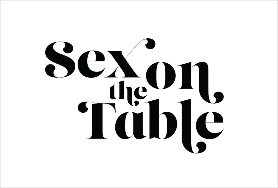
We started by looking at type treatments and gravitated towards a very sensual font called Lust by Neil Summerour. We loved its delicious curves and swash alternates.
These lockups had an interesting vibe and were certainly of-the-moment, but in the end seemed more suitable for headlines than for logo usage.


XO
Our next approach called out the “X” and “O” within the name to play off the romantic hugs-and-kisses qualities of this niche. The line above “table” is symbolic of a tabletop.
Bonus: the nature of the letter forms in the Sevigne typeface and the floating top line of the box allow this logo to be used as a stamp or stencil (see second image).


Stripped down
In this version, we distilled the name down to two symbols: an “X” representing “sex” is positioned above (or on) an iconic table shape. These elements are embraced by two brackets to complete the mark.
We brought in the lovely Cochin typeface in regular and italic to add an elegant juxtaposition.


Bare Essentials
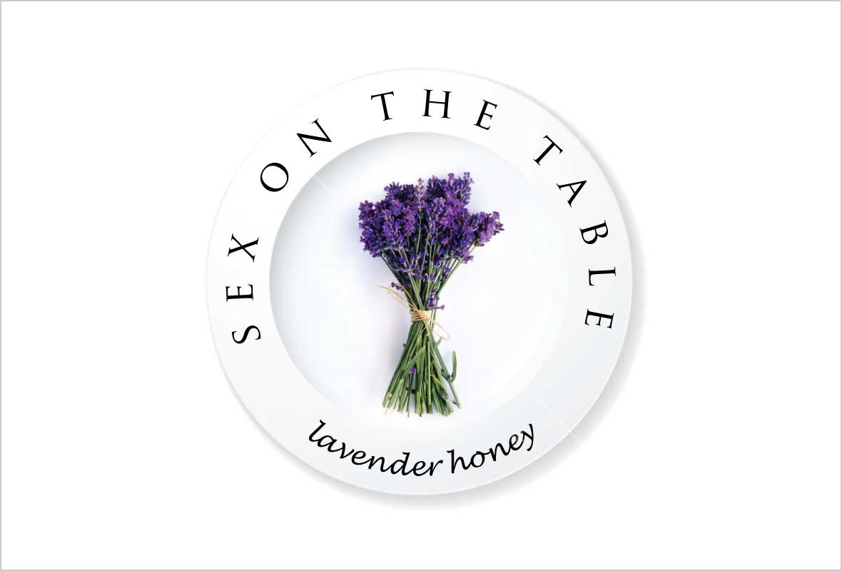
The last exploration led to the winning design. This study began with the idea of a plate. In the first design round, we used a minimalist representation of a plate to hold an image of the key aphrodisiac ingredient used in each product, e.g., artichoke, lavender, or strawberry. The name is wrapped around the plate in the classic Trajan Pro and the product or tagline is set in the friendly Lucida Handwriting Italic.


Monogram Heart
We determined that a corresponding product-neutral master logo was needed for general use. This led us to the idea of a monogram as you might see on fine china. After playing around with various letter shapes we developed a monogram incorporating an S and and X, shorthand for “sex.”
Detail: the letters form a heart when they come together, adding a subtle, romantic element to the design.


Sealed with a Kiss
Further evolutions turned the monogram into a mark that could be used as a wax seal, added to the plate with the ingredients or applied as a stand-alone mark.


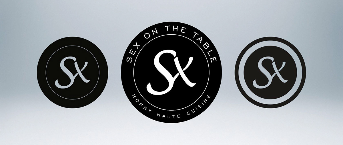
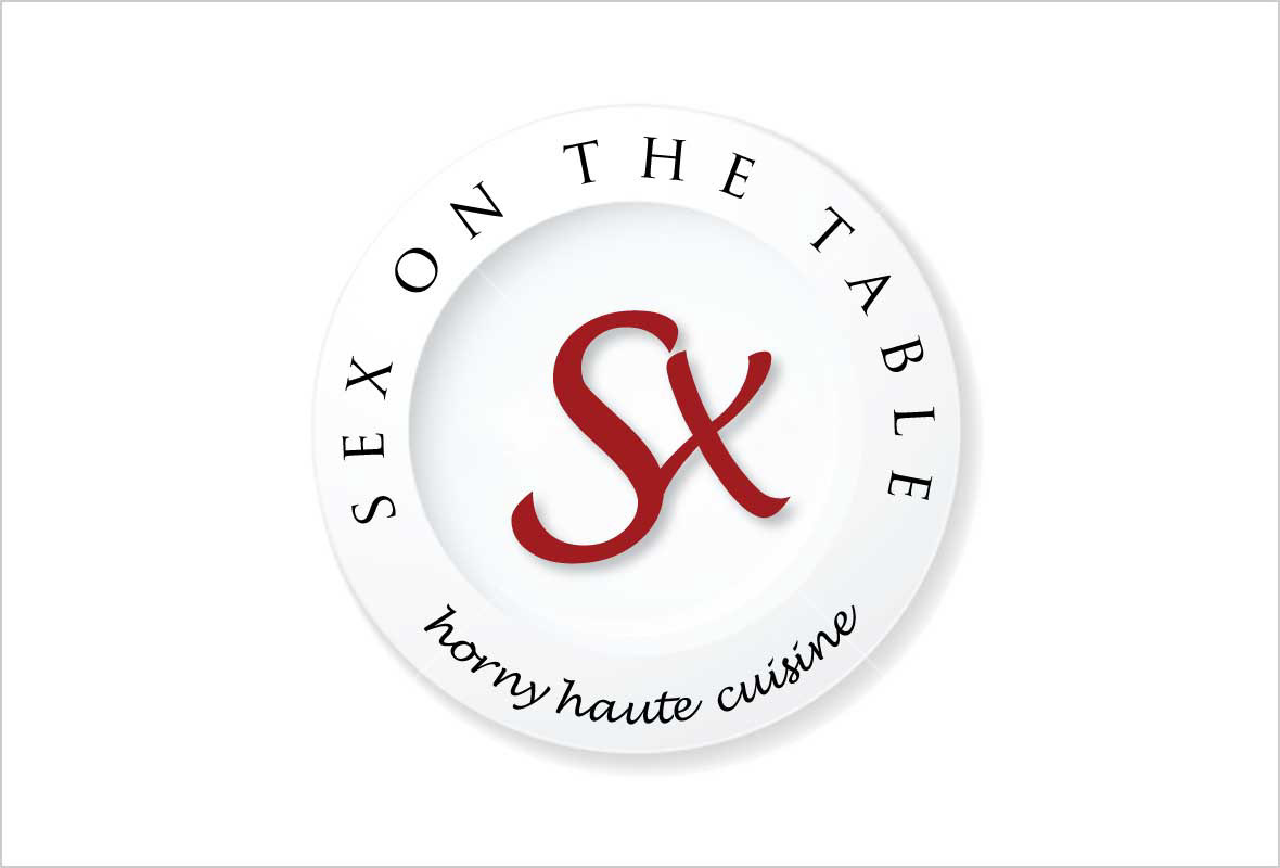
On the Mark
Additional refinements led to the final mark in three variations. First there is the main logo including the full “Sex on the Table” name and the tagline “Horny Haute Cuisine” in the clean, bold letters of Engravers’ Gothic. In addition there is a seal that can be used on lids or in other situations where the complete logo would be redundant. And finally there is a bold iconic version which could be stamped in wax on invitations and gift wrapping.


Get in on the action: contribute to the Sex on the Table crowd-sourcing campaign with Indiegogo and receive some delicious perks. Campaign runs through the end of June 2013.