Le Pures
Le Pures (& Le Pures Baby 乐宝适 ) is a mother/baby brand that provides baby line product for ages 0 to 10. The goal is to bring more happiness and safety for families in China (and abroad) through high-quality products.
Product line includes toiletries, diapers, wipes, cotton products, pregnancy and baby clothes, cups, straps, plastic products, tableware and more.
Brief:
Create a new logo and packing/identity for Le Pures. The logo and identity should be mysterious, abstract, modern, cool and cute. Focus on using purple as the main color, although there is flexibility around color palette. Purple, because it is a mysterious color. The icon mark and identity should be scalable and adaptable for future creation of stories around the brand, products and the icon mark. It is a combination of French and Chinese characteristics. The logo icon has to be a rabbit viewed from behind perspective. It does not need to show a face, but more as a curious rabbit viewing the world, having fun and learning new things. The approach comes from Chinese folk-story of a rabbit in the moon. Although even this is the origin, it doesn’t have to be communicated literally as such.
Initial Challenges:
- What is considered as cool?
- How to balance cool and cute?
- What is modern and abstract style for baby line products?
- Utilize a color palette that is mysterious and abstract, yet still warm and caring
Ideation: Initial ideation sketches. Few selected ideas from pen and paper sketching.

Iteration 01: Exploring styles and directions. Taking the sketches further

Iteration 02: Narrowing down styles, exploring different directions
Initial ideas were too much like characters than logos. The new iteration of ideas was aimed more towards a utilizing negative space to create a foreground and a background with keywords such as parents, family, a parent holding a baby(rabbit), hugging, care and warmth.

Iteration 03: Further exploration
Striving towards a more simplified approach. Aiming to integrate a "coolness" factor. Considering silhouettes and if emphasis should be placed on 乐 (Lè - fourth tone), which translates to fun/happy.

Iteration 04: Direction chosen, exploring styling and typography
After further discussions. The chosen logo mark had the right amount of balance of being usable (adaptable), mysterious, simple and cool.

Plot Twist: Re-thinking color theme for final logo
After more rounds of discussion and cups of coffee later: Dark purple as a color is royal, cool and mysterious. It could work nicely as is - it does seem cool. However, for a baby-focused brand the color can appear a bit too cold and a bit too mysterious when the goal is to communicate a caring and happy mood. It was still lacking in a balance between being cool and cute, thus the color approach changed from a dark theme to lighter theme.
Final Logo
Logo uses negative space to show:
- Rabbit silhouette (back)
- Rabbit silhouette (face)
- Rabbit with hands / hugging


Color Palette: The Le Pures Trio

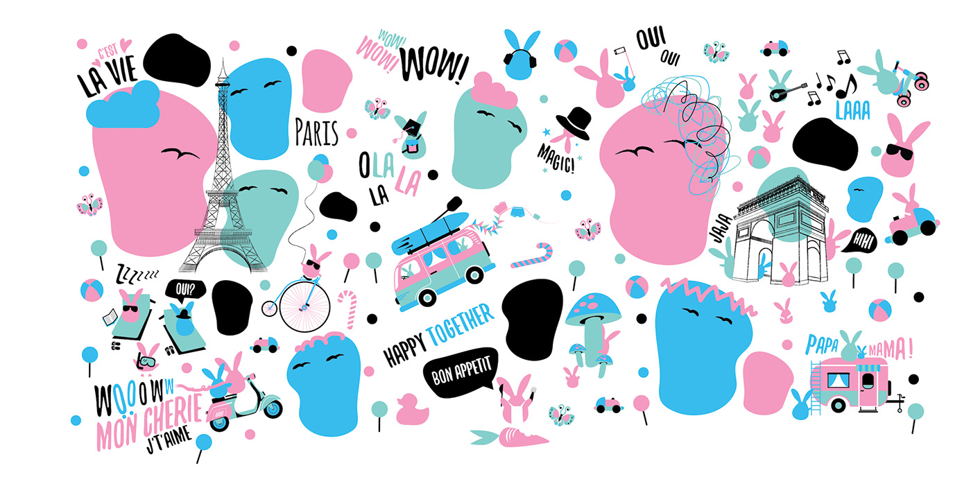
Packing and Identity: Le Pures Adventures


