


How to Web 2019 is by far the most complex project I worked on this year. It's one of the big players in CEE focused on delivering high profile content for building better products and faster growth.
I was in charge of the full spectrum of design: digital, presentations, stationery as well as projections, large scale printed banners and merchandise.
As a freelancer, I had to adapt to their working style and join their office to avoid feedback delays (the months before the event were mostly worked from their office).
The brief: Another agency created the web design with a few guidelines for other materials. Therefore I had a few shapes and 3 colors to work with.

For the digital campaign, the color limitation wasn't a big problem, as I used the speakers' photos as backgrounds. The focus was on making different kinds of photos look similar. I used a lot of Photoshop to get rid of random background details.
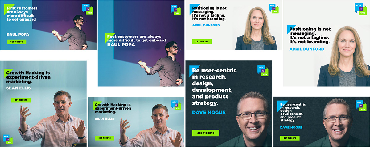
The struggle: The web design was cool for web matters, but a white background was out of the question for multiple reasons:
- it's too bright to be projected on the LCD walls in the event's location
- online: it wouldn't strike visually (both facebook & twitter have white backgrounds)
- it looks cheap and empty if used as background for huge prints (6x4m)
- white doesn't denote 'tech' or 'startup growth'
So, what was the solution? Using the other colors as backgrounds so that we can differentiate the stages and the subjects of the talks. For the event, purple was the winner, as it was easier for the eye to look at a darker color than to a bright blue/green screen. White was only used as font color or partner's background. But there's more.

We did use light green and blue in very specific scenarios and for limited amounts of time (eg. announcing the Startup Spotlight winners, signaling smaller stages with smaller screens).

For the ambient and small details, I made sure that every wall, table, badge & roll up were visually aligned with the main concept. Here's how a few details looked like.

How about the fun side of being both a designer and a copywriter? I've created some of the slickest messages for our merchandise section - the sales boomed unexpectedly, with waiting lists and dozens of t-shirts ordered in just a few hours.
The brief: create 5-6 messages connected to product growth, startups and funding. It has to be genderless and timeless. The most popular was: Veni, vidi, pitchi. But wait to see the rest.

I didn't stop here and I also created stickers with the same messages

What did I learn:
That different managers have different leadership styles and it's mostly my job to switch between them. That feedback coming from non-marketing people may have more to do with their tastes than with my knowledge.
In a team, everyone is responsible for talking about their truth and to ask for their needs. Nobody (not even the manager) is responsible for getting your job done seamlessly. If the information is incomplete, you ask for it until you get it. If the brief is vague, you ask helping questions until you clarify.


