

PayPing - Rebranding Project
PayPing, Business Payment Community Solutions
We believe that paying attention to the concerns will lead to better service.
In financial technology, PayPing has started its service with a variety of electronic payment solutions.
PayPing started four years ago as a startup, from Avatech Accelerator in Tehran, with the goal of providing a personalized payment service. Along the way, they have always strived to move along with their customers, as the most important asset of their business, to move forward and change for the better. During this time, PayPing evolved to try to better understand the financial needs of all types of businesses and to provide a comprehensive solution for businesses to pay online.


The safe area is used to prevent from placing other elements near the logo that may distort the perception of the signage. The module used to determine the safe area around logo is the letter “P”.


Graphic patterns
We have a rich heritage of communicating through bold, graphic patterns. They are an essential component of our brand language, and can be used to illustrate and communicate a concept.

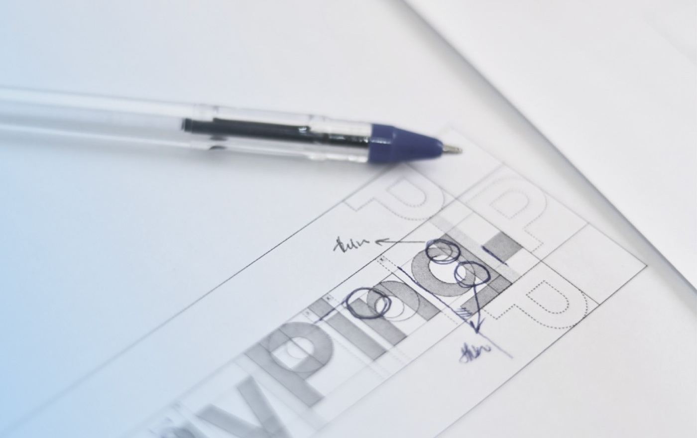
PayPing Concept
The Dot element, a metaphor for the endpoint of a successful transaction, is one of the most important elements in the new PayPing logo. A "point" arises from the intersection of two lines. In fact, that "point" is PayPing. The "point" is the end of all Ends and is the end of every transaction.
PayPing Payments is committed to delivering faster, more modern, and more secure end-to-end customer transactions. In the concept design and concept
PayPing Payments is committed to delivering faster, more modern, and more secure end-to-end customer transactions. In the concept design and concept


Focus group meeting
It was very important for us to ask the users what they thought about the selected concepts. For this reason, we asked users a variety of questions about the logos and concepts .
This meeting helped us to measure what users need and how we need design brand identity.
This meeting helped us to measure what users need and how we need design brand identity.


App Icons
The icon can appear on a white or Squid ink background.


PayPing colors
PayPing main colors are Squid ink and bright blue. blue is used for accents. Squid ink is used mainly for typography. primary palette uses bright colors to bring a boldness to PayPing Brand.


Payping primary english font is Lato. The font is available free of charge, and supports most of the languag- es. The Lato Font comes with 5 weights.


