PTS Taiwaness Channel Idents Animation
公視台語台在2019年開台,提供全台語的節目的頻道。因此我們以台灣的各種常見元素,例如枷枳袋、花磚以及玻璃窗等等,搭配代表台灣的三個顏色 - 青金紅。利用動態設計的靈活輕巧感,帶出富有台灣文化之外又平易近人的頻道開頭動畫。
In 2019, PTS launched its channel to provide an all-Taiwanese program.
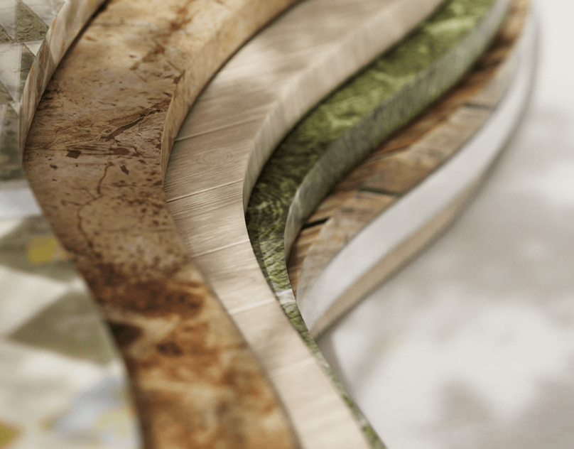
To design its channel opening animation, we use various classic elements that commonly make people think of Taiwanese when they see them, such as Ga-Ji-La bags, flour tiles and, glass windows.
And to create a culturally rich visual, we weave three iconic colors- blue, gold, and red; which represent the essence of Taiwan in the setting and layout design. With the lively and cheery design of the motion, Taiwanese culture can easily be recognized throughout the entire animation.
// Credit
Client : 財團法人公共電視文化事業基金會
Production : 動工設計MOKRAFT
Creative : 動工設計MOKRAFT + 空集設計 Nulls Design
Producer : 林宗毅
Director : 劉承杰 Jie Liou
Project Manager : 陳亮至 Liang Chen
Storyboard : 徐光慧 Sylvia Hsu、劉承杰 Jie Liou
Design : 徐光慧 Sylvia Hsu、劉承杰 Jie Liou、鄭麗華
Motion Design : 劉承杰 Jie Liou、徐光慧 Sylvia Hsu
Sound Design : 紋聲音樂 WinSound Studio
Music : 林孝親、林思妤
Sound Effects : 林孝親、林思妤
Audio Mixing : 林孝親
Storyboard

Styleframe


Process


Thanks for watching!


