

Domik Interiors
Logo design, brand identity.
Client's brief: "We are a new interior design and home staging business based in the UK. We cater to the higher end of the property market. Consequently, we need a logo that reflects luxury and sophistication, a very clean and smart logo that plays on the concept" - Kristina Wells
The simple word "dom" (rus. дом “house') and the derived word "domik" (rus. домик “little house') causes warm associations of a cozy home where you can relax with your family after a busy day at work. A comfortable chair is the first element we interact with is so I decided to use it as the main character of a brand.
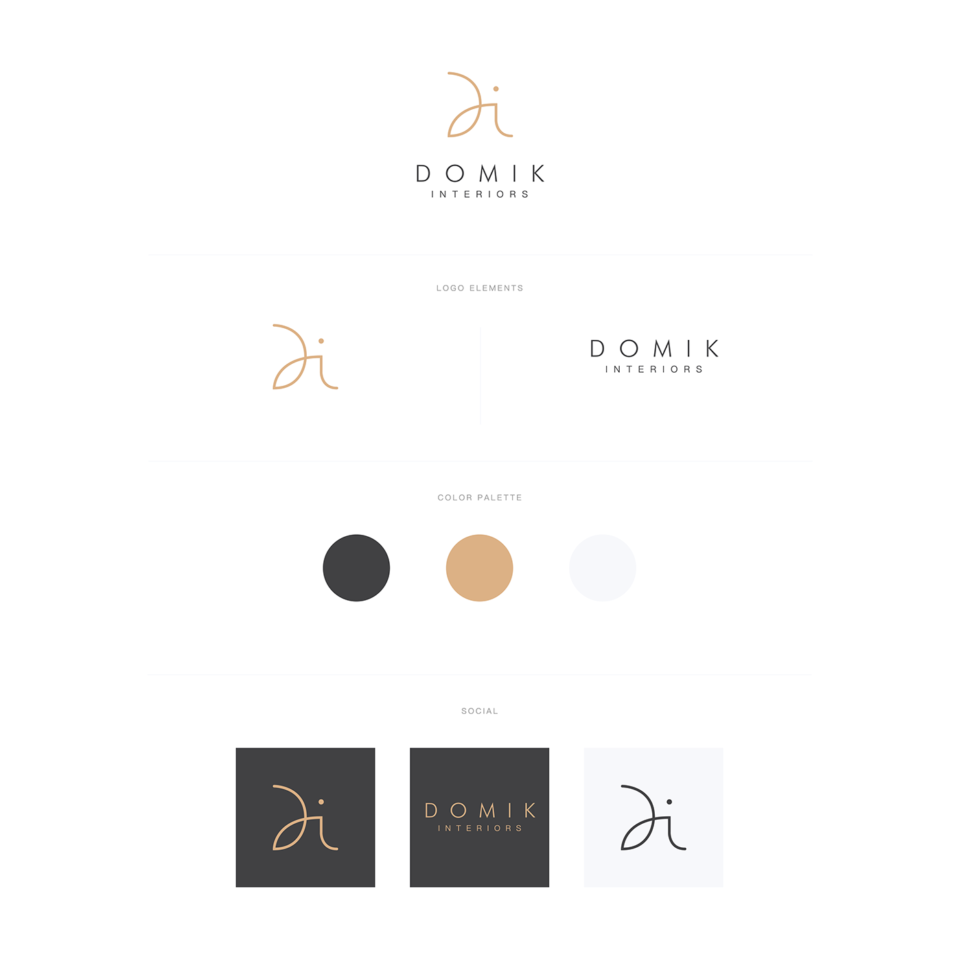
Taking inspiration from the visual language of a luxury tubular steel chairs and furniture of Bauhaus school (originally invented by Marcel Breuer) - I designed the visual identity for Domik Interiors.


A monogram serves as a shortcut for the Domik Interiors. It’s is constructed of a flexible, intersecting line that forms the letter “D” and flowing into the letter “i”. Logo reminds of a chair shape and appears friendly, familial and domestic.


Thanks for watching and your appreciation!
Facebook / Instagram / Pongo.space
Facebook / Instagram / Pongo.space


