


Background
ONE in SEVEN Australian's live with a physical disability many of whom often feel alienated and are not afforded the same opportunities or respect as their nondisabled counterparts. This project was created as one possible solution to challenge the public perception of individuals living with a disability in Australia and is the outcome of a design research study conducted to obtain a Bachelor of Arts (Honours) at Curtin University, Perth WA. The study focused on how visual communicators could assist in this increasingly important social issue and what responsibility they had for disability inclusion.
All participants in the study, disabled and nondisabled, agree that increased exposure and representation of individuals with a disability would increase the awareness and understanding of what it means to live with a disability. This theme of Exposure was what lead to the creation of a social brand and awareness campaign prototype which utilises a two-pronged approach. The first is to raise disability awareness of the general public through the use of a series of bright coloured posters which helps them stand out in an urban environment and includes thought-provoking captions and iconography. The second approach is to call out global influential brands who either don't include any people with disabilities in their visual communication or are not doing enough. This approach is done through an online takeover of the brands respective sites making them unusable and replacing their existing images with one that is more inclusive of disability but still reflect the tone and messaging of the brand in question further highlighting not only that the goal is achievable but that there is no excuse for them not to include people with disabilities in some of their visual material.

Animated GIF of social brand.
Process
The creative process for this project was heavily anchored in research. The whole project was governed by a research-led practice approach starting with analysis of existing disability and graphic design literature, conducting and analysing semi-structured interviews with disabled and nondisabled participants, and visual research of existing brand identity and campaign design.
Thereafter the project took a more typical iterative design process with each stage informing the next and the insights from the research constantly used to guide the direction of and evaluate the project. Thumbnail and layout sketches as well as website wire-framing kicked off the initial design and development of brand elements. Through the help of my supervisors it was necessary to create cohesive brand system that allowed for flexibility in order to be applied over multiple mediums. The addition of open source icon typeface - Visibility 93, adds another layer to the brand and expands on the use of the universal symbol of access by including icons representing many non-apparent disabilities. What resulted was, I believe, a very strong brand identity and campaign which provokes thought of its viewers, challenges global brands, and with the use of repetition within a consistent identity makes it recognisable over different places and likewise over print and digital mediums.


Outcome


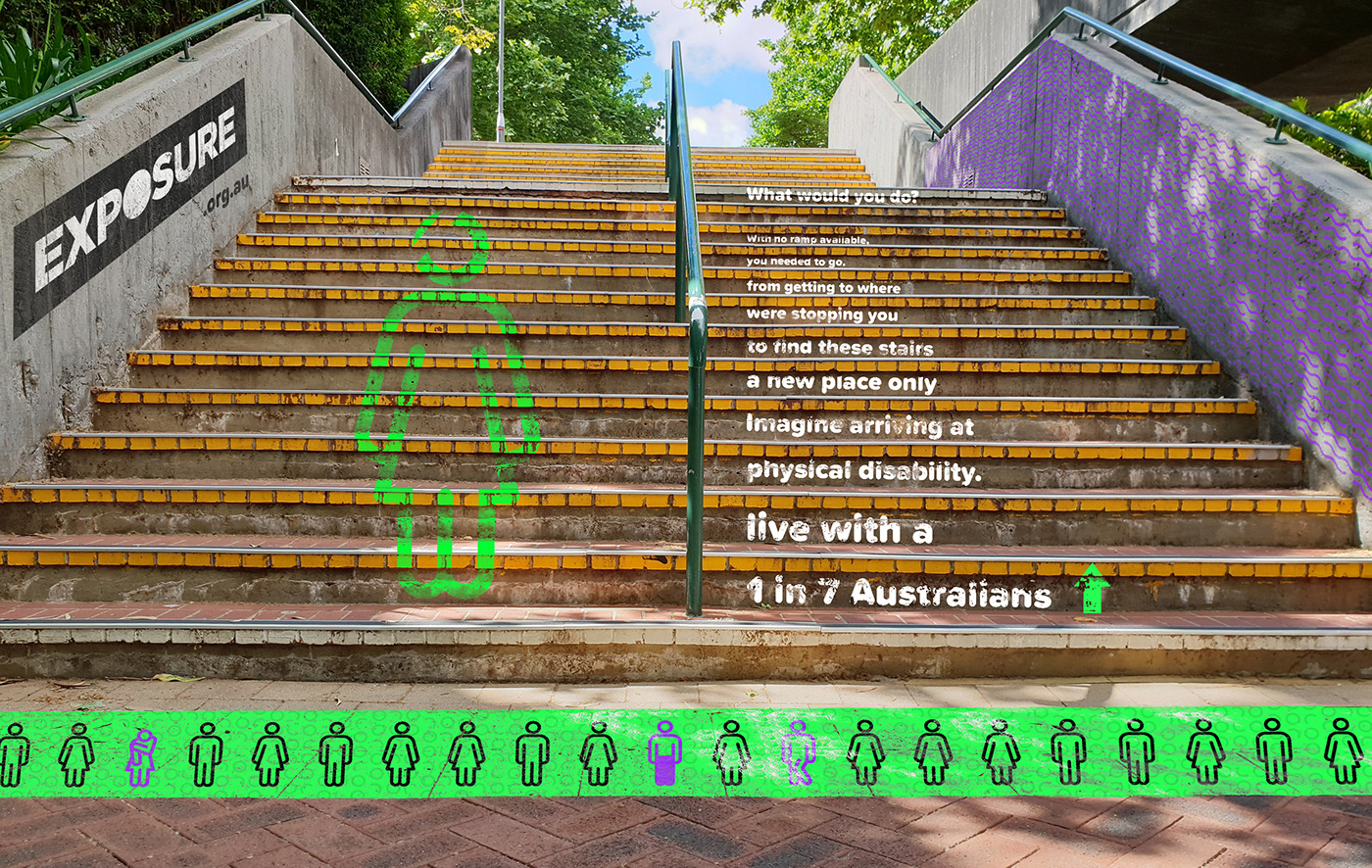
Place activation example in a University campus context.
Adobe XD prototype of campaign website


