Creating A Market-Leading Brand In An Industry That’s Hungry For Innovation With A Dream To Create A Strong And Healthy Community.
Cadence began as a physiotherapy business that has a huge passion in helping people and athletes restore their health and body movement through reestablishing the strength of their body core. Jon Joyce, the lead physiotherapist and owner at Cadence Physio, has been using Pilates as a tool to accomplish total body renewal and as a result of seeing the huge results, started building uniquely tailored Pilates classes that sought to fulfill the various needs of his clients.
From this place of a looking beyond a rehabilitative focus and developing the benefits of mobility, activation and strength, Jon had a dream to establish a separate brand as Cadence Pilates, one that still linked together with Cadence Physio. This is where we came into the picture, collaborating and consulting with the Cadence Pilates team.
We journeyed together to set Cadence Pilates as an industry leader with a total brand experience by establishing a bold and confident visual identity design, incorporating an eye-catching marketing collateral and merchandise experience with uniquely tailored branding and web design, whilst designing with foundational principles of editorial design in mind. Why? Because Cadence Pilates desires that their members be fully engaged and understand what the values and benefits are that they will see in return from investing in their health and fitness goals.


Approach
We discovered from our Roadmapping and Brand Discovery sessions that most Pilates studios are generally catered towards, or appeal, to a predominantly female audience. At Cadence Pilates, one of the distinctive traits is that their classes operate through a progressive and dynamic fitness model, which is uniquely designed to include male and female members and athletes.
We aimed to shift the perception within the Pilates industry primarily by building a design system that aimed to communicate Cadence Pilates as a unisex fitness model, with an emphasis on bold, confident and motivational personalities.
Three Key Elements In This Shift:
1. Cadence Pilates’ imagery strategy uses both males and females doing Pilates. In addition to this, the Cadence Pilates class photoshoot is led by trained physiotherapists.
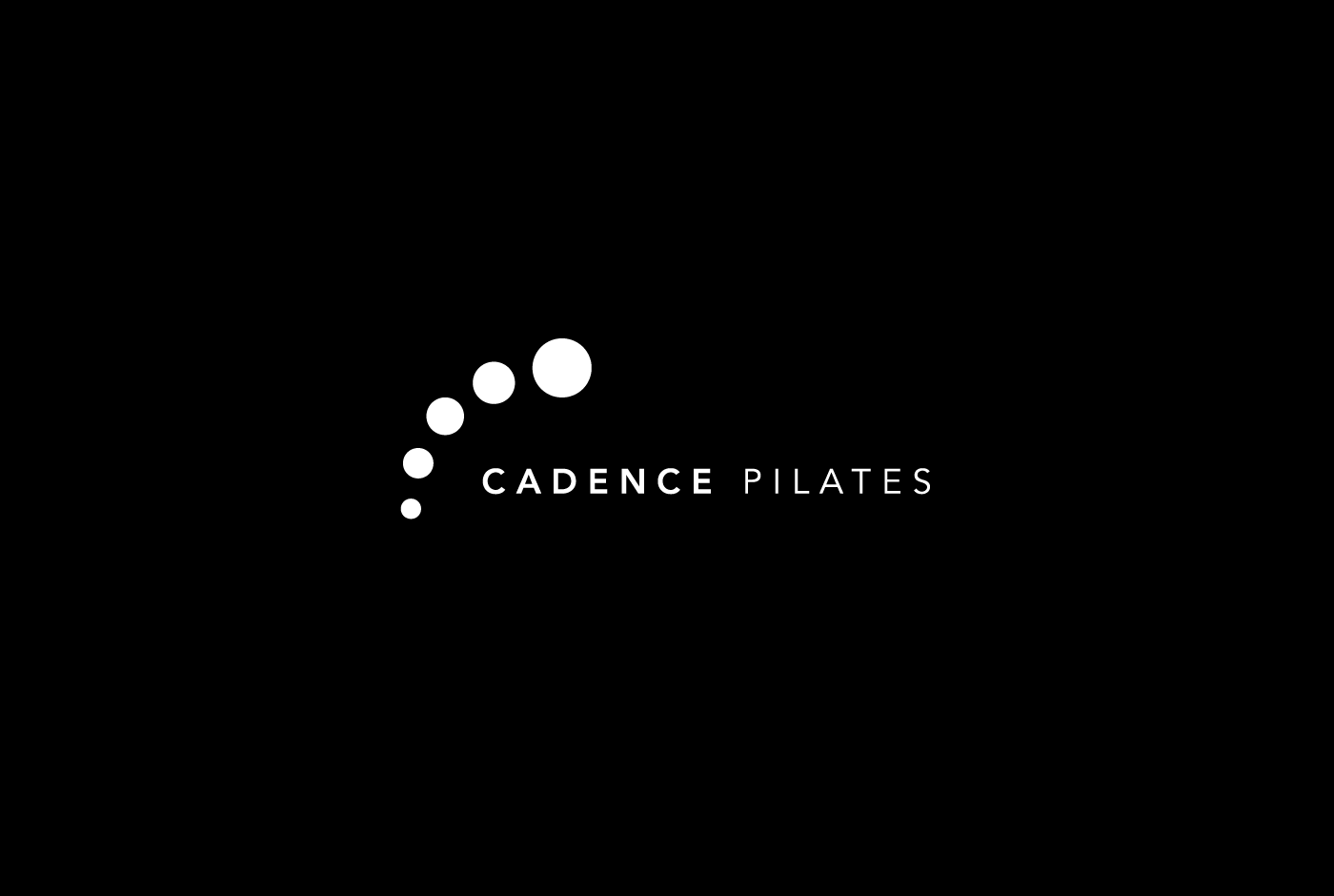
2. The Cadence Pilates visual identity (logo design) typography strategy is uses a thick and thin font type, within the Avenir font family to reflect the characteristics of both the male and female body figures.
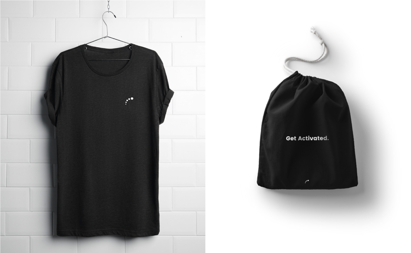
3. The Cadence Pilates color strategy use a classic black and white combination, along with with light grey, communicating elegance and boldness at the same time. For marketing collateral, we continued to use black and white as the dominant feature but also incorporated rich pastel colors that emphasize the different characteristics of the both male and female audience.
“We set out to create a visual communication framework both in the brand identity system and web design that carried a strong sense of culture, belief systems and instantly spoke a motivational undertone to all prospective members.”


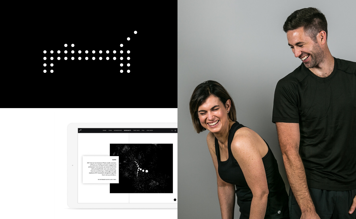
Workouts
Cadence Pilates bridges the gap between various forms of fitness and combines them to create workout that focus on reaching specific goals, rather than floating through exercises without set direction or goals in mind. For this level of forward thinking in fitness models, an identification system for the workouts needed to be built as an integral part of the brand identity system. Rather than creating separate forms, we decided to take the direction of expanding the brand using the visual communication already established so that members and prospective members can continue to directly associate the workout logograms with the brand identity as a whole.
“WE IMAGINED THE LOGOGRAM ACTUALLY DOING THE WORKOUTS.”
From there, we activated the Cadence Pilates logogram into a ‘person’, exploring the various movements within the Cadence Pilates workout routine. We carefully studied the movements, as well as the philosophy and history behind the movements and Pilates itself, in order to create a refined and unique design that communicates the intricacies of Cadence Pilates in an organic, effective and bold manner.

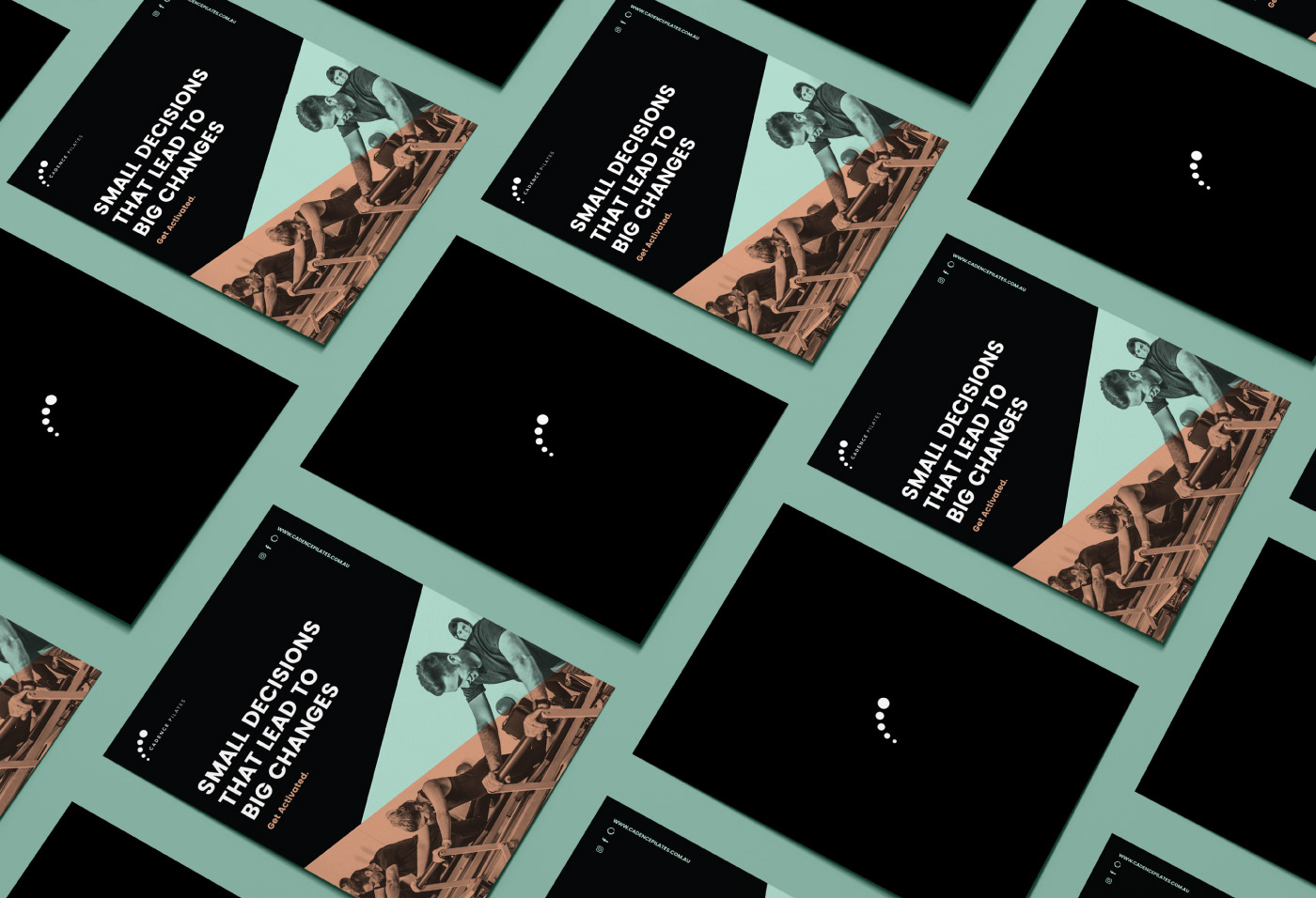
Promotional
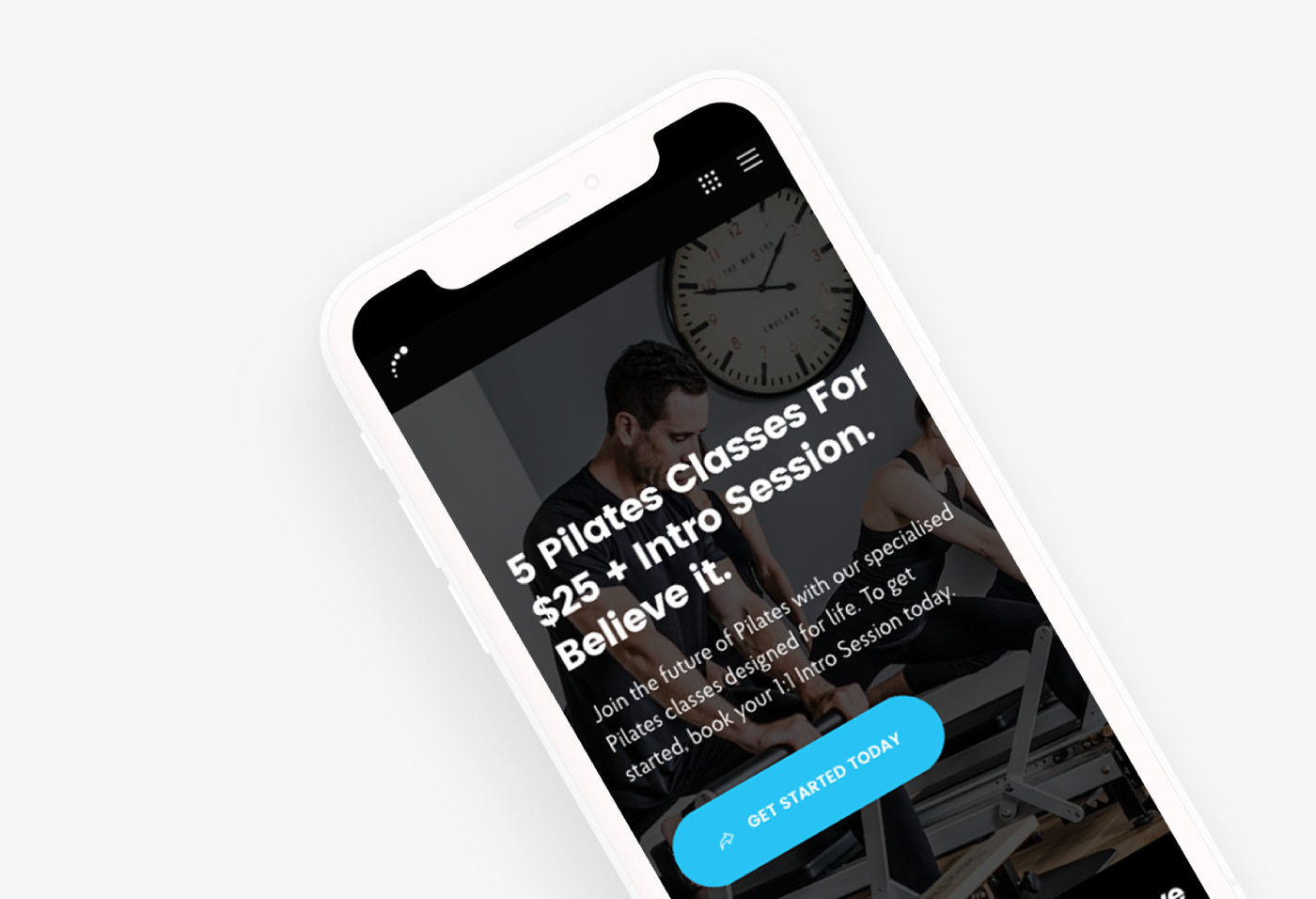
The primary expression of the Cadence Pilates brand colors is Cadence Black, Cadence White and Cadence Grey. This color system was chosen based on the discussed primary target market as a part of the consultations throughout the project. However, from a marketing and promotional point of view, this left very little room to move in regards to capturing prospective member’s attention when it came to activating the brand through promotional and marketing collateral. We took the progression of the brand forward with the use of vibrant colors that give an opportunity for Cadence Pilates to be seen in a new light and evoke the emotions inherently evoked from the use of color.
GETTING ACTIVATED WITH A NEW FITNESS MODEL.
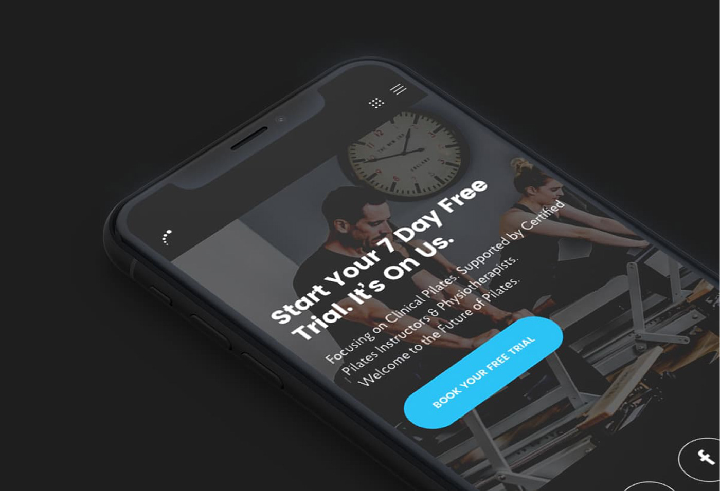
For the photography, we worked with international fitness photographer BrackenStrong, who recently shot at the 2016 Mr. Olympia, is an Optimum Nutrition Athlete and an Optimum Nutrition photographer. We led the art direction of the photoshoot with a creative brief by depicting the personality of the Cadence Pilates brand and in doing so, setting the framework by which we could capture the culture of the brand to evoke emotion and motivation.

Brand Activation
We positioned Cadence Pilates as more than just your typical Pilates studio, because Cadence Pilates is about Pilates workouts designed for life. As the first Pilates brand to integrate extensive goal-based Pilates workouts, as well as a robust acquisition, training and membership model, Cadence Pilates is connecting with the wider fitness community and boldly bridging the gap between what could be and what's currently expected in the Pilates industry.