


PROJECT BY QUEENIE Studio
BEE ROYAL is a branding (with naming include) and packaging concept for a premium and finest quality honey, 100% Artisanal & Organic.
CREATIVE BRIEF :
- A strong and original brand identity between classic and modernity / distinguish for the competition.
- A brand identity & a packaging that we want to keep with a unique and beautiful visual.
- A brand environmentaly engaged for the planet and for bees care with an eco-design:
no overpack, printed media with recycled materials or recyclable, eco label.
- Educated/sensitized the futur consumer to the fragility, rarity, preciosity of honey and bees.
- Premium product and finest quality honey (organic and artisanal) considered as a fine dish that we have to take time to appreciate as a great wine.
DESIGN PROCESS :
I want to give back noble title to bees, take the royal bee as an emblem, and the hard work of the colony to offer to us their finest and precious honey accordingly to put forward the quality of the brand, the purity of the products with an elegant, fancy and sober brand identity.
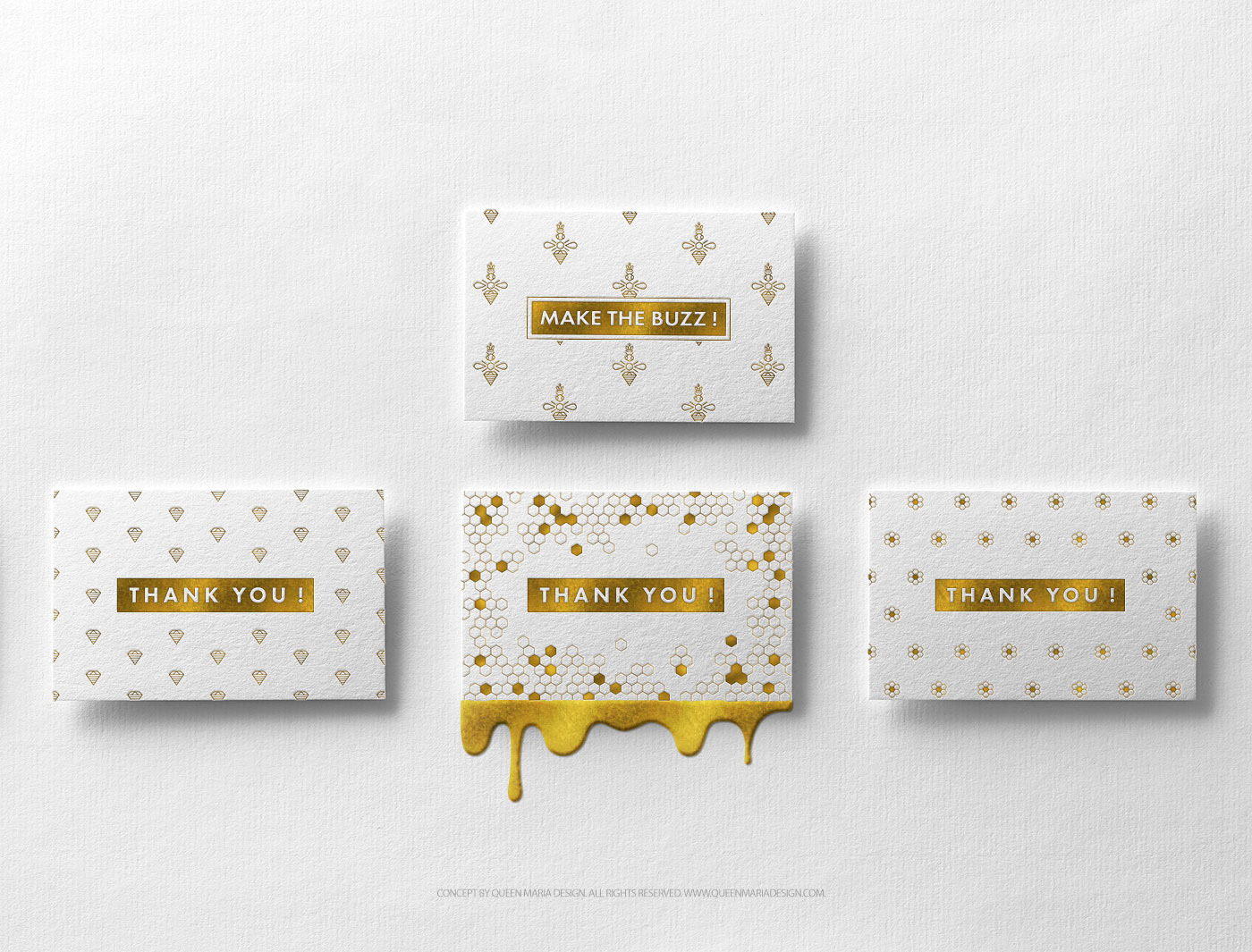
That's why I decided to choose a delicate and sober white/gold graphic chart with beautiful texture embossed finishing (that also remember the honey color) and a special colors code for packaging/tags according to the flavors.
All rights reserved © Queen Maria Design.

Business cards :

Customer cards / Thanks :


Enveloppe / stationary seal label :

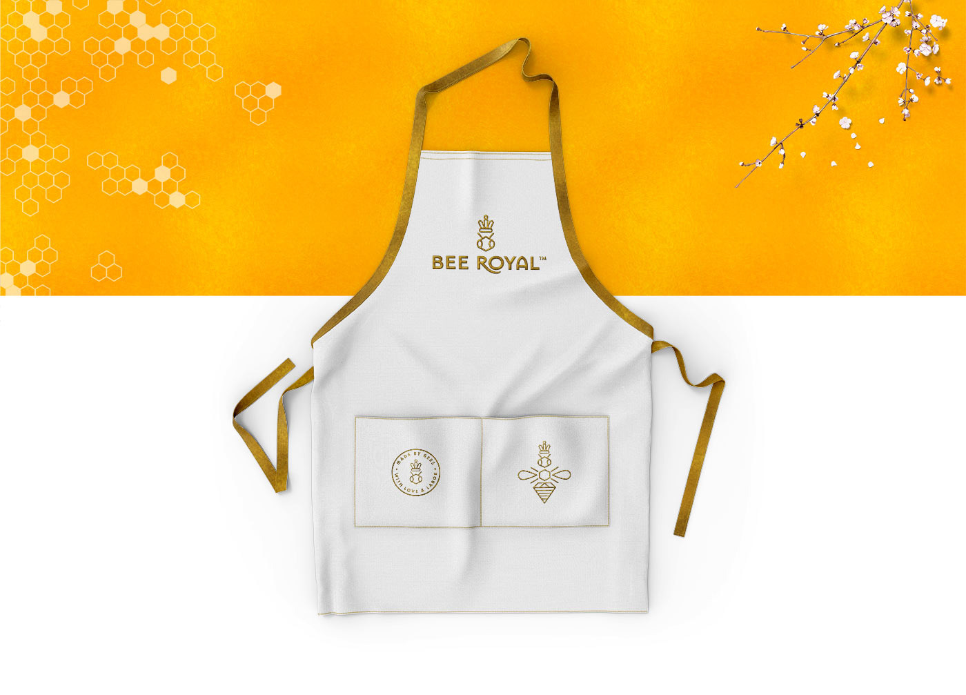
Embroidered apron for shop staff :
Honey jars packaging :


Special bee friendly label for bee royal :

Tags, label and emblem :


MAKE THE BUZZ !


