Sound and visual identity of O2.TV
National Television
Certainly playful design! It feels like one can touch it, move it, catch it. Having in mind what does it represent, O2.TV logo brings all the aspects of high television graphic standards and modern combination between shapes and characters. The composition is strong; lines, colors and shapes clear; general impression positive.
The television’s new and specific name was our focus during the logotype creation; on one hand – an inspiration, and on the other – a great challenge. A simple and modern name with a symbolic character demanded a very precise and clear solution.
The obvious O2 molecule connection and a sphere-like shape brought a regularity in this picture, along with a modern visual character.
A recognizable logo, adjusted to the demands of contemporary graphic compositions, balanced like nature and light like the air we breathe. This logo was created as a symbiosis between television and the organic world and the harmony it brings.
ART DIRECTION / GRAPHIC DESIGN / BRANDING

The logo is the visual identity of the O2.TV.
For on-air and outdoor use, and in harmony with the standards of O2’s mother company, a 2d solution of the logotype has been created, and it holds all its previous characteristics, with a new practical side.


The connection with organic and closeness with a male audience have given the best color combination for the look of this new logotype, blue and white are ideal for every possible use by keeping simplicity and elegance.


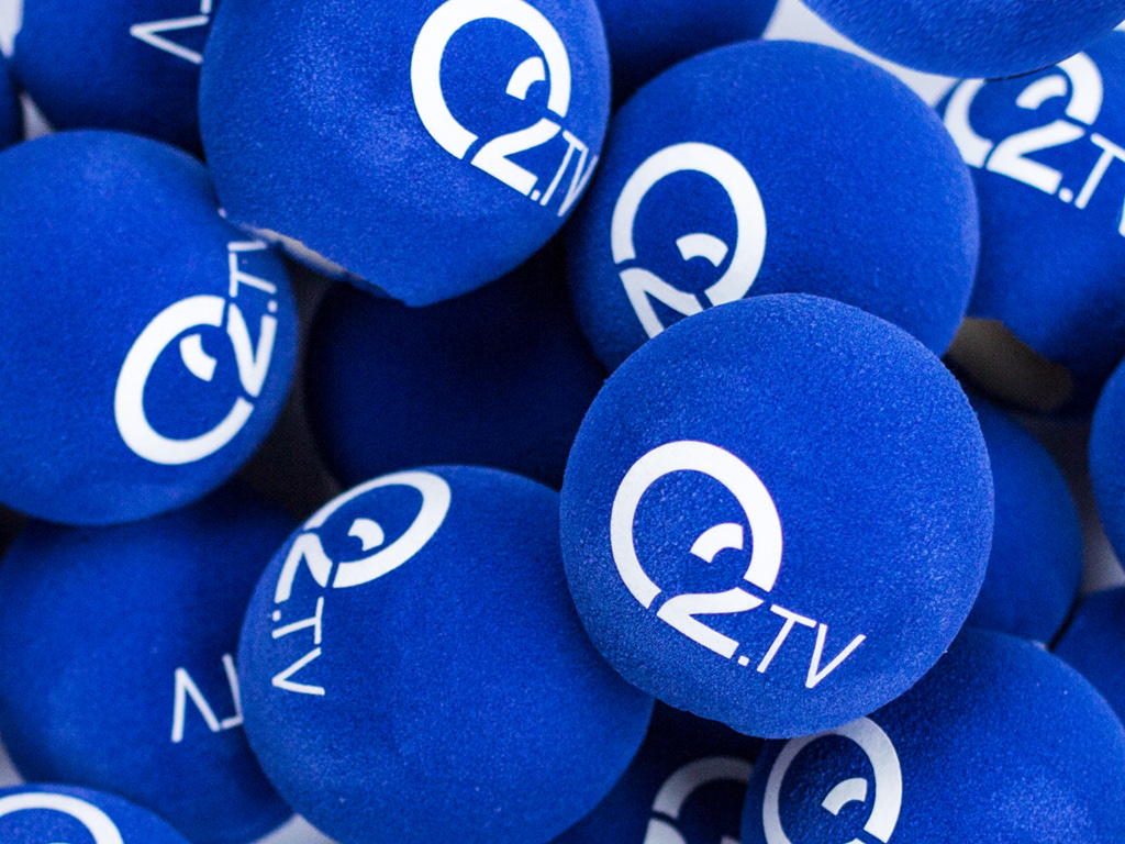
Microphone branding

ON-AIR
An important element of every TV brand – BUG – on-air use of the logotype has been followed with light transparency of the 2d logotype. At the same time, the identity of the television has been kept, and a unique on-screen image has been created.

BROADCAST LOGO

Tv Studio, Logo design
OFF AIR
Use of the circle as a visually recognizable element of the company and his connection to the appearance of the logotype, have led to a very effective solution, ideal for advertising TV formats through OOH. The circle separates TV characters of the advertising format, while the blue layer gives a frame to the written information and the brand.


Print

ON-AIR GRAPHIC / MUSIC IDENT / SOUND LOGO
The primary task was the identical direction of the television’s wholesome visual identity.
Art direction, led by the principles of practical, visually harmonious, modern and innovative has achieved the perfect
branding in all aspects.
The 3d animated ident is the strongest identity representative of the new television, next to the logotype. The play of organic shapes and harmony of movement have helped complete an original and memorable content of a very simple structure.

Promo ID, Art direction, Sound logo, Sound design
News intro, Art direction, Sound logo, Sound design, Logo design
3D animation: Pr1mer studio


