


Brand Identity Visual Design
for Penicillin Cocktail Bar
Penicillin Cocktail Bar is a part of a project named bEAuTy in Catalunya, Spain. I made identity and visual parts for this brand. Was hard and interesting job to investigate all the history of penicillin discovery,
read about doctors and scientists involved, dig into alchemy, going back to the roots of mixology.
The brand was planned as an extravagant mix of past and future, of the way how a one-man mistake can lead
to a big international BOOM and the teamwork heading the industries further, of the genius & accident,
of taste & experience, craft & art mastered with time.
Now a bit about the logo itself.

Different types of logo use:
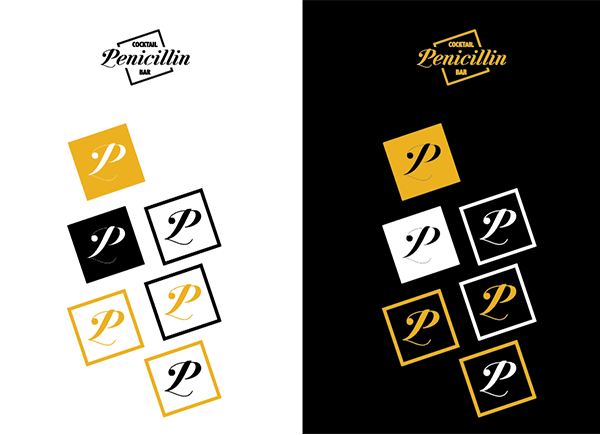
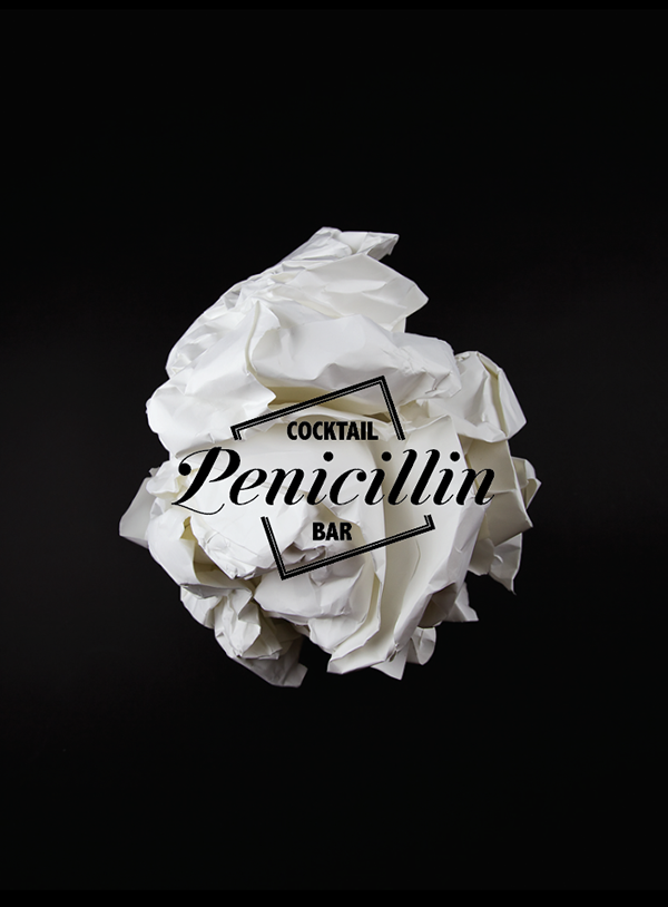
As a representation of such a great bond of themes in this idea I chose to make collages, using old and new photos, vivid colors, parts of old comics and science schemes. Under this text you can see a modified contour of a plate in which penicillin was discovered. This became like a stamp and guiding image in the brand map.


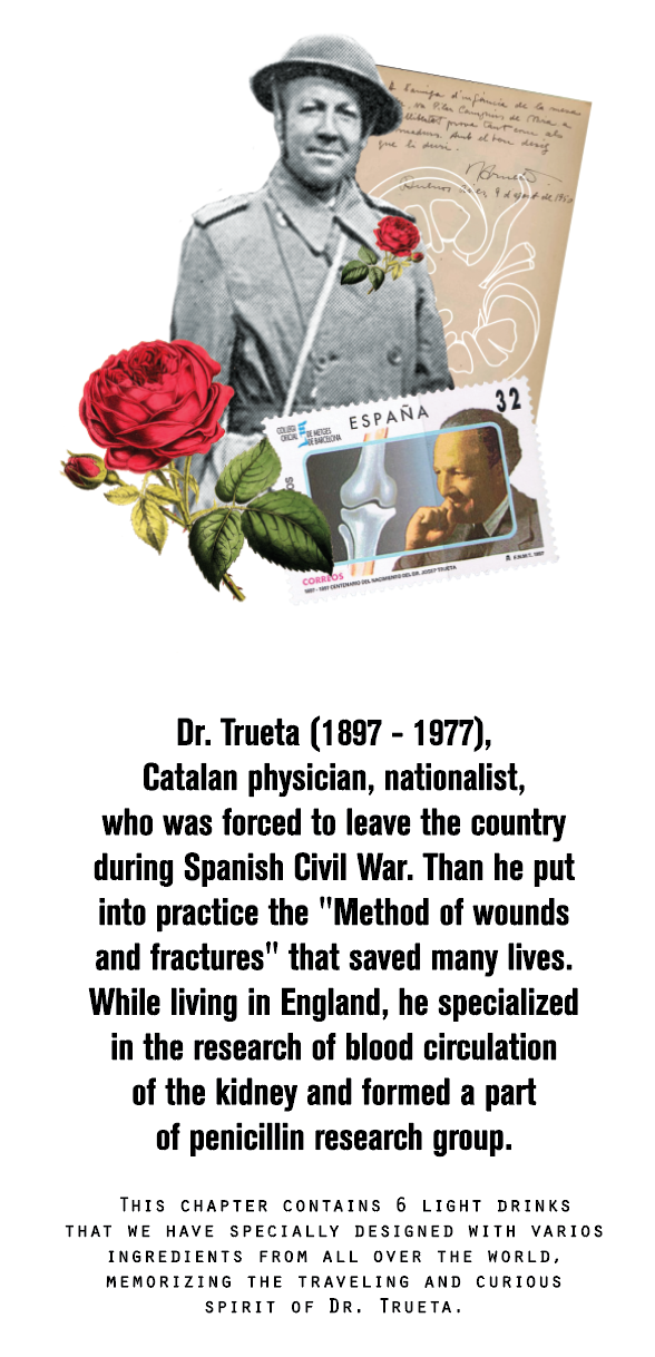
And here is one of the opening collages of the bar menu on top of which was thought to put the story of two main people behind penicillin discovry and popularization: Dr. Fleming and Dr. Trueta.

The menu was thought to have 3 chapters named after people who played major roles in alchemy, potion mixology and medicine over centuries. Here are the collages for the headers of each one with descriptions:

_____________________________________________
_____________________________________________

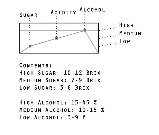
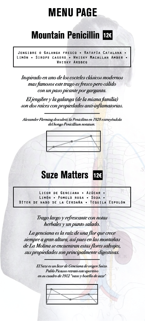
Next thing to be done was to find the way to imitate graphically the taste of every drink. To describe the taste scientifically you need to measure parameters. So basically it is analyses list.
So I was looking to medical charts & prescriptions.
This was the solution:
And this is how the page would look like:
It was a great experience working on this project that required not just design skills but analyses and material digging. This is what I like most - make things get together, structuring the essence and giving
it a shape. When nothing is just because, when each detail has purpose, its roots and connections
to the whole piece. Though this project was never finished, it still makes me proud of the whole road done.
Sometime ago I heard an expression - `overdesigned` - loved it. Totally my thing.
Hope you enjoyed.


