Simple & Pretty — Product design & strategy for startups
Money In, Money Out
A pair of apps to help freelancers with their bookkeeping

Money In and Money Out iPhone apps in a nutshell.
Project background
Money In and Money Out apps are a self-funded, independent collaboration between Simple & Pretty (Matt & Judit) and Andrei Mihailov, from Code is Poetry.
We started to work on our own apps with the intention of reducing some of the pain that comes with being freelancers, particularly when it comes to bookkeeping.
Objectives
Having worked in agency environments with both corporate clients and startups, the three of us had gained great experience in our areas of expertise (UX research, UX/UI design and code) but hadn’t had the opportunity to be a direct part of the entire product cycle, from ideation to launch.
Working together as an independent collaboration gave us the opportunity to own that process, and learn new skills along the way.
Goals
The solution we wanted to deliver should:
• Be faster and simpler to use than existing bookkeeping apps
• Save freelancers bookkeeping money
• Fill a space in the App Store that would generate us some revenue to keep on working in our own indie apps
How we validated the problem and defined our solution.
We started with a problem statement:
“Bookkeeping your freelance business is a nightmare, it takes loads of time and it’s cumbersome.”
And a set of assumptions:
“Thus, the majority of independent workers pay someone to do it, even if it involves paying higher accountant’s fees or a subscription to accountancy software.”
“A simpler, faster, more convenient way of bookkeeping on the go would replace the need of paying extra for it.”
We used these initial assumptions to generate hypothesis that we could test while conceptualising and executing the apps, some of them proof not to be correct and changed during the project as we developed better understanding.
With our assumptions and initial hypothesis lined up, we conducted just enough exploratory research to validate our statements about our target users, their goals, motivations, needs and pain points while bookkeeping their business.


User research to identify different user types
We organised an initial round of 10 user interviews with freelancers (our primary user) to gather information about their experiences handling incomes and expenses, and what problems and frustrations they face.
We conducted some interviews in person and others remotely, so we could have a wider and diverse range of participants (city-based, rural-based, digital nomads…etc). We wanted to be inclusive and avoid as much as possible our personal biases based merely on our own experiences. We wanted to distill commonalities and differences, so we could tailor our solution in the most effective way.
We also surveyed accountants (secondary user) to gather bookkeeping requirements for the accounts submission flow.
Parallel to this, we went into the app store to see what was already available in this space, so we could find out if our intended solution had a competitive advantage, or we were facing a saturated market.
Insights from our user interviews helped us identifying the wide variety of user types our product could reach, making it a blessing and a curse at the same time. Should we design for “Sam, the shoebox-keeper”, who hides receipts and invoices in envelopes until it’s time to send them over to their accountant? or should we target “Jamie, the Freshbooks subscriber”, who logs transactions regularly in an accountancy software?
We looked into patterns to identify what our users underlying motivations were, their needs and limitations to achieve their goals regardless the tools they were using. How could we make their bookkeeping simpler and more efficient, so they could save time, while reducing taxes and accountancy fees?

Preliminary persona for one of Money In & Money Out user types.
The experience requirements
Simple, focus, mobile app
We opted for a custom iOS-native UI, as we wanted to provide our users with a familiar experience that could be recognised, instead of having to learn a new set of patterns and interactions in their iPhones. The other benefit is easier inclusion of new native UI and functionality, that arrives in each new iOS — A painful lesson learnt from previous projects.
We focused and prioritised clarity and efficiency over aesthetic decisions. We opt for a non-jargon tone of voice, consistent labelling and clear system feedback, so the user could be at ease and control of their interactions with the apps.


Fast and smart
We prioritised work on features that could improve speed on input and submission, as one of the key requirements was saving freelancers time.
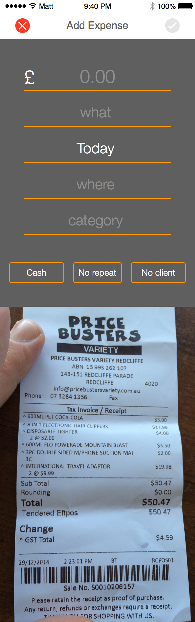
We discarded using existing technologies that have proofed to create extra friction in the input process, such as OCR (we wrote a blog post about it). Instead, we designed a data model that could proactively suggest auto-fills.
Our initial research concluded that, most of the times, people are bookkeeping a fix set of recurrent deductible business expenses and incomes types.
Creating and executing the user experience.
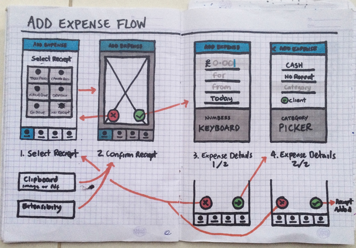
Early sketch for Money Out Add expense flow.
By identifying and collating the most common items into a data set, we could help people auto-completing not only items, but also suggesting in which category they fall into. Furthermore, the apps learn from user behaviour, adding new keywords to the data model.
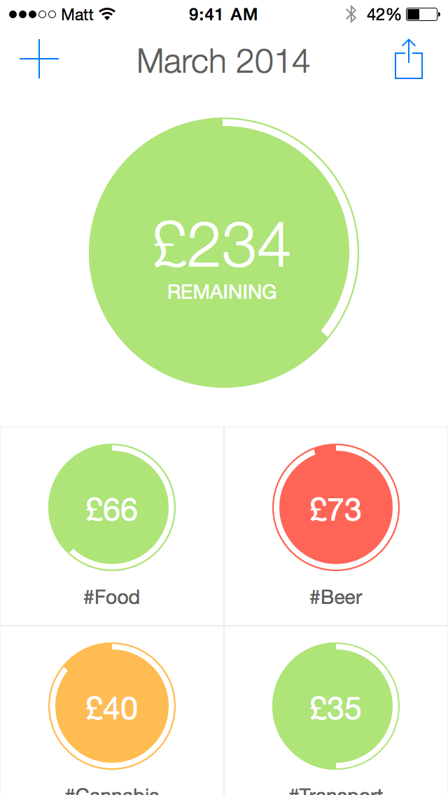
Money Out adding an expense, with predicitive input.
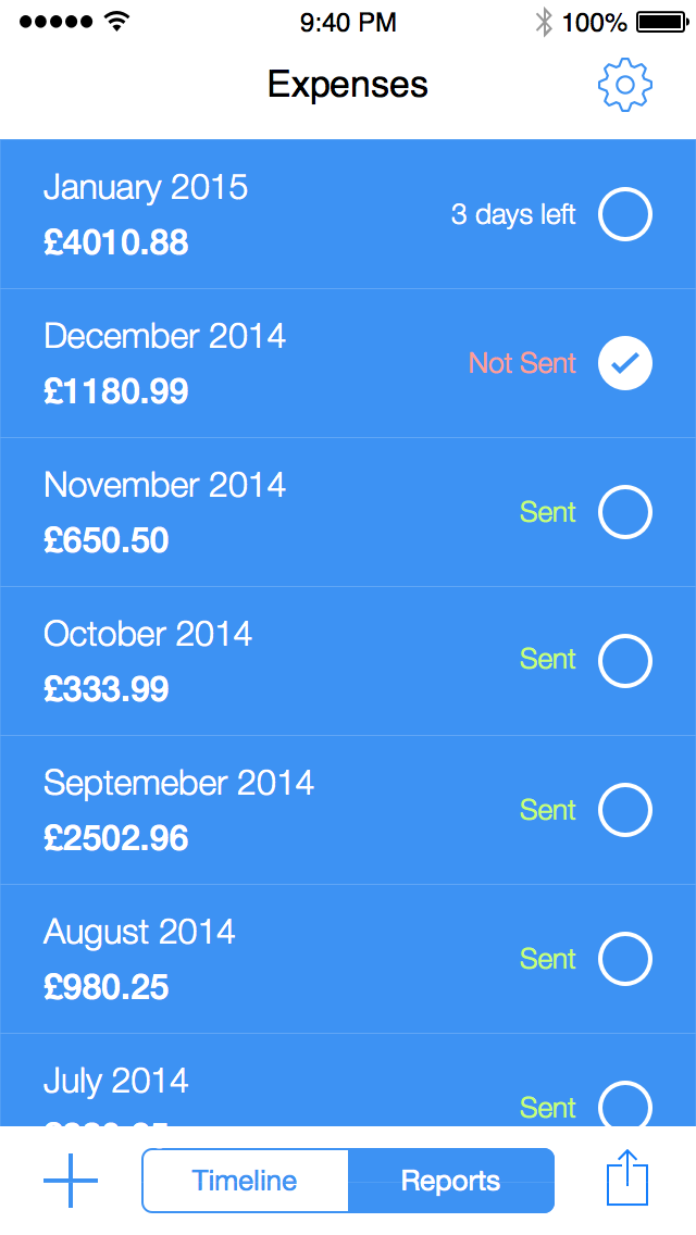
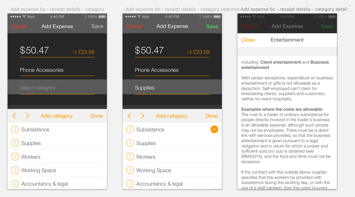
We also worked hard on designing a seamless submission flow. With only two taps, the user could send their period reports and proof of receipts via a pre-populated email addressed to their accountant.
Accountant-friendly
Beyond saving time, we wanted users to save money from their accountants’ bill. From our interviews with accountants, we learned that freelancers could save up to 30% of their fees, if they provided a comprehensive spreadsheet of transactions and proof of records that they could use to effectively complete their job. Failing to provide it meant customers had to pay extra to cover for an intern doing the bookkeeping task.
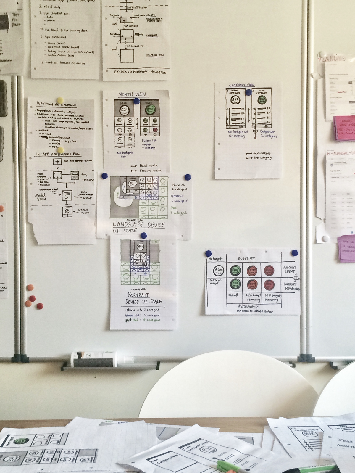
Money In & Money Out sketches on a whiteboard for discussion.
We tested our submission flow with both users and accountants, and went through several iterations to make sure data requirements were covered, without having negative impact in what was meant to be a user-friendly experience.
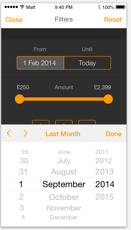
We mapped meaningful reminders to help users submitting on time, which would also safe them from overdue fines.
Iterating the design
These are some of the design iterations we went through:


Save, private and secure
We were fully aware that one of the key requirements for our solution was to provide users with a save and secure place to handle their financial data.
We took advantage of Apple’s iOS capabilities and company’s strategy when it comes to privacy. Through iCloud Drive integration, we were protecting our users data with FBI-proof 256-bit AES encryption.


Affordable and portable
During discovery, we identified a gap in the market that we thought we could fill with a unique competitive advantage.
Our solution not only didn’t require an ongoing subscription, it didn’t lock users data within the service. For the user, it meant that their data was portable, and they could access it anytime, anywhere, even if they stop using the apps.
We prioritised our users needs over our business ones as a long-term strategy that could pay off in the future.
Inclusive and accessible
We believe good design is accessible. In order to build an inclusive experience, we added accessibility labels to all elements in the UI, so we could implement VoiceOver for those with visual impairments.
Additionally, we optimised the UI and typography to allow Dynamic Type, which allows users could adjust their reading size preferences, without breaking the UI.
We picked colour-blind friendly palettes, to ensure people wouldn’t have issues interacting with the apps. Not being visually impaired, we had to test and iterate our implementation many times to refine.
Designing with (low-cost) user feedback loops
The two of us heavily collaborated in research activities by:
• Conducting and assisting during user research sessions
• Analysing and synthesising together key results
• Agreeing in next steps and actions
As we didn’t have a budget, we had to become creative in the way we regularly recruited and incentivised people to participate in user interviews and testing. Some of the things we did:
• We got lots of free help from our direct network of friends and colleagues, many of them freelancers
• We used freelance platforms, Facebook groups, Slack communities, Linkedin, Twitter and Craig’s List to seek research participants and gather user feedback
• We ran guerilla testing in co-working spaces and meet-ups in exchange for a coffee
• We used UsabilityHub, a user feedback online platform, to quickly and cheaply gather feedback to inform our design choices


Take aways
Over 18 months, with just enough client work to pay the bills, we expanded our skillsets, learning how to envision, create, build, release and iterate two digital products, end-to-end.
Design production and front-end development worked fast and lean through close collaboration, daily builds, testing and iteration. However, we underestimated the time it would take to implement key iOS backend features, such as CoreData and iCloud. This unfortunately created a production bottleneck in the last months before launch, which significantly impacted our planned milestones.
We also underestimated the time and efforts involved in marketing, as we were hoping that the Apple App Store would feature our apps as we were using their new technologies. We learned the hard way that app discoverability through organic search was mission impossible for most indie developers on the App Store.
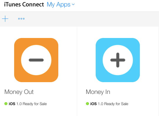
Money In & Money Out iPhone apps ready for sale in the iOS App Store
We launched in the Apple App Store in 2016, with iOS10. A few months later we localised them to Spanish and launched them in different regional markets.
Money In & Money Out promo gif for Spanish apps launch.
Related links


