Challenge
The Edwisor is a social learning platform that provides world-class curriculum and expert-educators for upgrading the skills of learners. The curriculum is created considering different segments of end-users — be it from urban or rural areas, professional aspirants, college grads(Fresher) or college students.
We specifically have three types of end-users, categorising them as — Working Professionals, Freshers & College Students
When we started this project, we came up with a set of product goals that the new app should meet. From these product goals, we filtered down to the following design goals.
1. Improve navigation throughout the app
2. Make it easy for learner to access the projects through app to get assessment from mentors
3. Make it easy for the learner to switch between the different career paths
4. Improve the UX and provide aesthetic feel at the same time
5. Make app design scalable
The Happy Path
For the new user: Plans to upgrade his skills → Opens the Edwisor App → Explore Courses → Start 7 Days Free Trial → Buy Full Career Path → Start Learning.
For the learner: Learning a course → Opens the Edwisor App → My Enrolled course → Continue Learning.
User Research
The research data was collected via internal stakeholders, feedback emails, support calls and through our learners.
- Target audience: 22-28 years
- Traffic ratio: 55% male, 45% female
- Paid users ratio: 80% male, 20% female
- Paid users ratio: 80% male, 20% female
Wireframes
After gathering all the requirements I started fresh with the Architecture of Edwisor App through which I created sitemap and wireframes. It helped me to get to the breadth and depth of the app.
Sitemap


Wireframe Snippets

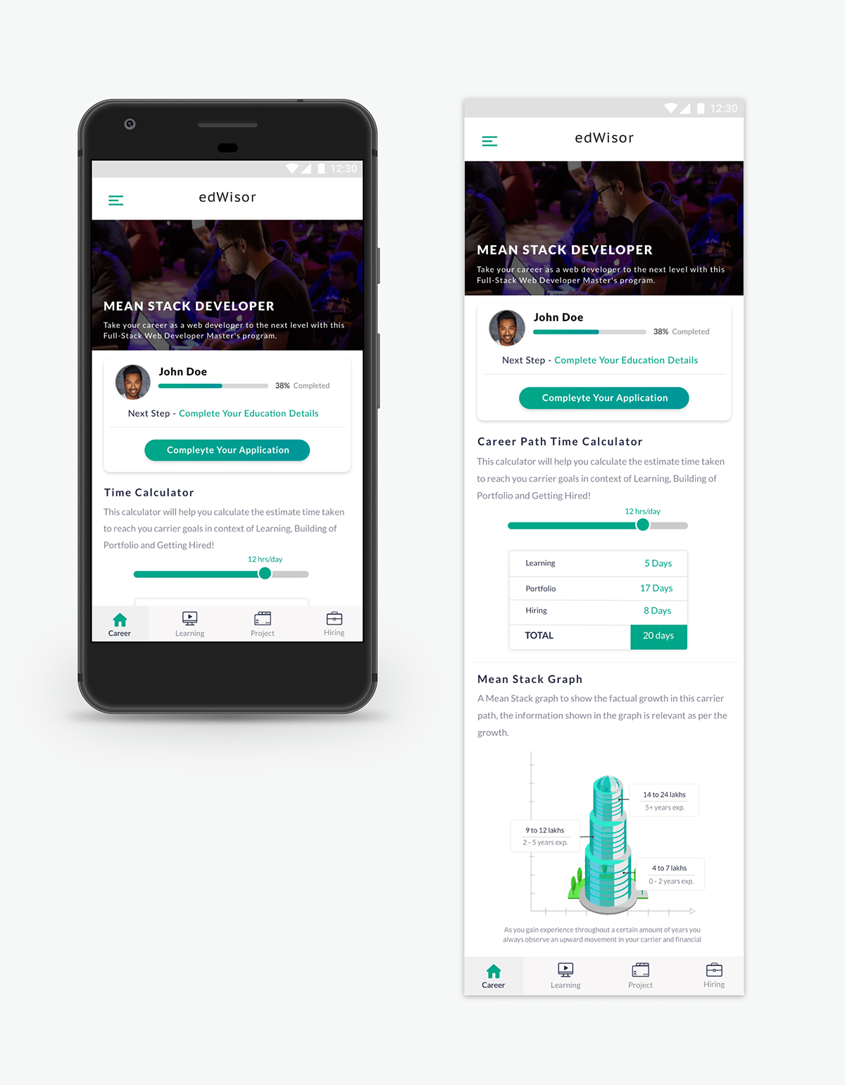
Goal 1: Improve navigation throughout the app
The goal was to branch the primary destinations of the app into bottom navigation. It allows the new user to explore the entire app starting with the career path details and start the career path as a 3 step process ( Get Skilled -> Do Project -> Get Hired)
But after doing the A/B testing, we had to provide Career Home as the default primary action. The default primary action in navigation allows the user to explore all about the career path details (inlcudes: career path time calculator, industry insights, mentors).

Goal 2: Make it easy for learner to access the projects through app to get assessment from mentors
The goal is to provide the portfolio building (a.k.a. Projects) right through on the go in app. As this is the new addition to the app, learner could now directly access the projects from app and also able to submit it through app.

Goal 3: Make it easy for the learner to switch between the different career paths
In the old version of Edwisor app learner did not have any option to switch between the career path as we provide a chance to new user when they are in trial period to change their career path but previously user can only do the same through raising the ticket from customer support.

Goal 4: Improve the UX and provide the aesthetic feel at the same time
While working on the revamp main goal was to improve the user experience in every aspect and provide aesthetically pleasing design at the same time because people often perceive aesthetically pleasing design as design that’s more usable.
We wanted to ship something that is fresh and provides a rich, engaging and delightful experience.

Goal 5: Make app design scalable
We already have a large number of audience who is using our product so, while doing the revamp I had to keep it in mind. I had to do it in such a way that learner need not relearn how to use the product and to make every step predictable.
Reflection and Learning
Redesigning the Edwisor app was a very special project for me as it was my first big task after joining Edwisor. I was excited to give it a new and useable interface. It is light years ahead in UX/UI when compared to the old Edwisor App.
Working on this project, I got to engage in brainstorming and reach a conclusion, collaborating with the developers and stake holders at each step. One important learning was taking design critique positively because at the end you are going to come up by creating something that is delightful and usable-by the audience.
In term of the success metrics, the overall engagement number got increased and Net Promotor Score is improved. Earlier our program completion rate was 25% on website but on transitioning to app, completion rate increase to 45% due to ease of access and use.
Our next steps include working on improving existing features and further integrate them into Android App