Overview
I'm Maddie, I'm the Head of Design at Hackabull for the 2019 season. ^-^
Hackabull is the University of South Florida's original student-run 24 hour hackathon. This will be our second year growing USF's hacker culture with the help of sponsors like JPMorgan, MLH, Github, and SHPE USF.
As Head of Design, I am redesigning everything - from our logo, to our marketing materials, to our website, to our physical goods! 🎉
In this ongoing project, I'm going to add the various projects that I've done so far for Hackabull. Hackabull hasn't happened yet - but it will in March!
After going to several hackathons in 2018, I ended that season with my university's hackathon, Hackabull. After attending all of these hackathons, I wanted to help throw the next Hackabull, and knew that I could help by building a fresh brand and visual identity for Hackabull. The thought of my work being online, on stickers, and on t-shirts was a huge motivator. It's a large task, and one that can create a lot of impact on our university's hacker culture. I owe a lot to hackathons, and to the community I've gained through them, so I'm working hard to give back.
Problem
As a young hackathon, our first year was beta-y. The major goal was simply to make the hackathon happen - to successfully demonstrate a proof of concept to our university, to MLH, and to prospecting sponsors was our first priority. And we did it!
As a result of that focus, however, design fell by the wayside. Many corners were necessarily cut; however, in this 2nd year, I was determined to help shoulder the burden of demonstrating a proof of concept by creating a strong Hackabull brand that was able to speak for us.
Solution
As a young hackathon with big goals, I decided to redesign our hackathon with the goal of hackers seeing us as a new, major Florida hackathon, leaving a strong brand image in hackers' minds that would help us grow in credibility and in size.
Research
The first task I had at hand was to assess the previous designwork that was done - what wasn't working in our favor, and how should I solve it?
First, I assessed the existing brands to find out how I could improve.
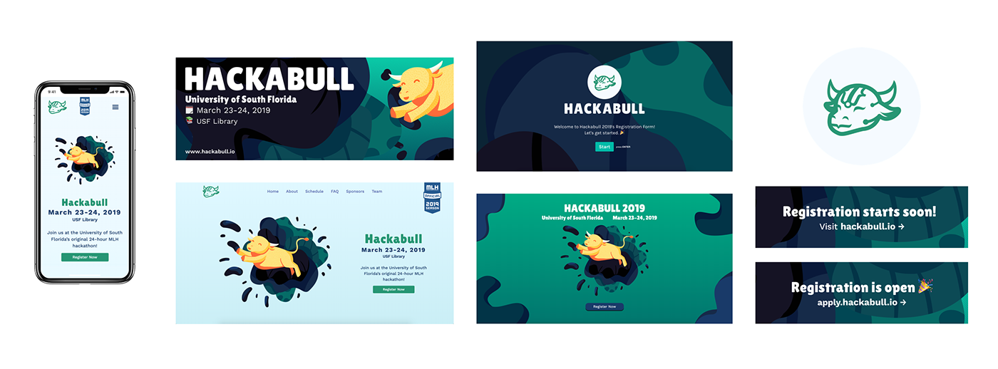
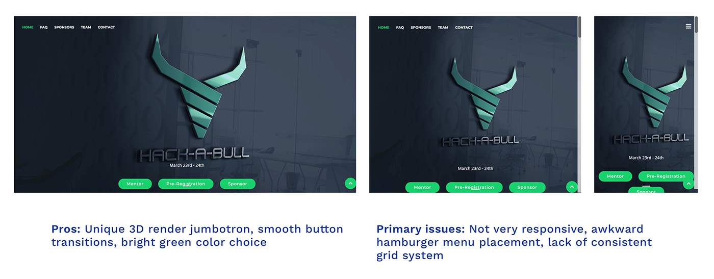
Site (2018):
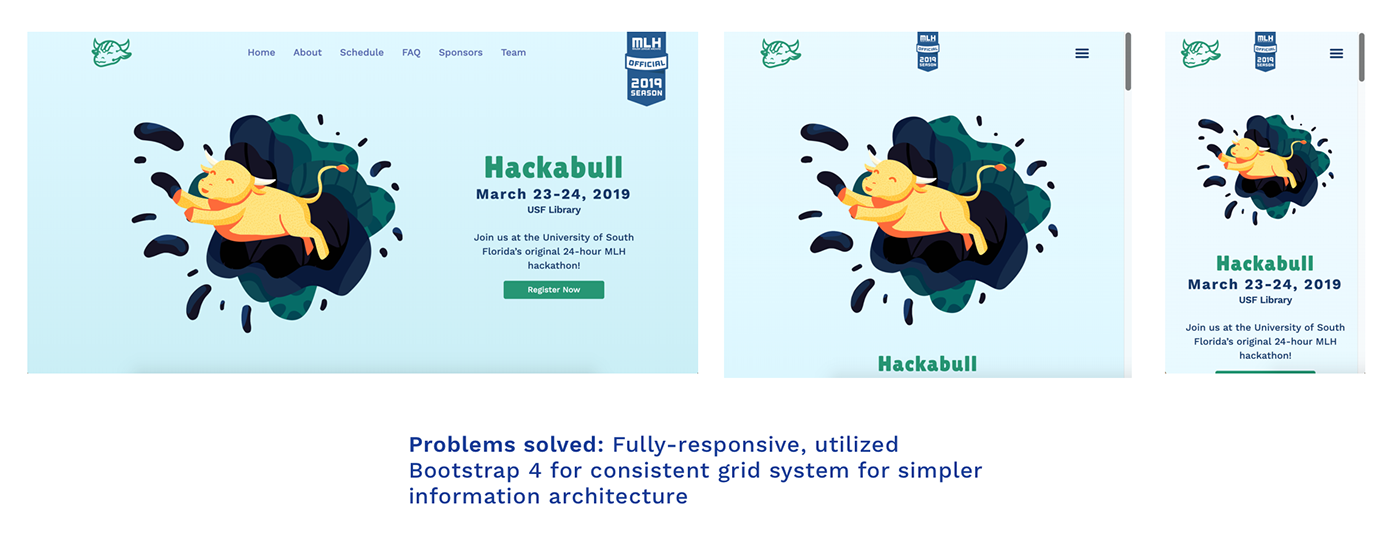
Site (2019):
Site 1: Splash Landing
Desktop, Tablet, Phone
What I Did: Design, code, add Google Analytics & deploy site
Release: January, 2019
Purpose: This site served as a temporary landing page during the finalization of web content and design for official site. Splash landings help to convey a sense of something "coming up", which helps deliver a sense of anticipation to visitors regarding the registration & official site opening.


Logo Redesign
This was a fun one!
The 2018 logo was made by someone else, along with our old site. I wanted to strengthen our brand visually to be more unique, fresh, and stronger in personality.
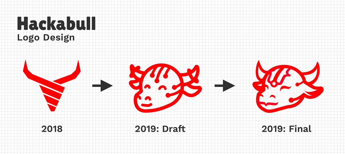
The draft iteration in the middle was one of four expressions. I showed the four options to my team to get their input on what felt best. To my surprise, the almost unanimously chose the one you see in the middle! So, I went with it and polished it up to become our new logo.
I added brackets, a common symbol in code, into the bull's design - as the mouth, and in the pattern on the forehead. Also, my team interpreted the eyes as tildes, which is also used in code. There are circuit marks on the bull in the logo as well to play with concept of a hackable bull.
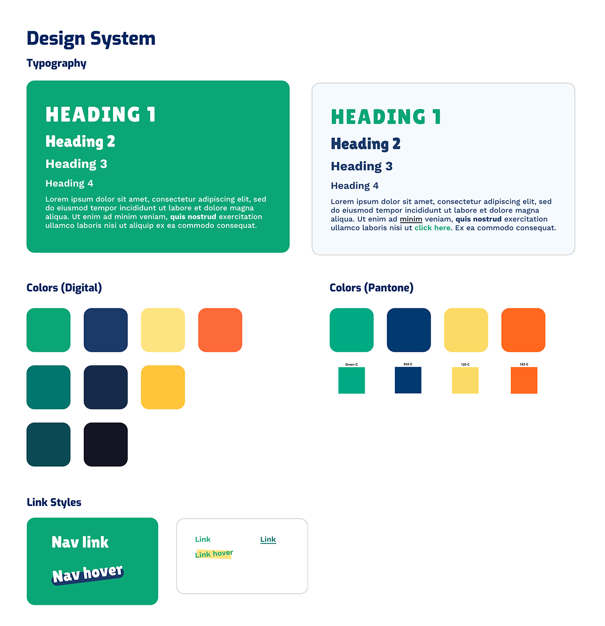
Design System
I intend to fully flesh out this design system, but for now, it has no hex values/etc. I'm the only one using graphics, and all of my colors and font styles are saved as symbols. With more time and with a team, I'd be sure to have clear documentation about the design system we're using.