Beam Suntory India
RETAIL SHELF TRANSFORMATION
The retail landscape for spirits has undergone a massive change over the last three years. Spirits are aggressively advertising in their retail spaces. Shelves in the stores are directly communicating with the shoppers to entice them with interesting materials and stories. The definition of premium has changed. It leans towards being more interactive, elegant and enticing.
The Beam Suntory India portfolio has the following brands-
1. Single Malts: Laphroaig & Ardmore
2. Blended Scotch: Teacher's
3. Bourbon: Jim Beam
1. Single Malts: Laphroaig & Ardmore
2. Blended Scotch: Teacher's
3. Bourbon: Jim Beam
THE BRAND CHALLENGE
Teacher's being the known brand of whiskey, needed to be upgraded in the retail space to create the right conversations and attract more customers. A visual merchandising strategy for Beam Suntory India (BSI) brands had to be devised by keeping in mind the current competitive context and using available technology. For the retail space, the entire unit was under the title of 'Whiskies of the World' . The unit itself failed to come in the purview of the shopper. Hence it became essential to help in increasing the brand visibility on the store and the unit itself needed to have stocking capacity as most of these stores would not provide provision for them independently.
The key deliverables for this project were:
1. A branded unit with Teacher’s, Jim Beam & The Ardmore Legacy
2. Individual Brand units and all placed together
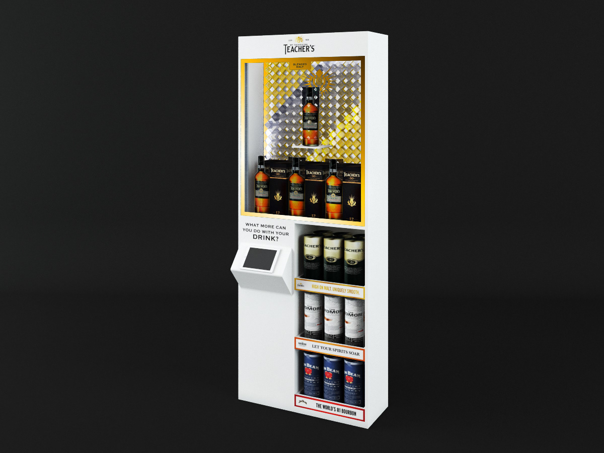
3. Teacher’s Branded Unit
Director of Design (Consultant) - Chirag Thakkar
Designer - Abdul Khader A K & Hafsah Parkar l 3D Rendering - Anket Pagare
Company - Interspace Solutions

CURRENT RETAIL SCENARIO FOR THE SHELF UNIT OF WHISKIES OF THE WORLD
THE SOLUTION
We needed to bring alive the brands that BSI had in the market. The ideal way would be to create a personality for the unit which would add character to the shelf unit itself. Whisky is primarily drank due to the legends and stories associated with its making process. We decided to add characteristics of that story to create a mystery and curiosity about the brands. It became a challenge to showcase the age old craft and labour of passion but, highlighting the origin story of each brand became the start point of this exercise. This was done using the right materials and relevant typography.
THE DISPLAY
Understanding the category was the starting point and then creating the right hierarchy for the same. Below is illustrated information hierarchy for the shelving unit. The materials suggested were also warm tones like copper and brass keeping in mind the colours of the brands. Use of white would help in highlighting the display unit in an otherwise dull space.
Understanding the category was the starting point and then creating the right hierarchy for the same. Below is illustrated information hierarchy for the shelving unit. The materials suggested were also warm tones like copper and brass keeping in mind the colours of the brands. Use of white would help in highlighting the display unit in an otherwise dull space.


THE CONSTRUCTION OF THE CONCEPT

VISUALISATION OF THE CONCEPT
1. INDIVIDUAL BRANDED UNITS OF THE BRANDS


LONG SHELF UNIT OF THE BRANDS
TEACHER'S BRANDED UNIT