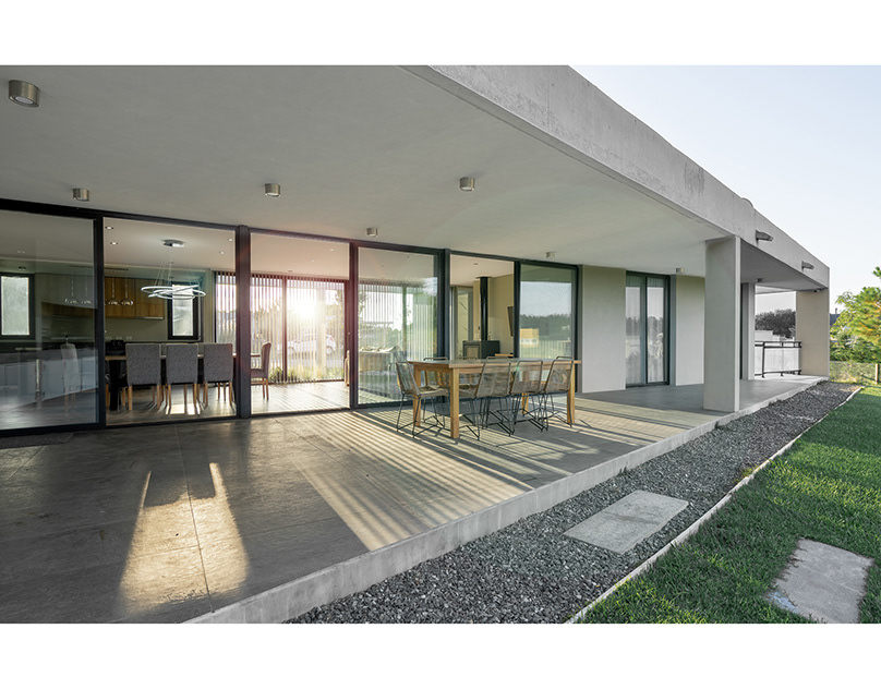
Tahhan started out as a well-established construction company.
Our rebranding strategy was to showcase their professional role as a Real Estate Development company as well as projecting their strong construction heritage.
Our rebranding strategy was to showcase their professional role as a Real Estate Development company as well as projecting their strong construction heritage.
We created Tahhan’s English initial letter using basic isometric shapes, creating a solid icon depicting a building. The icon also symbolizes Tahhan’s strong presence and heritage in the market.


