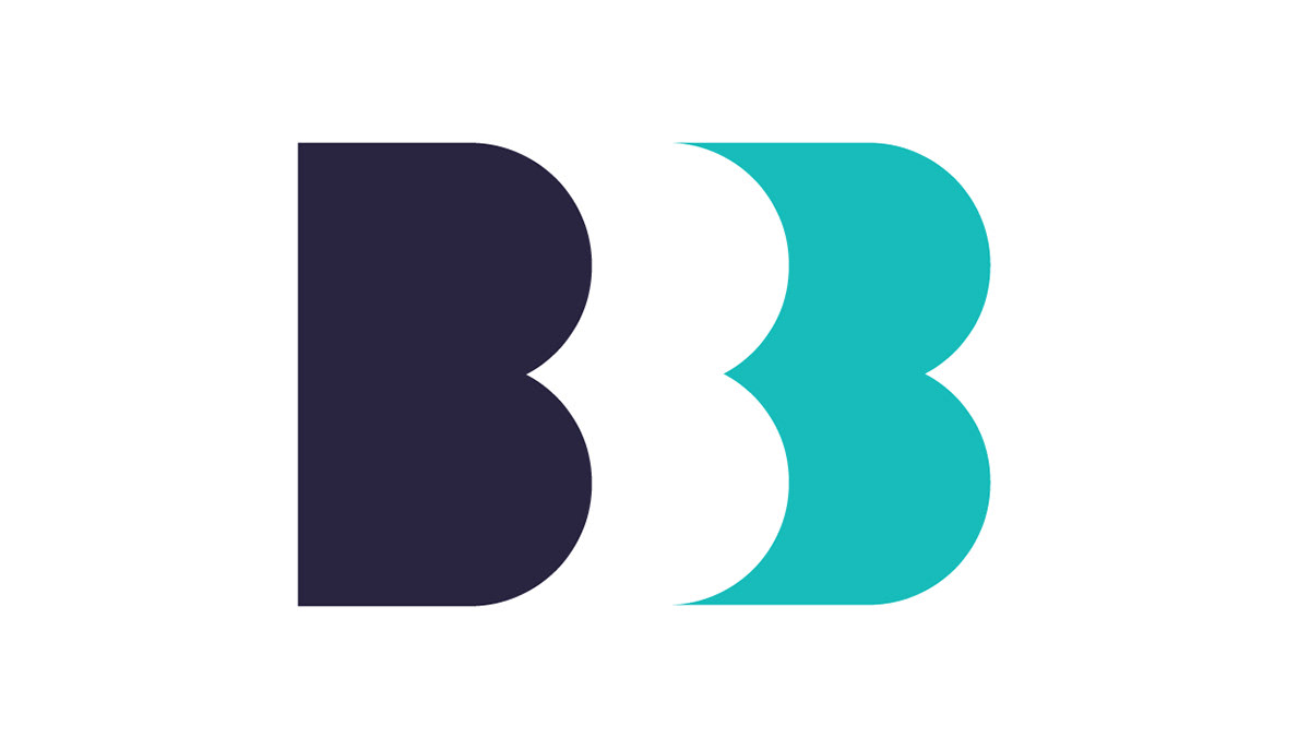
Brobyn Foundation logo
My first concept stemmed from the last name of the three brothers who headed the non-profit. This logo highlights the importance of a family-owned foundation. The three “B’s” play with negative space to become just abstract enough to be interesting. Paired with a clean typeface, the look is fresh yet professional.