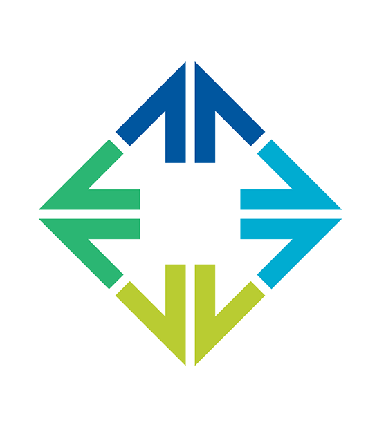
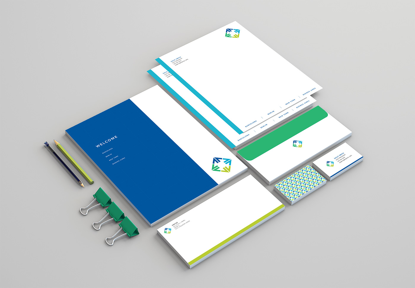
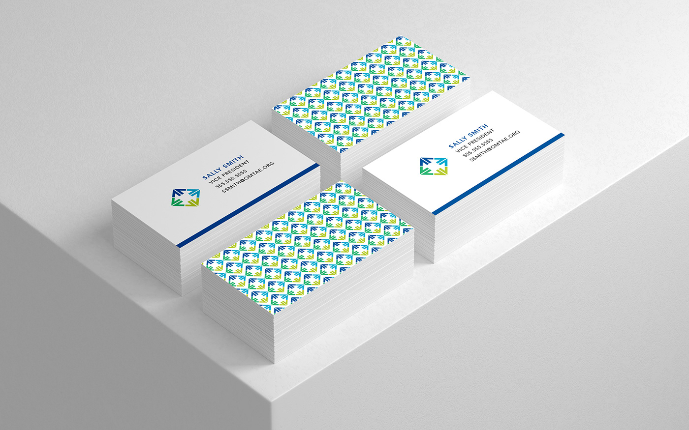
OMTAE: Non-profit logo
Given the task to design a logo for a non-profit holding company, I wanted to somehow represent the idea of exchange. Since the company does business both in foreign and domestic affairs, the logo also needed to convey movement.
I played with abstracted arrows to represent the non-profit’s dynamics; the idea of propelling growth. Arranged in a diamond shape and composed on 4 colored units, the logo mark represents each of the verticals in their business model. Paired with a fresh color palette and sleek typeface, the logo stands for a modern company that is looking to expand into the future.
I played with abstracted arrows to represent the non-profit’s dynamics; the idea of propelling growth. Arranged in a diamond shape and composed on 4 colored units, the logo mark represents each of the verticals in their business model. Paired with a fresh color palette and sleek typeface, the logo stands for a modern company that is looking to expand into the future.