


An exciting first impression for an outstanding product.
Background and Challenge
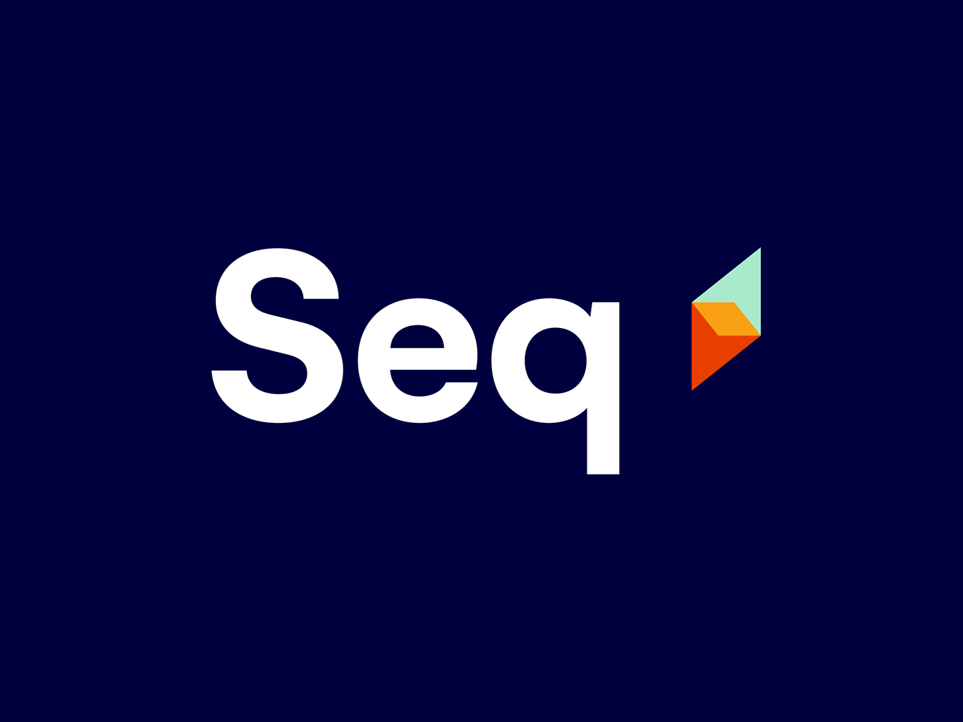
Seq is a diagnostics platform used by software developers at leading companies to confidently operate and manage the systems their businesses rely on. It materialises detailed information in real-time so developers can identify small issues before they become big problems.
Working with any brand is a wonderful opportunity, but working with one already held in high esteem by their audience is particularly invigorating. Entering the discovery phase of our rebrand process necessitates asking a lot of questions, in order to distill the driving purpose of a business.
A key insight that came of this was that the Seq user’s experience is like finding a ‘diamond in the rough’; that is, a great product whose first impression is far surpassed by the quality of actual user experience.
Our Approach
Seq empowers developers with insight, bringing the gift of clarity to technology, which we sought to translate into a visual identity. The diamond icon represents illumination, insight and new perspectives - the symbolic elements of Seq’s ability to crystallise the location of problems and gaze steadily upwards in constant improvement. The colour palette is broad to accommodate a number of digital software requirements, it's bright nature allowing for more joyful expression.
For developers, Seq provides the ability to realise what was once hidden – to 'see in the dark', so to speak. This presented production opportunities for the use of a luminous ink, a feature emblematic of the revelatory experience preserved for those ‘Eureka’ moments of the Seq user.


Testimonial
"When we began work on our brand refresh in 2018, we had a product used and loved by thousands of customers, and a brand that had just grown organically alongside it.
Working through a branding refresh with DSR helped us focus on Seq not just as we and our customers see it, but how it's perceived by newcomers who don't necessarily know what our product is all about. The first impression made by our branding needed to reflect the excitement, curiosity, and empowerment felt when using our product - somewhere our original branding fell short.
Redesigning our brand wasn't easy. The earlier look, feel, and logo, represented a business we are proud of, and a product we are deeply attached to. From the outset, it was obvious that DSR would bring a level of professionalism and polish not present in our earlier branding, but it took a lot of collaboration to reach a result we could love as our own. We couldn't be more pleased with the outcome.
Immediately upon launching the new logo - just the tip of the branding iceberg - positive feedback came in thick-and-fast from interested customers and supporters. As we continue rolling out more elements of the refreshed branding, we're finding that we're increasingly able to present our product in the way we ourselves see it - which is a huge win, and a benefit we didn't foresee when we started on this journey."
— Nicholas Blumhardt, CEO - Datalust


