Torchwood Labs is a research and development company that is researching brain to machine interfaces for applications like entertainment.
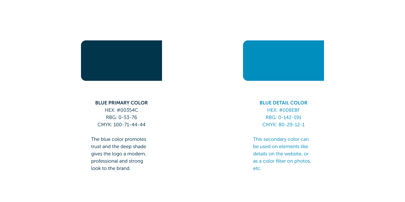
A brain-computer interface is like a communication pathway between a brain and an external device — a bridge between the brain and the machine — a bridge between the organic and the digital. The left side of the logo represents the brain, therefore the soft organic edges. The right side in contrast represents the machine, therefore the hard edges. It's a subtle contrast in order to keep the logo balanced. The same is reflected in the font with "Torchwood" in Museo Sans Rounded and "Labs" in Museo Sans.
I've used this concept as a silver lining for the brand image with the organic / soft edges on the left and digital / hard edges on the right. The photo-illustration sums up the brand image: a leap into the digital from the photo-realistic left side into the digitally-stylized right side of the image.


