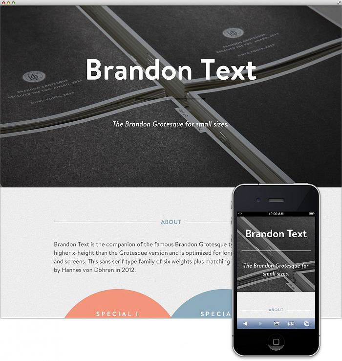
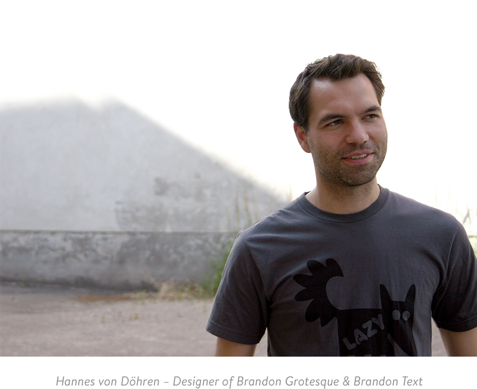
Brandon Text is the companion of the famous Brandon Grotesque type family. It has a higher x-height than the Grotesque version and is optimized for long texts, small sizes and screens. This sans serif type family of six weights plus matching italics was designed by Hannes von Döhren in 2012.

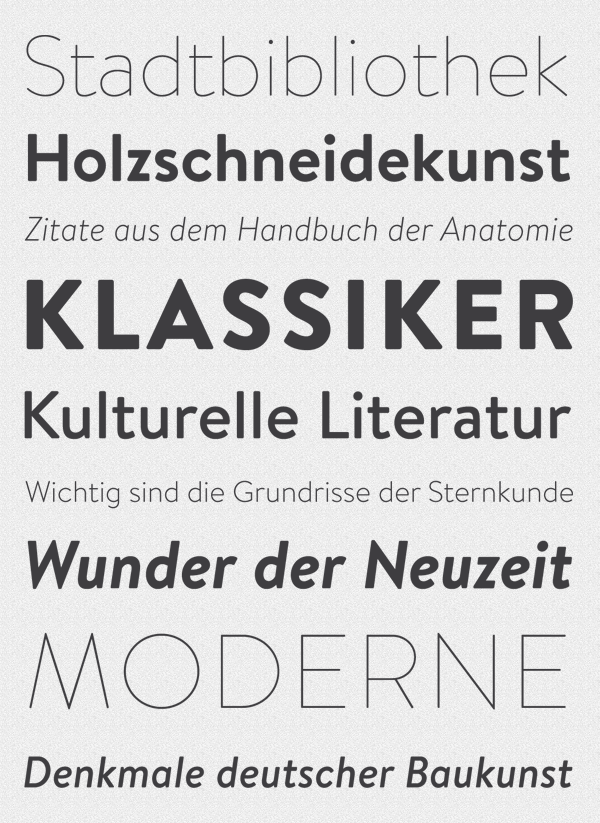
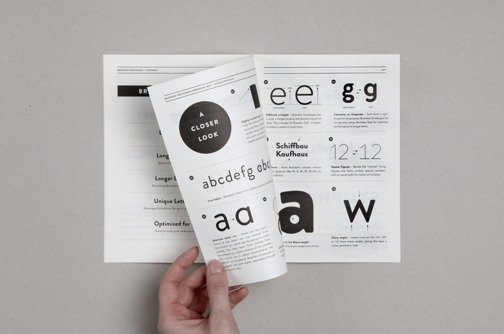
Influenced by the geometric-style sans serif faces that were popular during the 1920s and 30s, the fonts are based on geometric forms that have been optically corrected for better legibility. Brandon Text has a functional look with a warm touch and works perfectly together with Brandon Grotesque. It is manually hinted and optimized for screens, so it will be a good choice for Websites, eBooks or Apps.

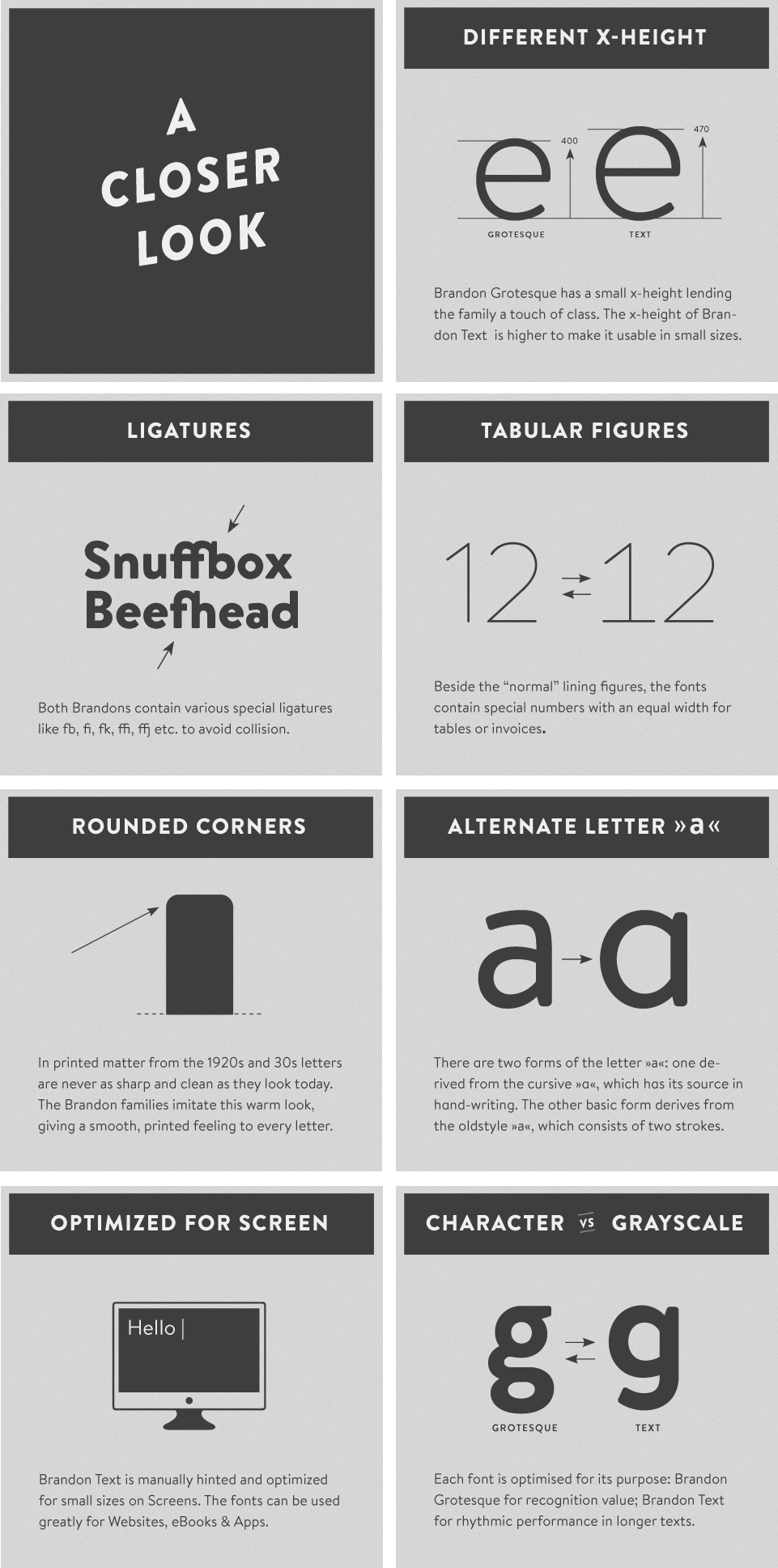
The whole Brandon series is equipped for complex, professional typography with different sets of numbers, alternate letters, fractions and an extended character set to support Central and Eastern European as well as Western European Languages.

Brandon Text comes in 6 weights plus matching italics. From the fine and noble Thin weight to the extra strong and loud Black weight.


The first 100 buyers of the complete Brandon Text family will receive a limited brochure about the fonts. Just send your MyFonts invoice to: hannes@hvdfonts.com and this wonderful little gift is on its way to you…


For all you quick guys, we have another special: the introductory offer until the 28th of February, 2013. You will get a 30% discount on Brandon Text.

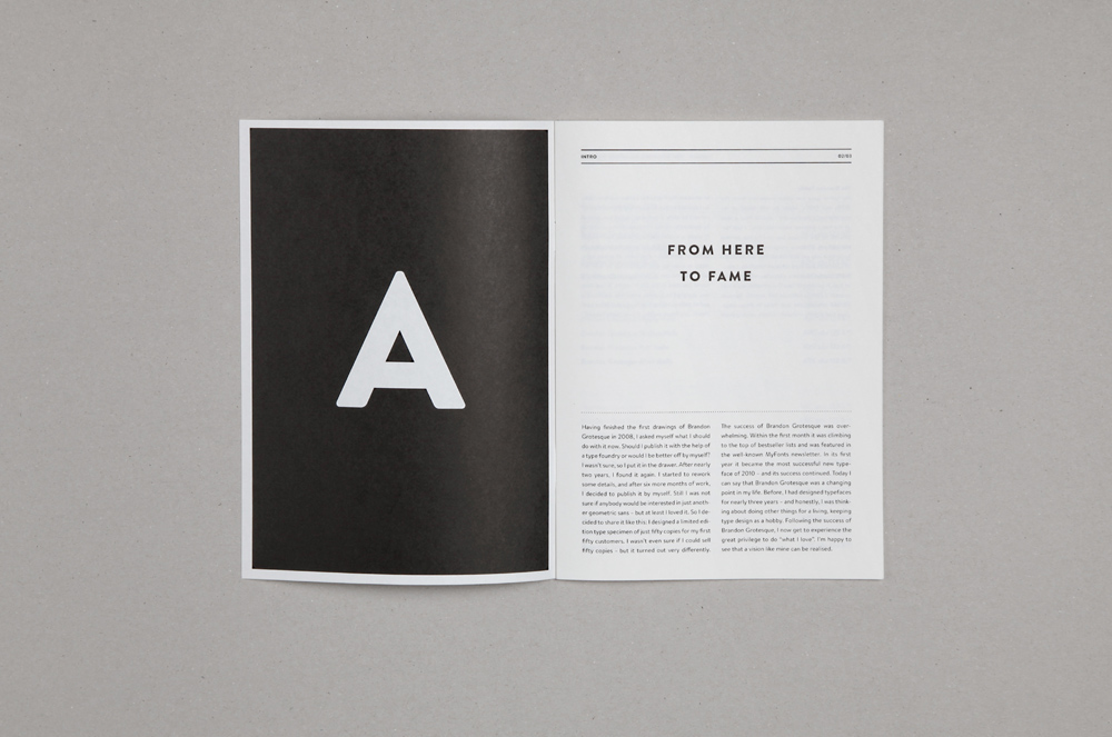
From here to Fame
Having finished the first drawings of Brandon Grotesque in 2008, I asked myself what I should do with it now. Should I publish it with the help of a type foundry or would I be better off by myself? I wasn’t sure, so I put it in the drawer. After nearly two years, I found it again. I started to rework some details, and after six more months of work, I decided to publish it by myself. Still I was not sure if anybody would be interested in just another geometric sans – but at least I loved it. So I decided to share it like this: I designed a limited edition type specimen of just fifty copies for my first fifty customers. I wasn’t even sure if I could sell fifty copies – but it turned out very differently.
Having finished the first drawings of Brandon Grotesque in 2008, I asked myself what I should do with it now. Should I publish it with the help of a type foundry or would I be better off by myself? I wasn’t sure, so I put it in the drawer. After nearly two years, I found it again. I started to rework some details, and after six more months of work, I decided to publish it by myself. Still I was not sure if anybody would be interested in just another geometric sans – but at least I loved it. So I decided to share it like this: I designed a limited edition type specimen of just fifty copies for my first fifty customers. I wasn’t even sure if I could sell fifty copies – but it turned out very differently.
The success of Brandon Grotesque was overwhelming. Within the first month it was climbing to the top of bestseller lists and was featured in the well-known MyFonts newsletter. In its first year it became the most successful new typeface of 2010 – and its success continued. Today I can say that Brandon Grotesque was a changing point in my life. Before, I had designed typefaces for nearly three years – and honestly, I was thinking about doing other things for a living, keeping type design as a hobby. Following the success of Brandon Grotesque, I now get to experience the great privilege to do “what I love”. I’m happy to see that a vision like mine can be realised.