


Golden Harvest
From a traditional family bakery in Floriana back in 1946, to the state-of-the-art facility the company currently operates from in San Gwann, Golden Harvest® has always been at the forefront of the Maltese bread industry.
From a traditional family bakery in Floriana back in 1946, to the state-of-the-art facility the company currently operates from in San Gwann, Golden Harvest® has always been at the forefront of the Maltese bread industry.
We were entrusted with kick-starting the process of re-inventing Golden Harvest®'s visual presence and give the brand a modern overview.
visit our website www.sancho.com.mt

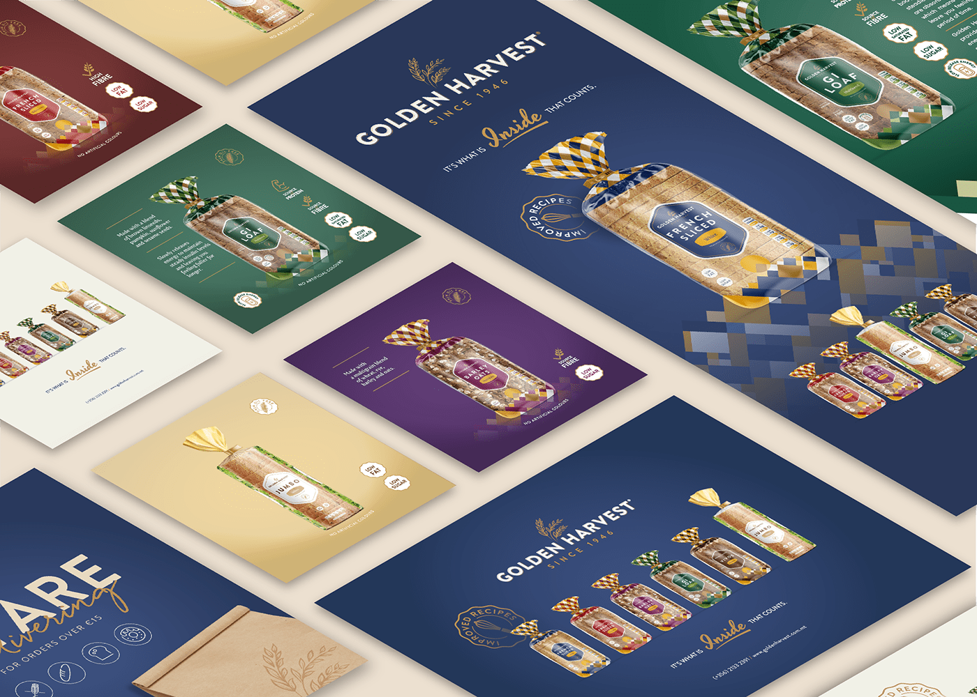
We started the process by re-visiting the Golden Harvest® logo. The essence of the logo was kept in place but improvements were done in its mark and typography.

Once we finalised the logo a visual re-invention of Golden Harvest®'s staple product, the sliced bread, was underway. We looked at reducing the area on the packs to expose more of the product, while coming up with a unique identifiable feature.

To create a unique pattern, we took inspiration from aerial photos of multicoloured fields. A system of 2 colour + gold was adopted for all the pack colour variations.


Golden Harvest® products boast all sorts of benefits. A versatile icon system was developed for these benefit claims.


Next in the re-invention process were the Golden Harvest® pre-packed buns. A seamless artwork was created for their standard range and also for their new Bistro Range. The latter uses a mixture of matte and gloss highlights as well as gold ink to elevate the packaging.


