


During the Master's Degree in Editorial Design, Print and Digital Media with Gráfica Futura mentoring, we were assigned to carry out a project with a real client: in this case, the Verne digital publication of El País spanish international newspaper. Verne, is a web page dedicated to explore the internet. In 2014, it started as a blog and later it became a website totally adapted for mobile. Verne's goal is to create such amazing stories that deserve to be shared on social networks.
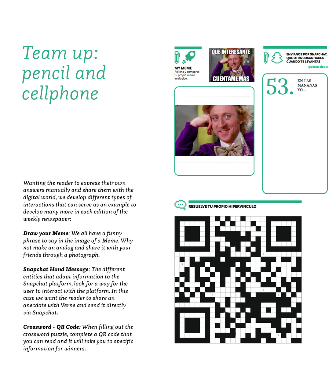
Verne wants to take the digital content to the paper to a weekly publication. Within the challenge of converting the visual language into paper is to integrate these digital information formats: tweets, videos, embeds, links etc.
Integrate some type of augmented reality so that readers go to the web to see those visual formats.
And finally respect Verne's graphic identity.
This project was developed by Marcos Miguel Alonso Castillo, Gianmarco Magnani and Paolat De la Cruz
on 2017 as students of IED Madrid on the Master's Degree in Editorial Design, Print and Digital Media.
Note: All images, texts, work and histories were provided by Verne. We are not responsible for any information written by this entity
in relation to the news used. All these news are published on the Verne website.


Verne on paper should be interactive, dynamic and fresh. Has to take advantage of all the possibilities of interaction that paper provides. Verne talks about the Internet, he has to use elements that refer to the digital world. Verne has to be friendly for different generations.


Moodboard: Verne


Questa Font Family
The Questa is a typeface varied containing four versions: Display, Serif, Sans Serif and Slab providing variety when combining them. This gives versatility at the time of raising information to audiences that vary in age and tastes, and in addition to that take a visual balance in terms of print and digital. Questa in FontSpring.


Playing with monochromes in a digital environment
Verne has a differential color, the green C74 M0 Y70 K0; that along with black and white make up the range of colors and base of major degradations that the brand has. We decided to refresh the layout with this identifiable and unique green;
apply monochrome to some photographs as part of the cleaning of the design, so that the existing full-color photographs stand out in a better way.


From pixels to infographics
Icons designed especially for Verne with the aim of providing a fun digital mood, and signaling digital information placed on paper. This type of icon also accompanies the cover in each edition of the Weekly.
The monochromatic infographics, give life to the supplement providing information in a fast and palpable way, explaining factors and providing conclusions.
The monochromatic infographics, give life to the supplement providing information in a fast and palpable way, explaining factors and providing conclusions.


Showing previously the inspiration, and the selection of elements individually, in this project the essential thing that is explored is that the paper version of Verne is as entertaining as the digital version, appealing to new proposals of fusion of the old and the new, for that all generations feel identified and rescue ways to enjoy the role, but now in conjunction with your mobile.


The cover of the Verne Newspaper went through a long process of tests that pursued the idea of being a photographic index. It was evaluated the idea of the amount of text that should have and whether it was monochromatic or not. The digital world became impoverished with monochrome, the excess of text overwhelmed and the absence of it confused. The final design is a balance of everything.


Final Covers


