

This is a fictional work created for a module called "Typography II". The assignment required us to create a large-scale poster and open deliverables, supporting the chosen event.
I decided to choose Halloween Horror Nights by Universal Studios Singapore as my chosen event. I created my poster purely through typography, a brochure for the event and supporting open deliverables, in the form of mockups.
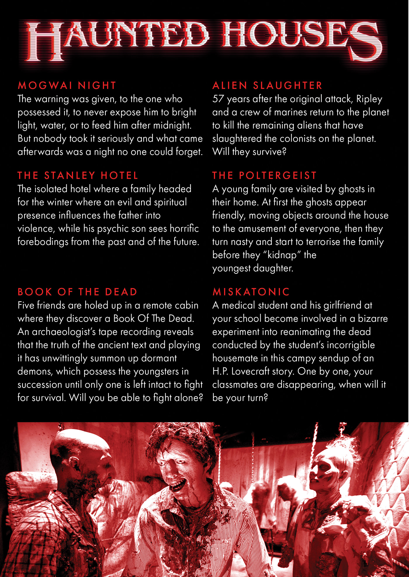
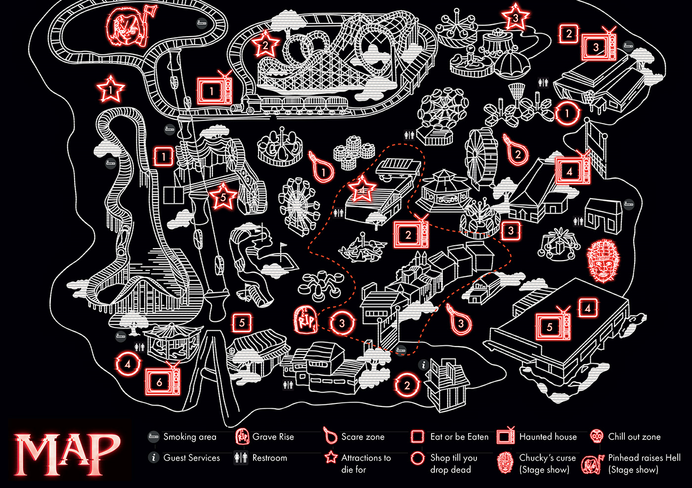
This particular brochure opens up to reveal a map on the other side. This is extremely useful for visitors due to how compact it is. There is a consistency in the use of colour, specifically red, black and white, with the same effects of vhs effects and glitchy interferences.


The bottom shows the brochure as it is printed, which will be folded into a booklet that displays the information in the sequence as shown in the grid above

After opening the brochure up, by flipping the page, the entire map of the theme park will be revealed.
I did a series of deliverables, specifically, a multi-purpose double-sided ticket. Using perforation, there are coupons that visitors can tear out to use at the event itself. For example, First 100 to find "Pinhead" mascot will receive a free pinhead vinyl action figurine. Another series of deliverables is vinyl collectibles, where the packaging is redesigned to fit the theme of the year. I did mockups for Jason Voorhees, Stripe and Freddy Krueger. Last but not least, there is also a series of pin-back buttons, including, "I love Chucky", "I love Pinhead", as well as "I love Freddy."

The following is a video of my documentation journal, recorded by Temasek Polytechnic as a model journal example, for future juniors to refer as model references.
Thank you for viewing this particular project and I hope you learned something new!
If you liked this project, click here for more!
If you liked this project, click here for more!


