


House of Ivy is a newly opened restaurant in Albury, South Wales. The Tandon's commissioned me to work on their visual identity. As an artist, I didn't follow standards and rules of design and went more by the 'feel' than anything. The job comprised of the following:
1. Logo Design
2. A painting for their inside wall.
3. Business Cards.
4. Menu Card Design.
This is a very crisp mood board the client's sent to me:

The first thing that struck me was a sense of 'balance'. A balance between casual and formal, solid and liquid - opposites that work, somehow. And this inspired the following,
Logo Design

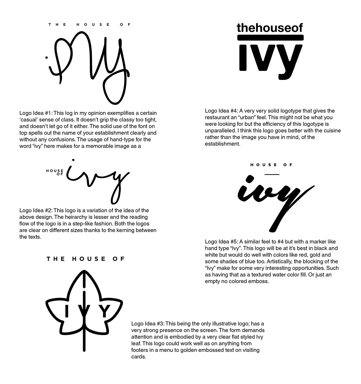
The following are some typeface based logo designs that were part of the process. The client's liked the aesthetic of 'Logo Idea #5' and wanted me to strike a balance between their design and my iteration and then we came to 'Logo Idea #11', the one that struck the right chord.

The logo - fixed and finalised - was then put to test on some mock-ups.

And, this is what it looks like in all of it's glory,

Illustration for the wall.
For the wall inside the restaurant, the Tandon's wanted something artistic, there weren't very many restrictions apart from a few ideas. These are concept paintings inspired from the references received.

None of these illustrations really seemed to be working up until I stumbled across Shepard Fairey's Costa Mesa mural. This 55 feet tall mural had elements that I felt would work well for bringing in a contrast to the interior of the restaurant. So taking visual references, from this beautiful mural...

...I came up with this design...

I put in elements from Australia such as the street signs, the beaches and included elements that are just aesthetic in nature. Hidden messages in this painting were also fun for me to put in. Such as the "Swaagat hai aapka" on the left which is Hindi for "We welcome you". The rest are for the visitors and the viewers to find.

Business Cards.
The client's wanted to have a very minimalistic and informative card going with their brand. To bring in the theme of 'balance' I created a hand painted illustrative logo.

Which once put on business cards, looked like water colors; the leaves became the freer element while the text kept the full appeal crisp.
Now that the informative side of the card was done. The other side was treated by a gold emboss, which was a choice made from the client's end.


Menu Card Design
The menus were made keeping in mind: readability, aesthetic appeal and information.


I wouldn't lie, working on this project made me very hungry at very odd times. I mean, just take a look at the food!

A huge thank you to Col. Tandon and his family for giving me an opportunity to have my work in an entirely different continent!


