

The Pantry Mexican Restaurant

Placemat menu design, front and back
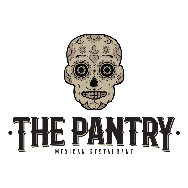
Mexican restaurants can be fun and festive, high-end and classy or anywhere in between. The Pantry runs in the middle towards the modern side, so the logo utilizes a more subdued palette. I chose a brown/black color scheme that would lend itself well to a trendy establishment.
I created a sugar skull as the logo mark since the sugar skull is an iconic Mexican-style image.
I chose a bold serif font for the logo type, complementing the mark’s look and feel. I also applied an offset type treatment, extending the type in an arc form for additional visual interest. The end result displays a cohesive, catchy logo that captures the spirit of the establishment.
Thanks for viewing this project! Get in touch to see how I can help with your graphic design needs.


