Squib
Brand design and implementations
Brand design and implementations
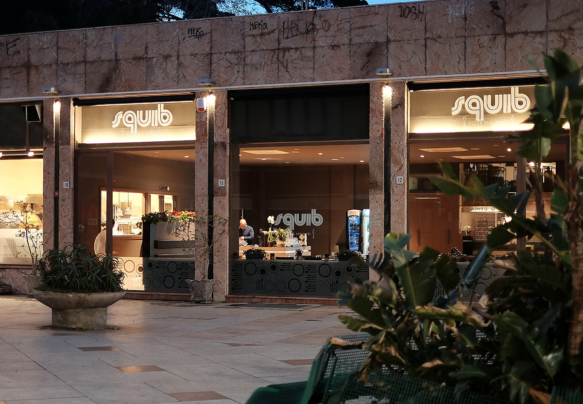
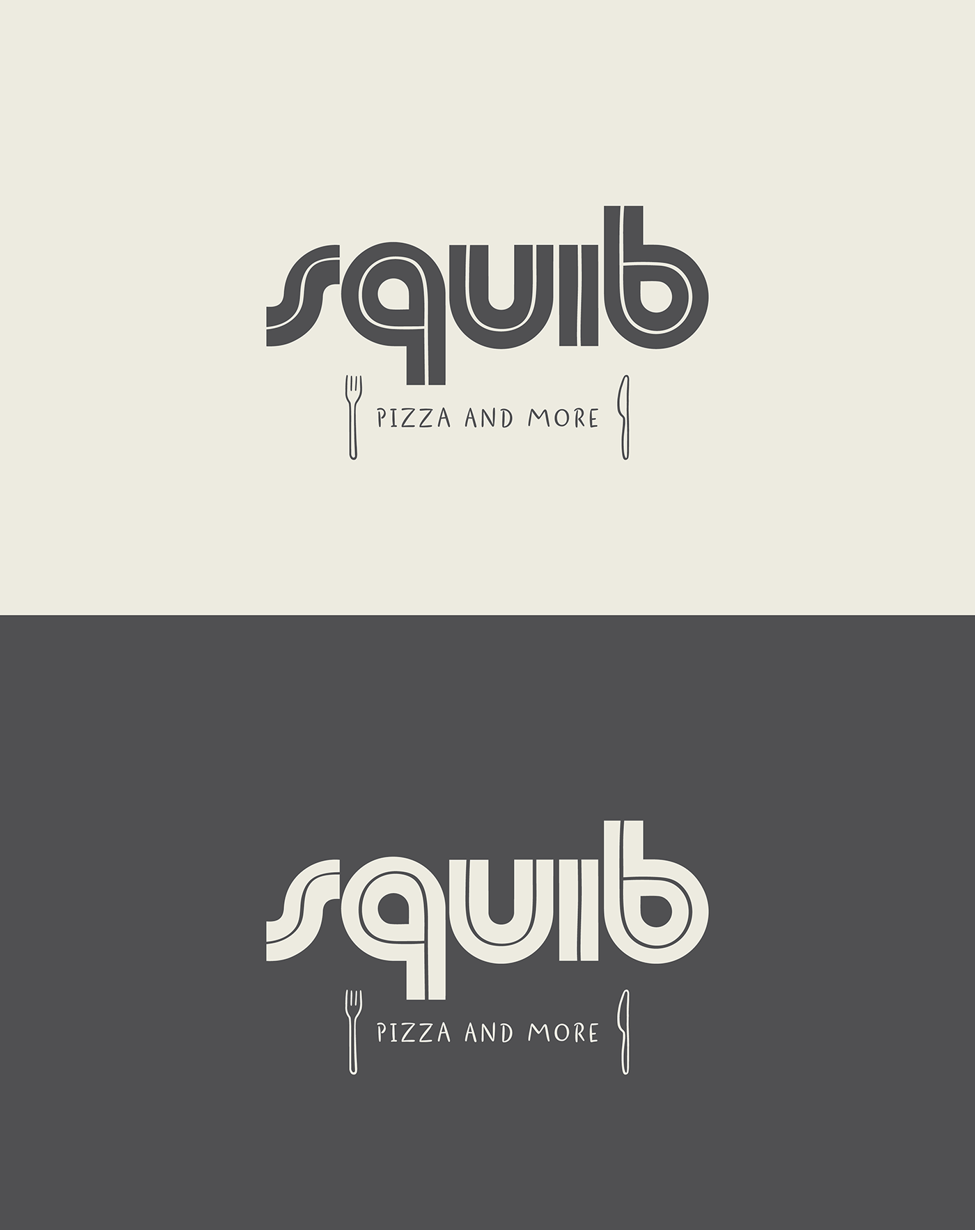
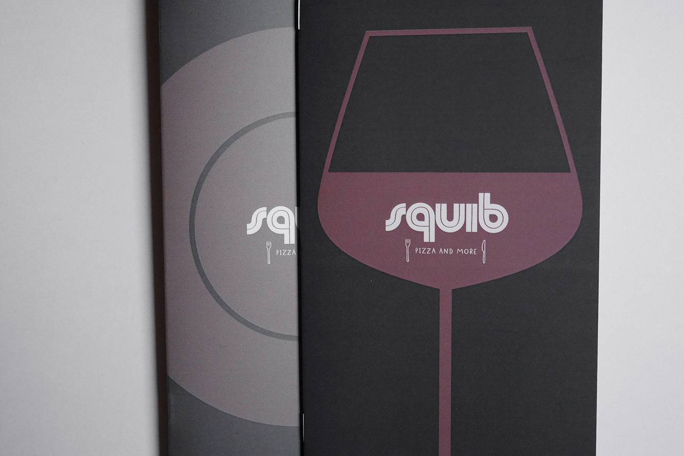
Squib, Pizza and More, is a new restaurant in the center of Catania. It is located in an urban square of the mid-50s, between design shops and under a semicircular terrace frequented by young skaters. The area is commonly called Squib from the name of the factory that once was here (hence the origin of the name). For the study of the logo we kept this characteristic context in mind. The roundish font winks at the 60s and the sign that crosses it is a bit like the wake of a skate, the semicircular belly of the “q” and the “b” recall the topography of the area.
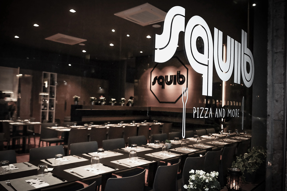
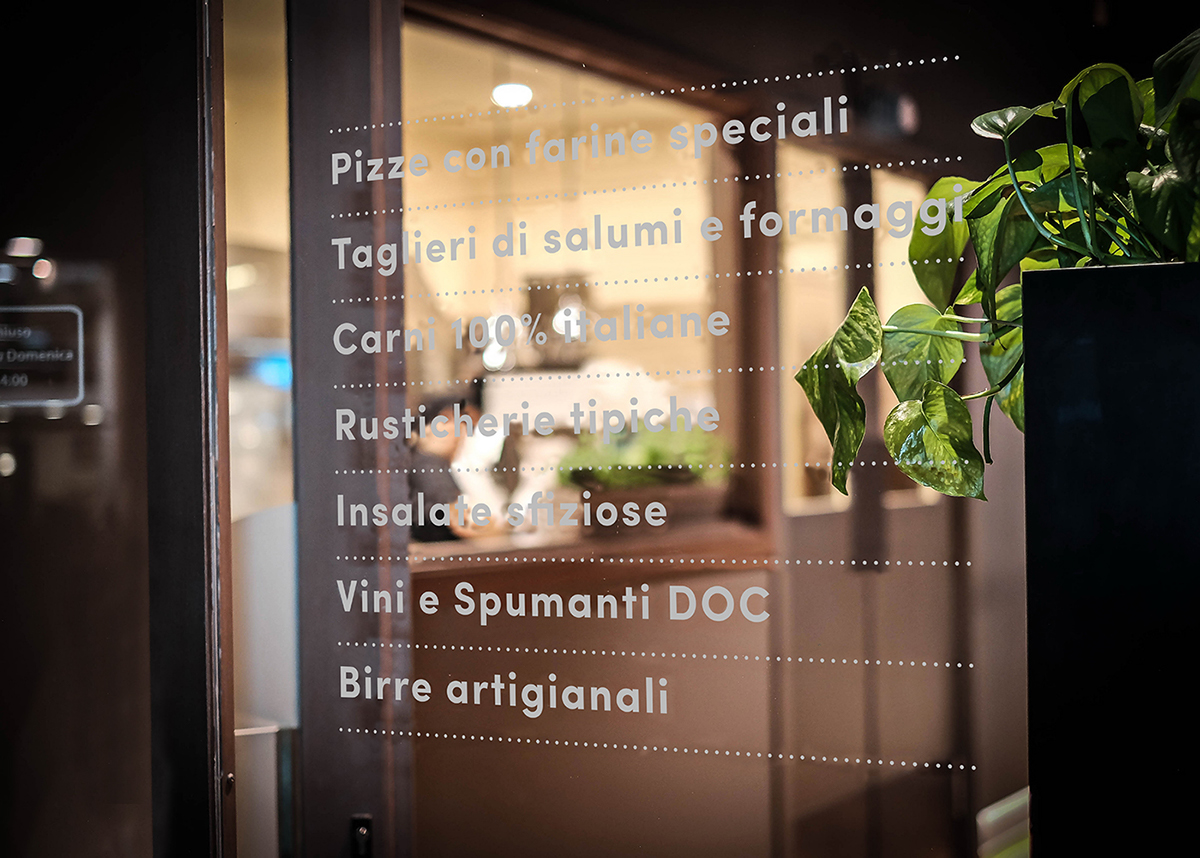
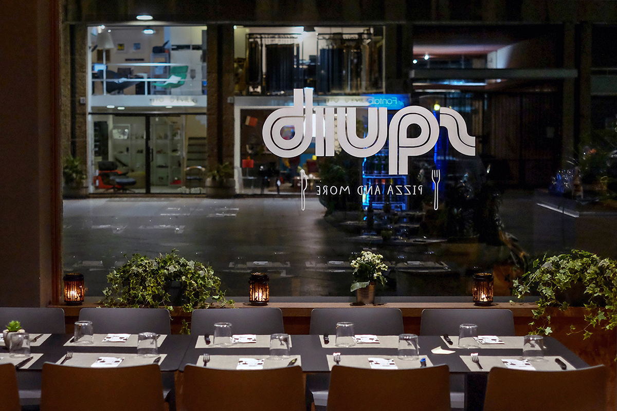
The logo in the central window of the restaurant is very visible both from the outside and from the inside. A list of the strong points of the culinary offer furnishes the other two windows.
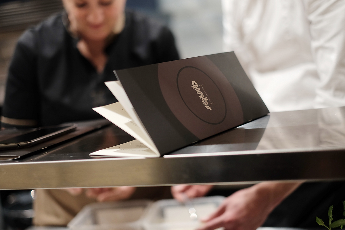
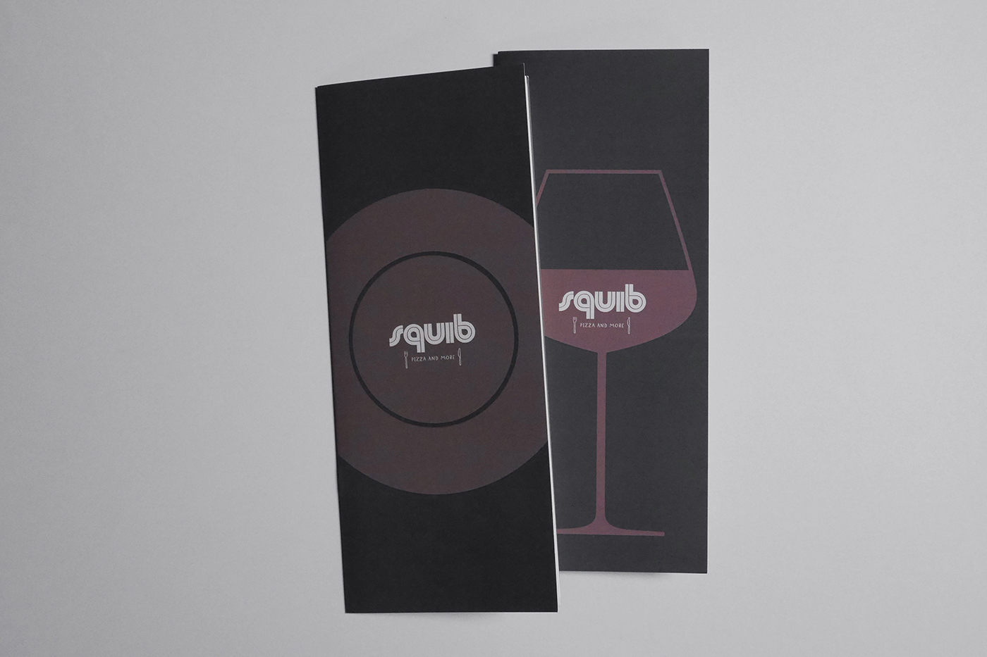
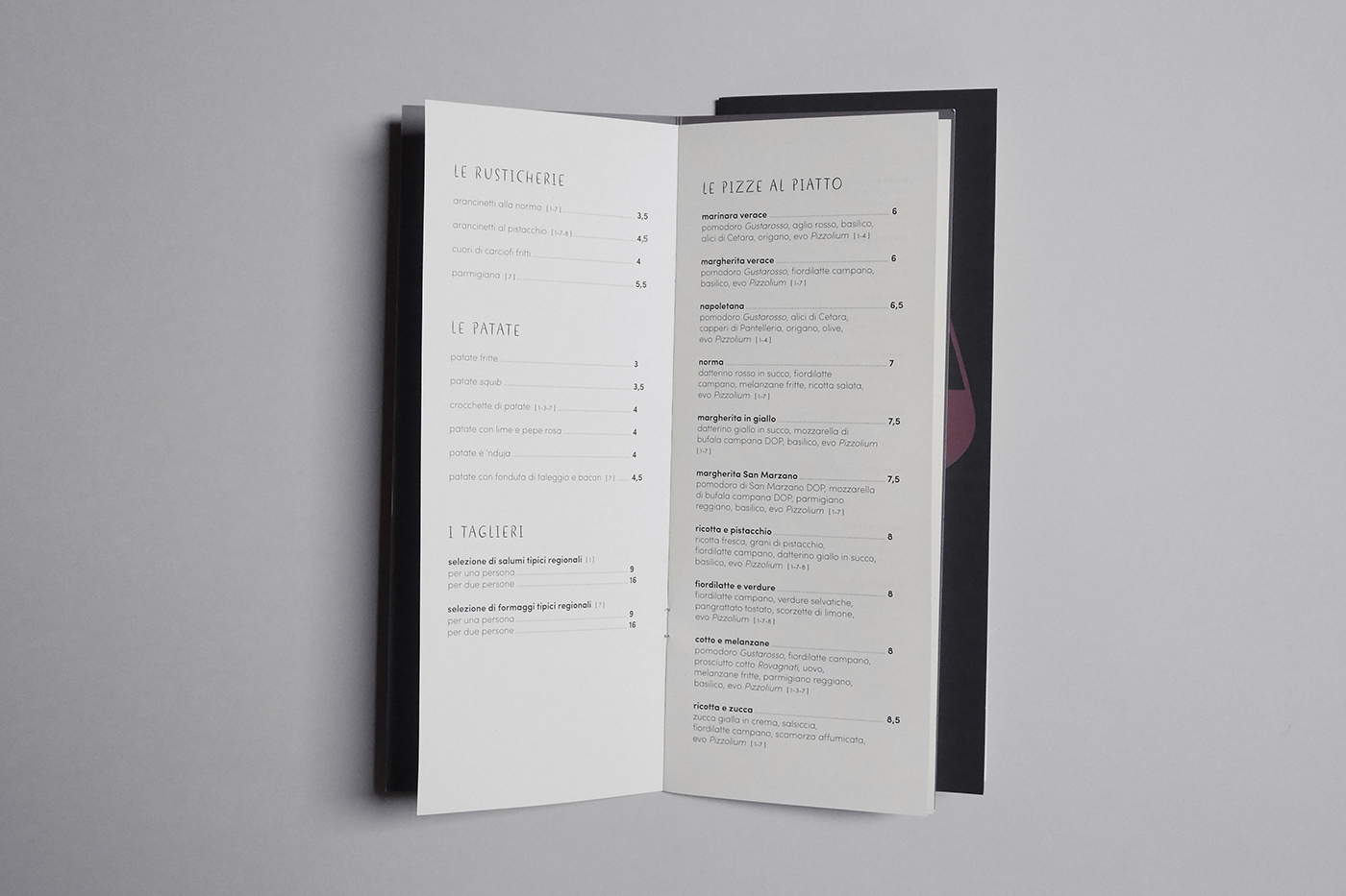
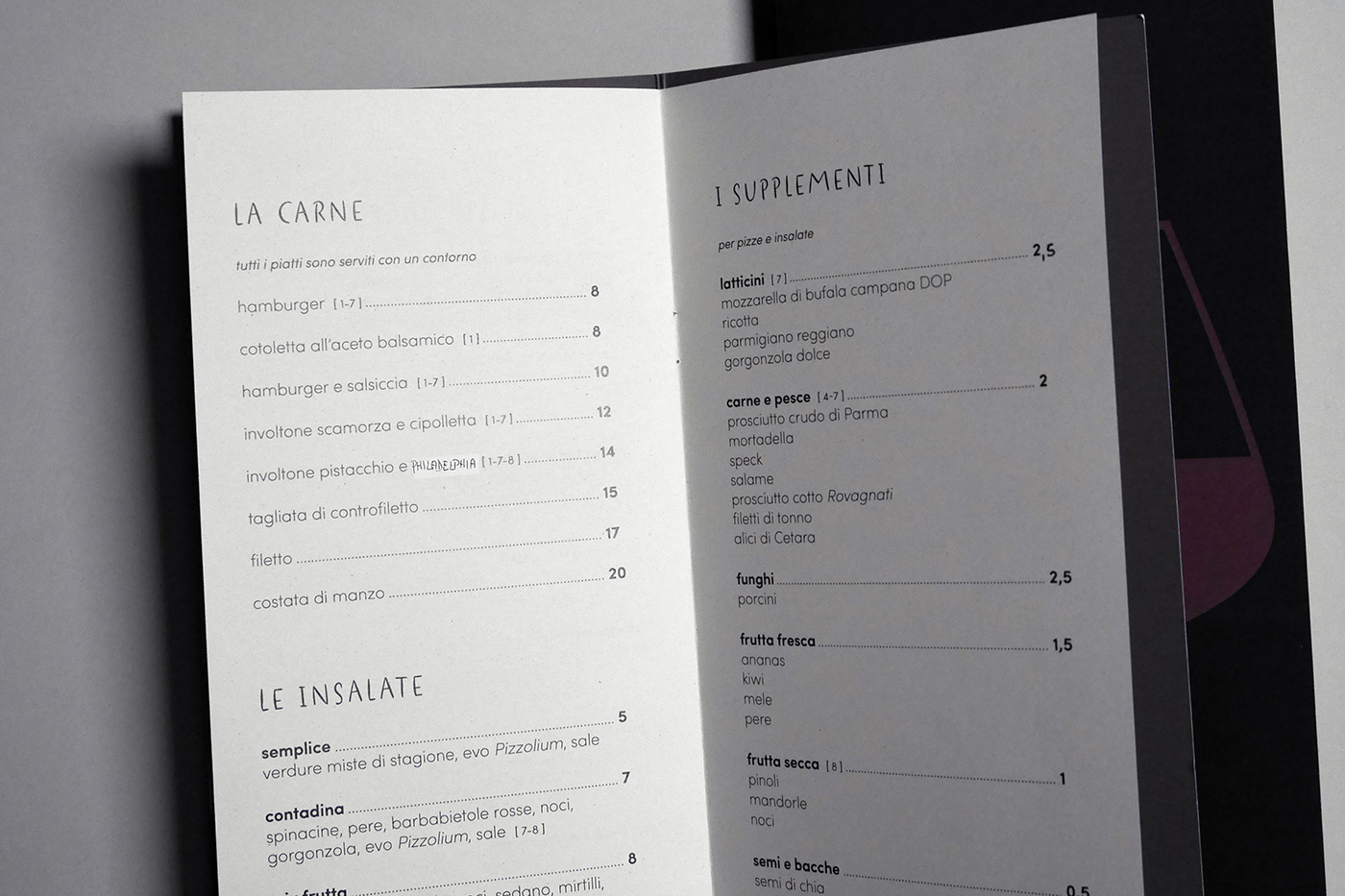
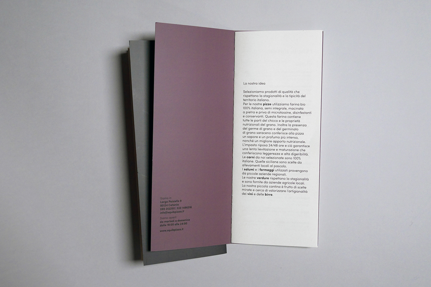
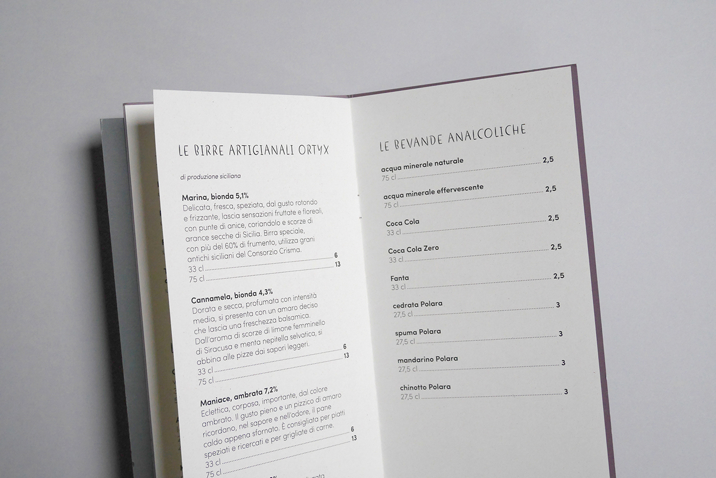
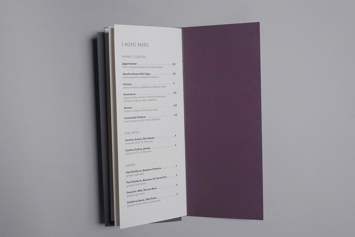
The paper menus, food and drink, are well integrated with the color context of the dining room: the covers use a palette of grays and browns.
The easy-to-navigate website tells the atmosphere of the place in a sincere way. From the very beginning, it tries to entertain the reader by involving him in reading an auto-typing question and immediately providing him the tool to book via email (desktop version) or via phone (mobile version).
Here the link of the site.
