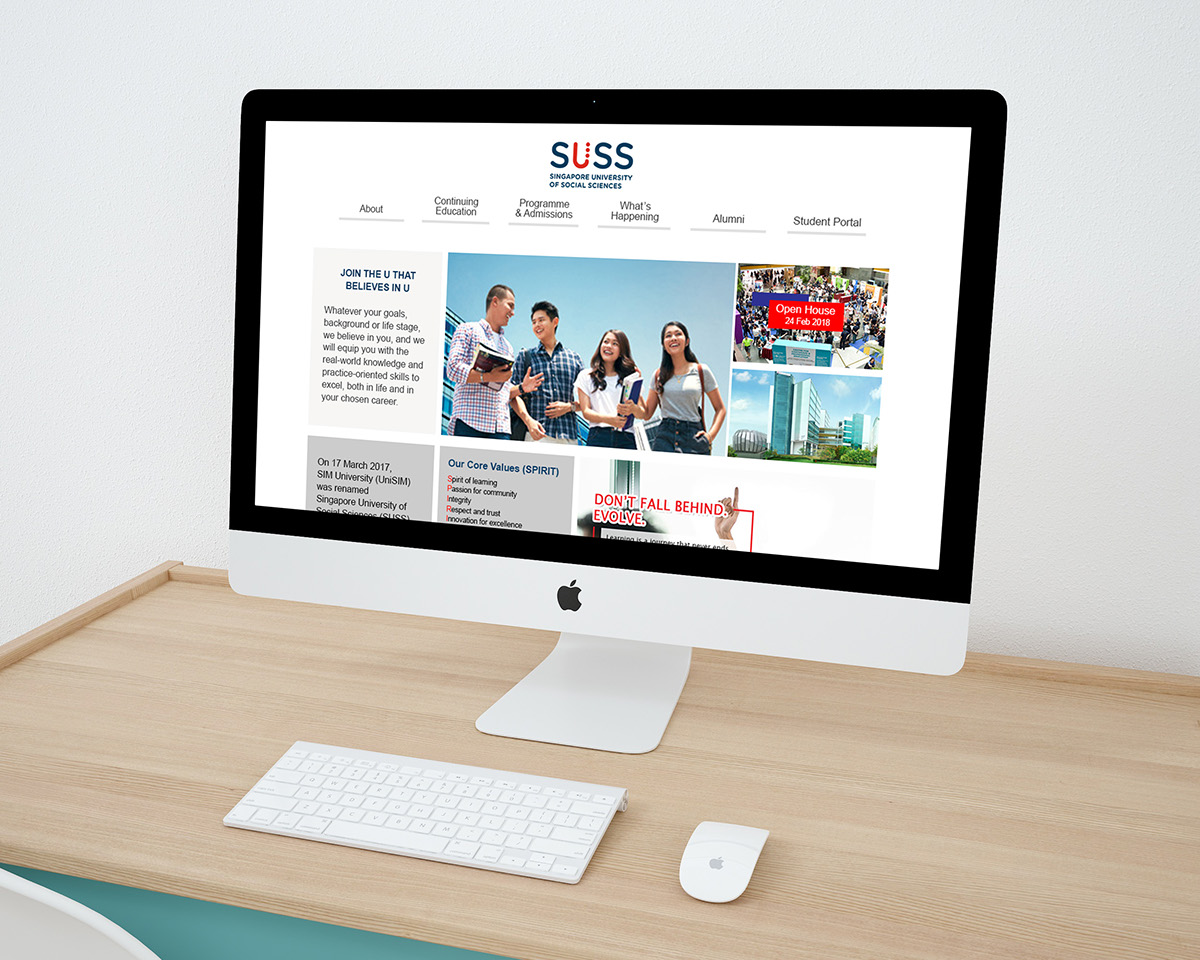
Redesign IA for SUSS website
(desktop version)

Introduction
SUSS previously known as SIM University went through a whole restructuring into being Singapore’s sixth autonomous university.
The name change reflects the university’s decision to distinguish itself from private university, SIM Global Education.
Brief: Your design should meet the user goals represented by the 3 given personas, the goals of the school, and its existing brand. (website to be in desktop version) Focus on 1 of the 3 persona for more in depth research.
The 3 given persona:

Problem: The current website have at least 4 different link to mingle around to find the information users needs. The design are not consistant throughtout the website and the navigation bar is not easy for the users to navigate around.
Who uses the school website most of the time almost daily?
The chosen persona:
Jessica, the current student. The reason why I decided to work on the student portal as it will be challenging to work on something that is not easy to gain access to and I realize there is no one in my class is doing this persona too! It will be interesting to redesign a whole new student portal base from my research findings.
Pain Point: Users wanted to check just their schedules, they need to clicks a few times to find what they want. It is a pain to do it everyday.
User Research
Some of the main comments from the students I have interview with. Although they are not student from SUSS but the idea behind student portal is the same. And not to be bias, I find a few different students from different schools.
"I have to click lots of tabs in just to check my class schedules.”
“Informations are all squeeze together at the top left hand corner”
“I am force to use the website as it is the only place I can get the necessary information although it’s get on my nerves every times I used it.”
“There are quite a number of links that I have no idea of.”

I have come out with a dashboard type of homepage for the users to easily view their timetable and reminder.
Prototype: https://bm0ezj.axshare.com
What's Next?
1. Making the navigation bar into more task base naming because it will be clearer for the users to navigate. Making it an action oriented navigation.
2. Interview the real current student from SUSS to know more about their pain point.
3. Able users to have a control to edit their calendar
For more in depth explanation of the process: https://medium.com/@hanvone/project-2-ux


