The founder of Hook Media Davin Sgargetta thought it was time to re-design the visual identity, creating a new consistent visual language for a business still growing and finding its place in the media landscape. Our goal was to create a visual language that captured the essence of what Hook Media do: the clients they currently service, the spaces they would like to move in; a concept that felt future ready while also acknowledging the history of the media profession from which they have learnt from and grown.
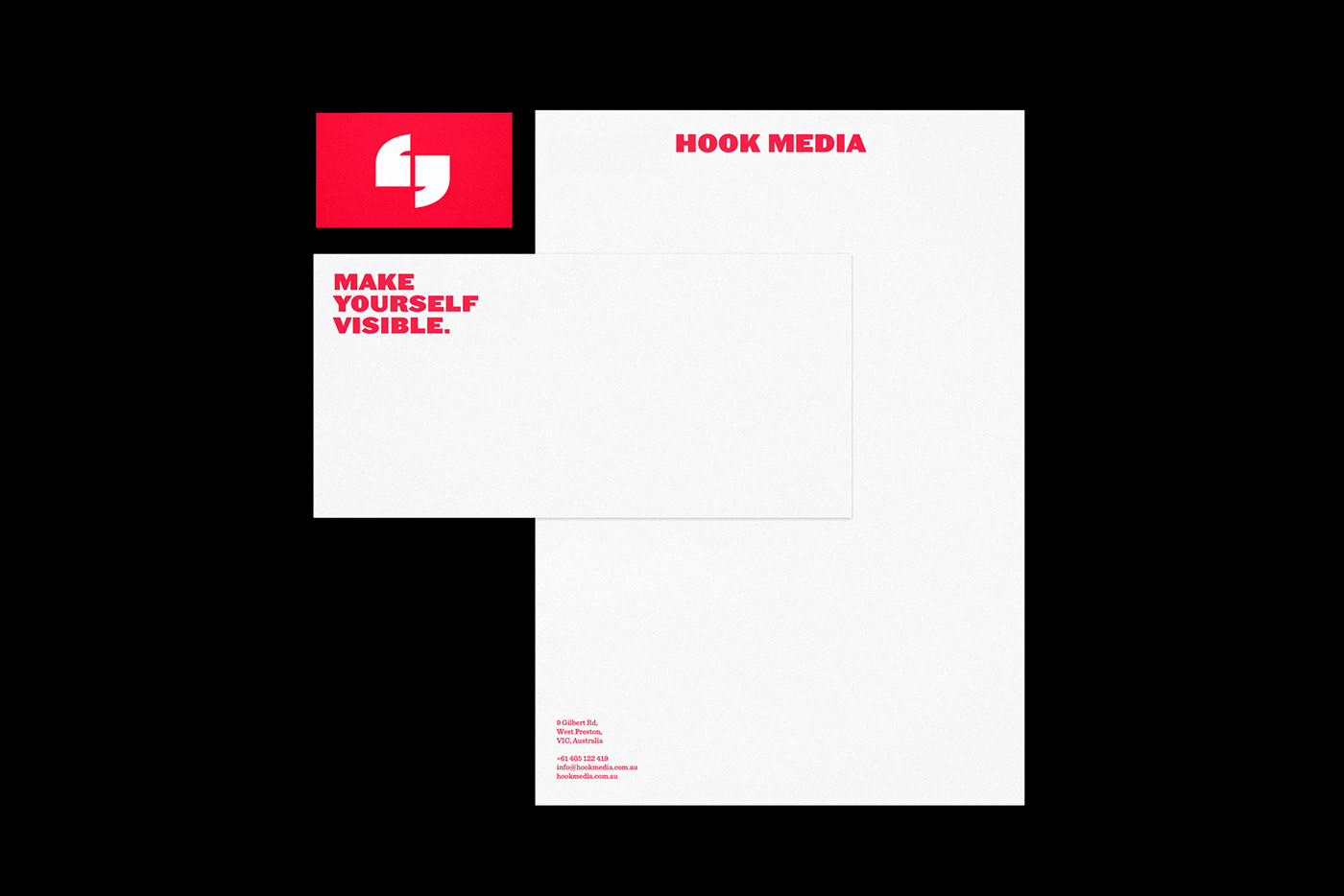
We started by working in the negative space of the letter H. From speech bubbles to quotation marks, it was clear that communication was the essence of what Hook Media do, and this was going to form a strong foundation for the new logo and visual identity. We felt that quotation marks had strong symbolism — no matter the medium, they will speak. They will tell stories, deliver key messages… Hook Media will communicate. The typography chosen was a print media throwback, but with a currency and edginess that keeps it relevant across the modern platforms.
— Concept
— Visual Identity
— Visual language
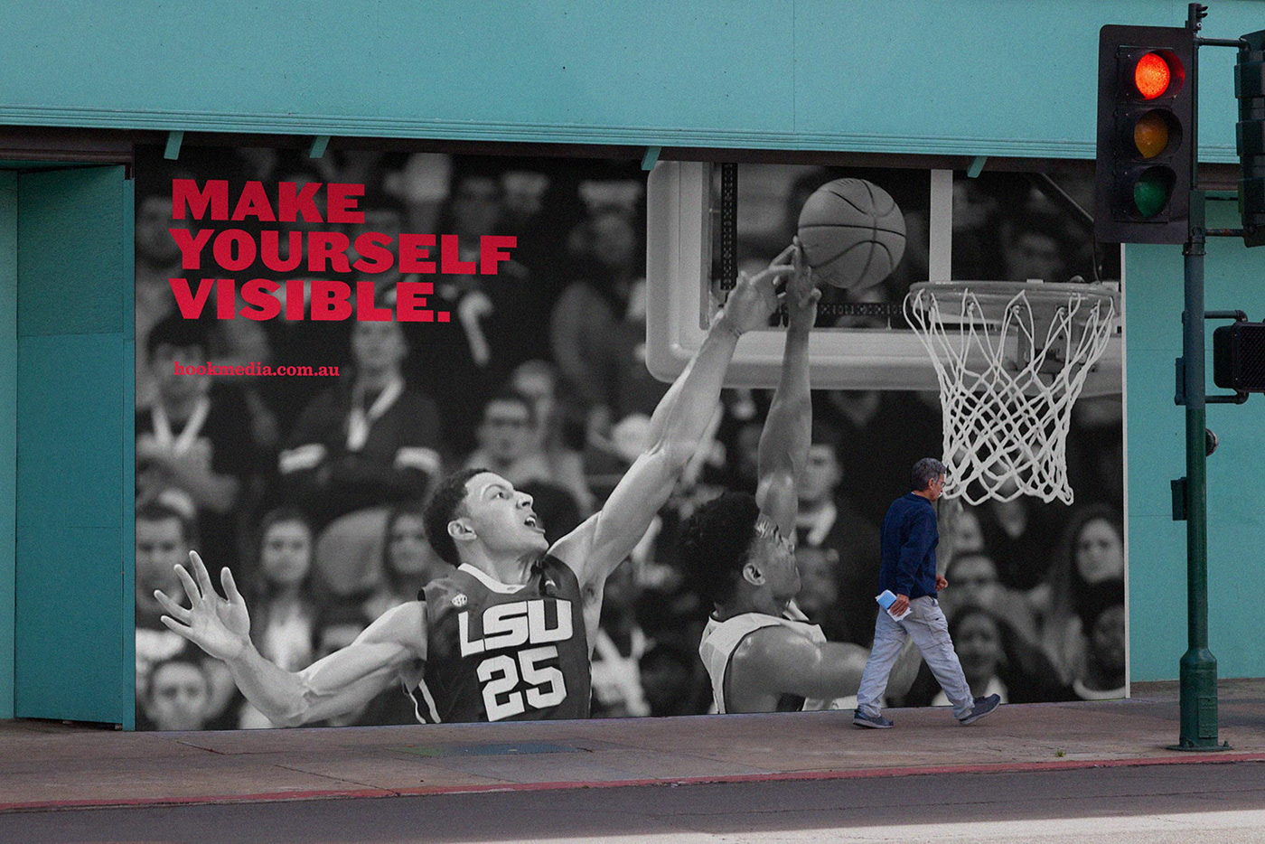
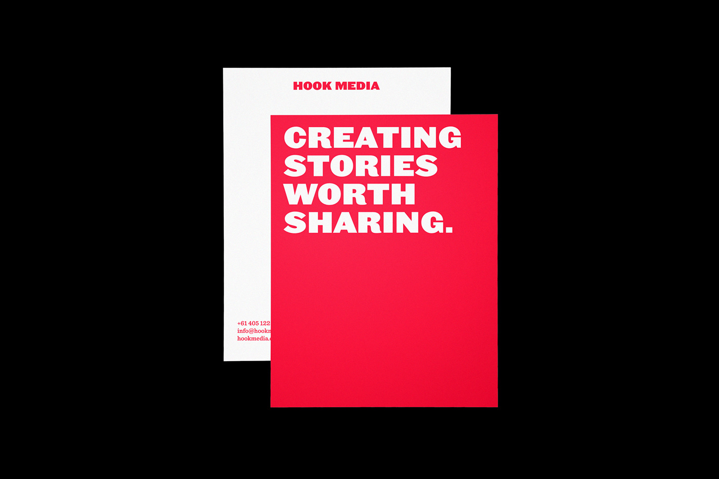
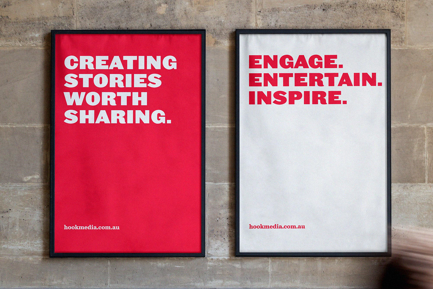
— Identity application (across print and digital mediums)
— Comprehensive Brand Style Guidelines
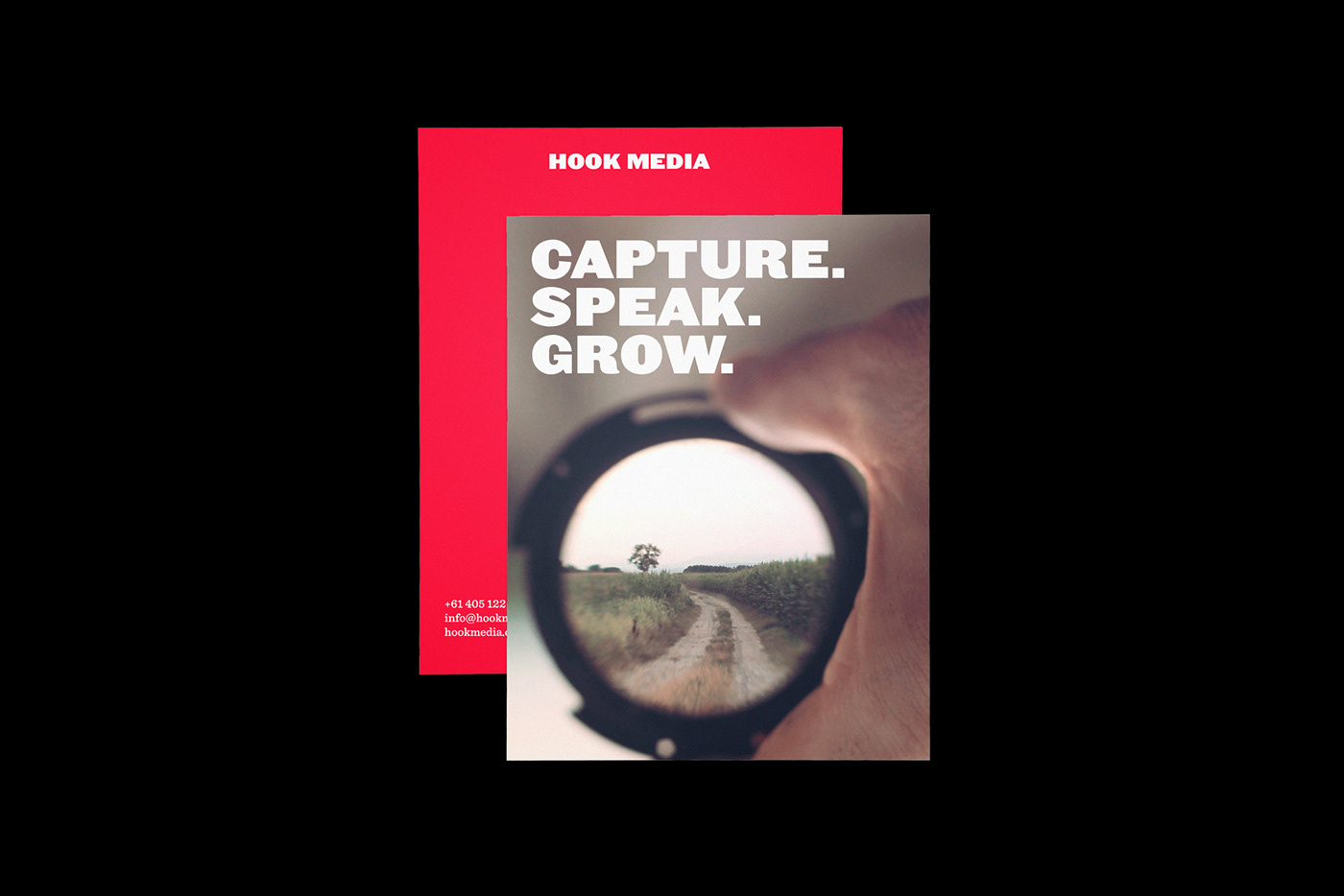
— Collateral
— Typography