

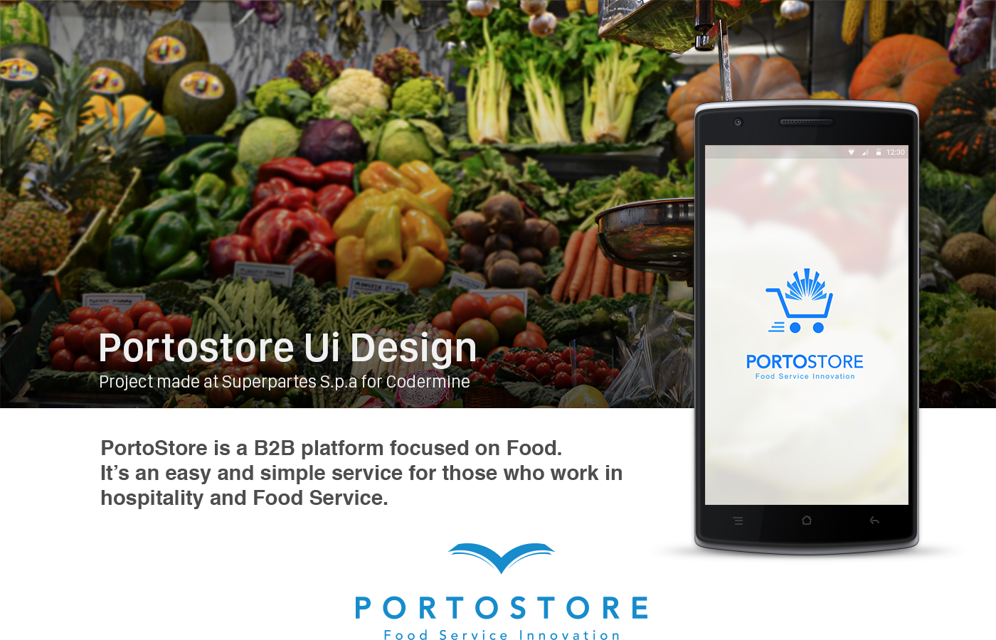

PROJECT:
In order to understand better the user and create the best UI that fit with our targets we explore many ideas and test them quickly using wireframe and rapid prototyping.


To improve the communication between dev & designer and most of all to maintain consistency tough all the project we made a style guide. Colors, typography, and elements like buttons are been documented. We create them also for the different state of the buttons (pressed, inactive). With this approach, the developers were free to implement others screen using just a wireframe as a guideline.

With more than 100 screens building the style guide was very helpful. Here some of the layouts:

ONBOARDING:
Using the "Tour pattern" we were able to highlit the main features of the apps:

EMPTY STATES:
Like all big apps, we have a lot of hidden features, some advanced some not.
We designed the empty state to educate our users and where possible to make an action:

We built mobile and tablet version because a huge part of our users keep switching between those devices based on where they are or by the task they're doing. In some case, we redesigned the UI of the App to better fit the tablet screen and create a better experience.


